Nature Photographers Network
This is the preserved archive of the original Nature Photographers Network. The community continues at naturephotographers.network.
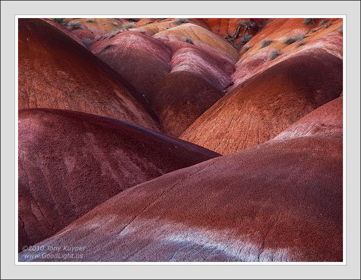
Bentonite Blossom
‹ PreviousLandscape GalleryNext ›

Bentonite Blossom

by Tony Kuyper

Gallery: LandscapePosted May 21, 2010574 views37 comments
I thought the repeating patterns of bentonite hills created a sort of flower-like arrangement. To make it feel even more flowery, I took a bit of Photoshop liberty with color and saturation. For me at least it still looked natural, but also understand that for others it may be a bit much.

Good or bad, I would be interested in your thoughts on this image.

Canon 5D, 28-200.

Comments

37 comments
Comment posted by Nicolaus Wegner on May 21, 2010 at 11:58 PM
You are the badlands master of abstract photography Tony. The top with the brush and wood is a tad distracting, but overall it's an excellent image.
Registered on February 21, 2010, 133 Posts, 1509 Comments
Comment posted by Youssef Ismail on May 22, 2010 at 12:05 AM
Tony,

IT looks natural to me, but I was not there to see it in person. I love the lighting.
Registered on November 1, 2003, 474 Posts, 5555 Comments
Comment posted by Michael VanBeber on May 22, 2010 at 12:05 AM
Excellent detail with beautiful rich color along with a strong composition. Awesome image Tony!

Registered on February 27, 2009, 34 Posts, 183 Comments
Comment posted by Ben Horne on May 22, 2010 at 12:07 AM
The saturation looks very normal to me. I really like the rolling hills of color here -- especially as it fades to pink, then yellow, and finally orange in the background.
Registered on August 27, 2009, 51 Posts, 959 Comments
Comment posted by Wayne Rhodus on May 22, 2010 at 12:13 AM
The light is wonderful, it reveals the layering and fine detail in excellent fashion. Wonderful comp and a very pleasing image Tony.
Registered on November 16, 2003, 157 Posts, 3326 Comments
Comment posted by Michael J Greene, on May 22, 2010 at 1:18 AM
Hi Tony,

I really like your composition a lot. The reds seem a little strong for my tastes, but not completely unrealistic either. This is a very well crafted image.
Registered on June 18, 2009, 86 Posts, 2317 Comments
Comment posted by Rick Goldwasser on May 22, 2010 at 1:59 AM
The colors are a bit strong for me, but I really like the comp here. I love the way the lines seem to flow out of the corners, very nice!
Registered on May 10, 2009, 127 Posts, 970 Comments
Comment posted by Joel Hazelton on May 22, 2010 at 2:27 AM
Nothing here looks overdone to me, Tony. Excellent composition, too. I love the brush in the background but could do without the bit of wood (flood debris?). Still an absolutely fantastic image.
Registered on August 6, 2008, 194 Posts, 1315 Comments
Comment posted by Helio Cristovao on May 22, 2010 at 6:37 AM
Looks great to me. It´s really weird and that´s what I like about it. Well done!
Registered on September 15, 2009, 83 Posts, 434 Comments
Comment posted by Paul Marcellini on May 22, 2010 at 8:40 AM
Wonderful tones as always Tony. Love the comp. Yes the wood catches my eye a touch and bit more room would have helped, but it isn't clipped either, so it really doesn't bother me.
Registered on November 27, 2007, 250 Posts, 2468 Comments
Comment posted by Kurt Budliger on May 22, 2010 at 8:49 AM
I love the color, the layers and intersecting lines in this, wonderful shot :toast:
Registered on June 11, 2006, 113 Posts, 2116 Comments
Comment posted by Eva McDermott on May 22, 2010 at 9:32 AM
I love the rich colors and textures Tony. Looks good to me.
Registered on January 4, 2009, 1015 Posts, 13229 Comments
Comment posted by Dietrich Gloger on May 22, 2010 at 9:57 AM
This rocks Tony! I can honestly say that I have never seen a weak image by you, and you have posted similar scenes, but this one is particularly strong in my opinion. What I like here is the depth and 3d effect. Colors, framing, lines, curves,light - it all converges into one highly appealing piece.
Registered on January 26, 2007, 360 Posts, 9876 Comments
Comment posted by Dorin Bofan on May 22, 2010 at 10:17 AM
The curves and the way they accentuate the layering effect is mesmerizing. The tonality is pretty amazing too. Stunning as always, Tony!
Registered on April 30, 2007, 122 Posts, 3086 Comments
Comment posted by scott lanz on May 22, 2010 at 10:34 AM
An interesting, artistic image. Very well composed.
Registered on November 14, 2003, 840 Posts, 12902 Comments
Comment posted by Shane McDermott on May 22, 2010 at 11:38 AM
Hey Tony

Love the composition here, you really have a great eye for these kinds of scenes. I also like your artistic rendition of these fabulous hills, although enhanced, is still within the realm of realistic interpretation. My only suggestion would be to lighten the hill top that emanates out of the ULH corner. If it's shadow line was similar to the hill directly below it, I feel it would help create better balance throughout. I guess I would need to see it to know if this would actually improve the image. Just a thought. Regardless, it is a wonderful image.

Shane :toast: :toast:
Registered on November 12, 2007, 49 Posts, 1074 Comments
Comment posted by Erik Stensland on May 22, 2010 at 12:16 PM
Fabulous Tony! It looks natural to me and I love the way you laid this out. I probably would have cropped off more of the top but I'm glad you didn't. It really works well. Excellent image all around!
Registered on September 27, 2004, 121 Posts, 718 Comments
Comment posted by Abdullaziz Bin Ali on May 22, 2010 at 12:54 PM
Beautiful work Tony
I love it
Registered on May 31, 2009, 112 Posts, 1590 Comments
Comment posted by Tyson Fisher on May 22, 2010 at 12:57 PM
Great image Tony! I love the overlapping lines and fabulous array of colors. These hills remind me a bit of the Painted Hills in Oregon
Registered on September 17, 2008, 44 Posts, 623 Comments
Comment posted by Paul Breitkreuz on May 22, 2010 at 1:45 PM
Tony, the overall detail, color, and composition is extremely nice. As far as the saturation I find it has a natural look to me overall. As I only shoot Velvia what I see as natural is not of course the same as natural to many others. No doubt the balancing act between too pumped of colors and the much flatter unsaturated look is the ending twist of the person performing the processing. Somewhere in the middle is where I think we all try our best to land. However, to me there is a need for it to look as though it's "alive", even if it does not have a heart beat. Not sure if that makes any sense, but that is how I view images. :cool:
Registered on February 25, 2006, 525 Posts, 8448 Comments
Comment posted by Joseph Kayne on May 22, 2010 at 2:03 PM
Hey Hey!!!! Looks good to me! Joe.
Registered on November 1, 2003, 573 Posts, 2619 Comments
Comment posted by Kevin Trinkner on May 22, 2010 at 2:28 PM
Beauty Tony, love the patterns and textures, the light light and colors aren't bad either... ;)
Excellent work.
Registered on June 30, 2008, 203 Posts, 2641 Comments
Comment posted by Rick Lundh on May 22, 2010 at 3:22 PM
Love the repeating lines and the colorful pop this one has... No nits here, Tony.
Registered on April 28, 2004, 774 Posts, 4351 Comments
Comment posted by Harley Goldman on May 22, 2010 at 3:43 PM
Tony, you take liberties with color and saturation?? That is shocking, simply shocking! :biggrin:

Cool image. I like the colors and shapes. I am finding the tree/bush at the top to be a little bit of an eye magnet, as it is so close to the edge of the frame. I would like either a little more room or do without it. But minor nit. Overall, I really like the image.
Registered on November 19, 2003, 586 Posts, 11271 Comments
Comment posted by Mark Metternich on May 22, 2010 at 4:47 PM
Love it. Paria? Funny how the Paria area looks a lot like the painted hills in Oregon, but are a completely different thing. All is well on the developmental side of this as far as I see. Nice job Tony. Will be in your area in about two weeks repelling far down into the belly of the earth for some new work! :biggrin:

Mark
Registered on June 19, 2009, 276 Posts, 6240 Comments
Comment posted by Mark Pelton on May 22, 2010 at 6:35 PM
I love the colors and processing, but I find myself much more drawn to the upper part of the image (with the brush), than the central part of this composition. Pretty neat image, Tony. It makes you stop and study a while.
Registered on November 25, 2003, 380 Posts, 4647 Comments
Comment posted by INGOMA on May 22, 2010 at 11:22 PM
Woooow!!!. I think this is my new favourite of yours!
Registered on July 2, 2004, 231 Posts, 3110 Comments
Comment posted by Vance Gese on May 23, 2010 at 12:34 AM
Once again, a phenomenal image Tony. The forms of these mounds, the amazing light, and the superb color all make this astounding. Throw in the incredible textures and the beautifully designed composition and you have art.
Registered on November 13, 2008, 298 Posts, 6629 Comments
Comment posted by Pramod Viswanath on May 23, 2010 at 12:50 AM
Amazing seeing Tony. Signature colors in this image. Just loved it all the way.
Registered on December 4, 2008, 60 Posts, 697 Comments
Comment posted by Winnie Ho on May 23, 2010 at 1:15 AM
Wonderfully seen and composed. There is a quiet beauty radiating from this scene that keeps you looking, signature TK work. :toast:
Registered on January 6, 2008, 93 Posts, 1788 Comments
Comment posted by Gary McGhee on May 23, 2010 at 7:49 AM
Beautiful rich red tones Tony. The comp works for me with all the curves leading my eye to the center of the image. Wonderful contrast.

Gary.
Registered on April 15, 2010, 142 Posts, 2416 Comments
Comment posted by Bruce King on May 23, 2010 at 10:33 AM
Fantastic Tony. No critiques only compliments on this one. This would also fit well in the Photo Art Gallery. :toast:
Registered on January 14, 2010, 276 Posts, 2212 Comments
Comment posted by Anthony Vincent on May 23, 2010 at 7:40 PM
Wow...... stunning textures Tony. Everything flows so well and I do believe the top brush and wood are important here. It just dots the top with enough texture to go along with the folds.
Nicely done
Excellent image
Registered on February 5, 2009, 199 Posts, 2775 Comments
Comment posted by Aaron Feinberg on May 24, 2010 at 8:34 AM
Pretty sweet photo. As for the saturation...would this be pushed any farther than velvia would have pushed the scene? Or any other super saturated film? Never been there but looks natural to me :P

For comp and light it looks pretty sexy...was going to suggest the white strip be bottom corner right...but minor nit. Nice work:)

aF
Registered on October 26, 2009, 399 Posts, 2789 Comments
Comment posted by Jimmy Gekas on May 24, 2010 at 1:33 PM
Looks totally natural to me. Of course, your style and creativity in the post processing of images can push things to new limits and it still falls within the natural. I really like this simplicity of this one, TK. I also enjoy the glow from all the different areas. :toast:
Registered on July 26, 2007, 244 Posts, 2807 Comments
Comment posted by Doug Roane on May 24, 2010 at 5:22 PM
You do a masterful job of bringing out colors and textures and still giving the image a natural and 'real' appearance. This is fantastic, Tony. :toast:
Registered on December 12, 2008, 213 Posts, 2226 Comments
Comment posted by Rudy Ruberti on May 24, 2010 at 5:50 PM
Really like the shapes and strong colors here. Nicely done, Tony.
Registered on October 28, 2008, 179 Posts, 1875 Comments