Nature Photographers Network
This is the preserved archive of the original Nature Photographers Network. The community continues at naturephotographers.network.
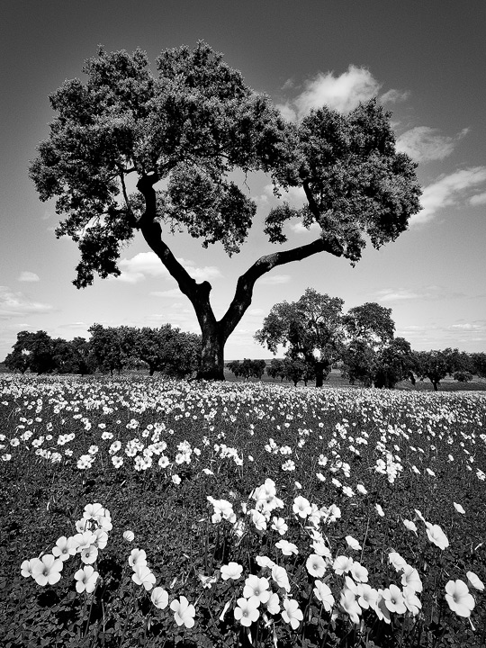
The Elder Oak +Repost (Color)
‹ PreviousLandscape GalleryNext ›

The Elder Oak +Repost (Color)

by Helio Cristovao

Gallery: LandscapePosted April 13, 2010267 views12 comments
Alentejo, near Guadiana Valley Natural Park, Portugal
(Parque Natural do Vale do Guadiana)

Fine-Art interpretative Black and White conversion for a "dark" feel and high contrast, increasing the dramatic feel of the old Oak, the main subject and overall motif of the scene.

Notes about digital processing:
Used Dynamic Contrast B/W Nikon filters;
Added Neutral Density Graduated filter darkening lower portion, too bright initially;
Adjusted manually vignetting control

In the Field:
14-bit RAW image exposed on 4x6 format (re-framed to 3x4) shot at f/19, 12mm wide angle and ISO200, using Tripod and mirror-up for maximum sharpness directly through the lens.

Comments

12 comments
Comment posted by Helio Cristovao on April 13, 2010 at 7:00 AM
I must say I´m completely obsessed with this rendition :biggrin: the tree form and scene itself is really speaking loud for my taste. I had imagine this image even before I made it. Now I´m thrilled I did achieve it :smile:

All your thoughts about this image are highly appreciated.
Thanks
Registered on September 15, 2009, 83 Posts, 434 Comments
Comment posted by Bruno Silva on April 13, 2010 at 7:53 AM
nicely composed, Hélio! you´re conversion looks fine, framing as well. I like the contrasts here and the touch of the fg flowers. don´t get me wrong but I don´t get that "dark feel" here, even in b&w I kind of feel a sense of peace and quietness, but I´m a very dark guy. If the image were mine I think I would bring down the light in the lower quarter as our eyes are driven to the highlights and as you said, you´re goal here is the big old oak. the lower flowers grab my eyes, much more than the main oak. I would also see that halo around the tree on the ULC and maybe darken the mid sky a tad under the tree to pop out those clouds. just some thoughts. a fine comp and b&w image, overall.
Registered on May 6, 2009, 132 Posts, 1406 Comments
Comment posted by Andreas Resch on April 13, 2010 at 8:35 AM
Very interesting shot, Hélio. The stark contrast really makes a difference here. The image conveys more of a peaceful mood to me too.
Registered on November 14, 2007, 322 Posts, 6101 Comments
Comment posted by Paulo A.Lopes on April 13, 2010 at 9:22 AM
very honestly i feel that the pb option a wrong one. Spring time and you erase colors??? :confused: Show me the color version please.
Registered on October 14, 2008, 122 Posts, 836 Comments
Comment posted by Roberto Fernandez on April 13, 2010 at 10:24 AM
Hi Helio

I agree with Paulo, we're familiar with this kind of forest and flowers and I'd prefere the colored one

best regrds :biggrin: :biggrin:
Registered on November 21, 2009, 36 Posts, 95 Comments
Comment posted by Paulo A.Lopes on April 13, 2010 at 10:36 AM
very honestly i feel that the pb option a wrong one. Spring time and you erase colors??? :confused: Show me the color version please.
Registered on October 14, 2008, 122 Posts, 836 Comments
Comment posted by Jeremy Kessler on April 13, 2010 at 12:21 PM
I think this great.
Registered on September 13, 2007, 36 Posts, 1283 Comments
Comment posted by Zack Schnepf on April 13, 2010 at 12:58 PM
I love your comp here, the flowers in the FG really make this shot. I would love to see a color version as well. Beautiful shot!
Registered on November 1, 2003, 403 Posts, 2528 Comments
Comment posted by Helio Cristovao on April 13, 2010 at 2:36 PM
Thanks for feedback thus far, may I ask for the following on your comments/critiques?
Would like to know - in One word, how this scene makes you feel, guess can be interesting knowing various opinions :smile:

@Bruno,
:biggrin: I get the dark feel bro. I mean, there was just "too much" light, very harsh. My "dark feel" relates with the heavy contrast applied, seeing the image being processed, you could compare how this looks comparing to a standard B/W conversion... Sure there isn´t the same feel just as an image ´really´dark ;)) just as tis one:

The Darkness
Link to image

:cool:
Registered on September 15, 2009, 83 Posts, 434 Comments
Comment posted by Helio Cristovao on April 13, 2010 at 2:43 PM
Repost - Colored version, as wished by some of you people. I didn´t think of this on color version, because - on colored versions I have other imagery, that I find to be more dramatic, nicer light from Spring season... available briefly :smile:
Anyway, here it is, Spring colors from South East Portugal - Alentejo
Registered on September 15, 2009, 83 Posts, 434 Comments
Comment posted by John Williams on April 14, 2010 at 12:34 PM
That oak is truly grand Helio. The flowers make a nice foreground to complete the scene.

I like the color version, but the vegetation seems too yellow.
Registered on September 6, 2007, 221 Posts, 5985 Comments
Comment posted by Barry Vangrov on April 14, 2010 at 9:10 PM
The B&W is much more interesting to me than the color version. Pretty colors but nothing special whereas the B&W has the dramatic feel to it. Personally I'd like to see more B&W interpretations in this gallery rather than just "colorful" scenes.
Registered on September 1, 2009, 148 Posts, 749 Comments