Nature Photographers Network
This is the preserved archive of the original Nature Photographers Network. The community continues at naturephotographers.network.
into the light (repost)
‹ PreviousMan & Nature GalleryNext ›

into the light (repost)

by Andrius Pašukonis

Gallery: Man & NaturePosted April 11, 201081 views5 comments
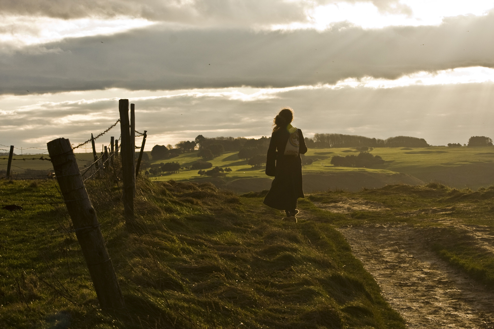
I took this picutre in February on a walk on the French coast of Normandie. Im not a big pro of PS so I only adjusted this picture in PS raw. I could probably achieve some more interesting effects with blending. Any suggestions?
Canon EOS 40D + canon ef-s 55-250@70mm
F10 1/400s ISO400
I always forget to change the ISO from auto and my camera puts it automatically on 400. I do see a difference when I use 200. :rolleyes:

Comments

5 comments
Comment posted by Nicolaus Wegner on April 11, 2010 at 5:00 PM
Very moody image Andrius. As for processing, you could definitely get rid of the dust spots. Maybe lighten the foreground, dodge the fence posts a bit, maybe do something with those green plains in the background. Maybe duplicate the image, do a recovery on the sky, and blend it into the original. Or, keep it how it is, but remove the dust spots. ;]
Registered on February 21, 2010, 133 Posts, 1509 Comments
Comment posted by Kurt Budliger on April 12, 2010 at 9:58 PM
I love it! I would perhaps crop from the top to just below the brightest parts of the sky in the upper right. This will get rid of some of the blown/distracting highlights and really emphasize the woman. Stunning shot though.
Registered on June 11, 2006, 113 Posts, 2116 Comments
Comment posted by Andrius Pašukonis on April 13, 2010 at 1:24 AM
Thanks for your suggestions, I really appreciate that. Here I did some finer adjustments: I cropped from the top and from the left a little bit, brightened up the foreground, darkened and recovered the sky and tried to add some more contrast to those plains in the background. Oh, I removed one dust spot as well :smile: . Actually, a lot of those dark little spots are the seagulls far in the background. Didn't really want to mess with that. Does it look better?
Registered on July 23, 2005, 111 Posts, 408 Comments
Comment posted by Kah Kit Yoong on April 13, 2010 at 7:24 PM
Beautiful mood. It succeeds despite the technical flaws which have been pointed out already. The second post isn't much of an improvement. The sky is still blown and distractingly positioned on the edge so I would crop below the problem areas.
Registered on September 27, 2006, 636 Posts, 10682 Comments
Comment posted by Marsel van Oosten on April 14, 2010 at 9:32 AM
What KK said. Great mood, great shot!
Registered on March 9, 2004, 285 Posts, 2277 Comments