Nature Photographers Network
This is the preserved archive of the original Nature Photographers Network. The community continues at naturephotographers.network.
Hidden Detail
‹ PreviousLandscape GalleryNext ›

Hidden Detail

by Tony Kuyper

Gallery: LandscapePosted April 2, 2010631 views50 comments
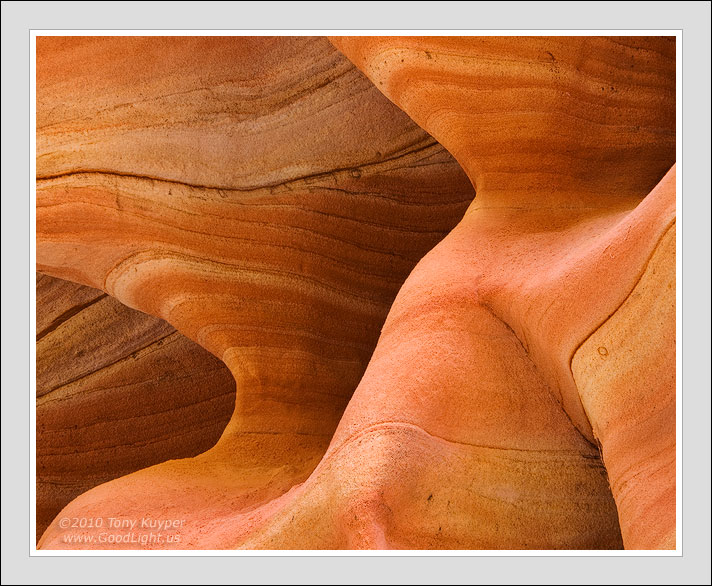
This is a sandstone detail from a hike in Hidden Canyon in Zion National Park. The title is meant to be a bit of a double entendre. Not only was the detail photographed in Hidden Canyon, but this comp was actually hidden in one the images I took. I had to do a pretty significant crop to find this. When I was shooting the scene, I knew I wasn't quite getting it, but it was only after bringing it into PS that I was able to figure out that I needed to go even tighter . . . at least that what seems to work best for me. I'll post the full-frame below and you can decide.

As always, your thoughts and recommendations will be fully considered and sincerely appreciated.

5D, 28-100

This image BTW is used for the header on my blog. It's just getting started, but will hopefully grow and expand.

Comments

50 comments
Comment posted by Tony Kuyper on April 2, 2010 at 10:12 PM
Registered on November 1, 2003, 364 Posts, 22328 Comments
Comment posted by Philip Schwarz on April 2, 2010 at 10:21 PM
Love the patterns and colors on this one.
Registered on November 29, 2006, 236 Posts, 1210 Comments
Comment posted by Anthony Vincent on April 2, 2010 at 10:30 PM
Great eye Tony to further delve into your images to extract another image. I think both are excellent in terms of graphic statements but the tighter crop brings you into the image more. Ya deep I know, :smile:
What I mean is that the sense of where you are or what your looking at becomes lost (in a good way). Has an alien chamber feel to it. I will definitely have to come visit you sometime :biggrin: , ahhhhhh just sick of Illinois.
Great image Tony
Registered on February 5, 2009, 199 Posts, 2775 Comments
Comment posted by Rick Goldwasser on April 2, 2010 at 10:37 PM
Love everything about this one Tony! The smooth curves and the glossy glow really set this one apart. I definitely think the crop is the way to go with this (not that the other one is bad) because it emphasizes the parts of the image that make this so special.
Registered on May 10, 2009, 127 Posts, 970 Comments
Comment posted by Bill Pelzmann on April 2, 2010 at 10:38 PM
Thanks for showing the original. It's very instructive to see how much your crop improved the image. Losing the distraction in the upper right realy keeps my attention on the sensous lines. In the original, I immediatey go to the upper right.
Registered on January 26, 2005, 27 Posts, 265 Comments
Comment posted by Robert Dayton on April 2, 2010 at 10:52 PM
Love the curvilinear lines here, Tony. I prefer the cropped version.
Registered on November 11, 2008, 281 Posts, 3958 Comments
Comment posted by Eva McDermott on April 2, 2010 at 11:04 PM
The cropped version has very smooth transtions from curve to curve. The uncropped version has some rough edges the distract. This is a wonderful find Tony full of wonderful lines and tones.
Registered on January 4, 2009, 1015 Posts, 13229 Comments
Comment posted by Youssef Ismail on April 3, 2010 at 12:38 AM
Tony,

Both are nice, but I agree with you on the crop, it is a notch above.
Registered on November 1, 2003, 474 Posts, 5555 Comments
Comment posted by Abdullaziz Bin Ali on April 3, 2010 at 1:14 AM
What a great abstract
Tony, I'm always amazed with you work

:toast:
Registered on May 31, 2009, 112 Posts, 1590 Comments
Comment posted by Bruce King on April 3, 2010 at 1:18 AM
The cropped version seems to have more depth IMO. The cliche, "the proof is in the details" never rang more true than it does here.
Registered on January 14, 2010, 276 Posts, 2212 Comments
Comment posted by Michael J Greene, on April 3, 2010 at 2:11 AM
Hi Tony,

I guess I am in the minority here all the way around. I definitely like the uncropped version better myself. I think it has more detail and is more interesting to me at least...Overall, though I don't think either one is representative of your best work Tony. The comp is good and the web sharpening looks great, however the light looks flat with little contrast and shadow and the colors aren't really that appealing to me. For what's it worth - I hope this helps. Michael
Registered on June 18, 2009, 86 Posts, 2317 Comments
Comment posted by Dean Sauskojus on April 3, 2010 at 2:25 AM
Both are very good and neither is better than the other IMO. The cropped has a softer look to it and is much more personal. Could be a result of sharpening, not sure. The original has more lines promoting more detail and texture to the eye. Nice 3d look to both images. Great shots, like em both.
Registered on September 29, 2009, 137 Posts, 2659 Comments
Comment posted by R.Bill Moser on April 3, 2010 at 2:45 AM
Both of them are excellent images. It's hard to decide which one I would prefer but I tend to the tighter crop which seems to bring you even more into this image with curves and lines. On the other hand the cropped version has some "rough" edges from curve to curve and this distracts a little bit. The original is really very smooth. but it's a great abstract with very beautiful looking colors and beautiful lines and curves. Great work
Registered on January 29, 2010, 285 Posts, 4281 Comments
Comment posted by Dietrich Gloger on April 3, 2010 at 3:01 AM
Both are really strong Tony! The cropped image of course is a bit more "direct" and maybe has more immdiate impact, but I don't think the full version is weaker by any means. It's just a different image as well composed. What particularly works very well in the full version is that diagonal line that runs from the lower left corner towards the upper right.
Registered on January 26, 2007, 360 Posts, 9876 Comments
Comment posted by John&Patty Benway on April 3, 2010 at 5:46 AM
The cropped version Tony, really like the lines and detail, very well balanced. Beautiful work.
John
Registered on May 12, 2006, 626 Posts, 8700 Comments
Comment posted by Mitch Erwin on April 3, 2010 at 9:00 AM
Yep Tony, I think that the crop wouldn't have been necessary if it wasn't for that URC piece not flowing with the rest of the curves. As always a very appealing stone abstract. :toast:
Registered on April 24, 2006, 98 Posts, 656 Comments
Comment posted by Nick Bristol on April 3, 2010 at 9:22 AM
Great tones and lines. The crop version has a smoother flow to it and is very nice, but I seem to prefer the uncropped version myself. I like the detail and texture in it a little better. Both are nice.
Registered on February 1, 2004, 752 Posts, 14140 Comments
Comment posted by Rick Lundh on April 3, 2010 at 10:30 AM
Incredible vision here...how many people would just walk by a scene such as this, not knowing its potential? I love your work...nobody captures and shares the beauty of sandstone like you do Tony!

You made the right choice with the crop, although its kinda sad to loose that many pixels on this amazing image, but maybe it doesnt matter with the softening techniques? I would really like to see a full gallery showing of your gorgeous SW images someday... Anyway, There's no finding any flaws on this image...well done! :toast:
Registered on April 28, 2004, 774 Posts, 4351 Comments
Comment posted by Paul Wegemann on April 3, 2010 at 10:38 AM
I see why you cropped this, Tony, and a beautiful image resulted. I will say though, that I also like the uncropped version even with the distracting formation in the URC.Thanks for giving us both versions to compare.
Registered on December 14, 2006, 58 Posts, 1888 Comments
Comment posted by Jeff Hackett on April 3, 2010 at 10:54 AM
I think you refined an already excellent image. Your crop is more the the point, yet still leaves room for the imagination. Defintely one case where less is more.
Registered on March 13, 2006, 65 Posts, 1119 Comments
Comment posted by Russell Colletta on April 3, 2010 at 11:17 AM
Nicely done Tony. The way you have portrayed the form of the sandstone in this comp is perfect IMO. The thumbnail caught my eye and the image itself is even better.
Registered on October 31, 2009, 114 Posts, 1008 Comments
Comment posted by Bruno Silva on April 3, 2010 at 11:35 AM
gosh, tony, this is awsome! I like both comps but the second version blows me away. the amount of detail is impressive and there is a "wave" feeling in this that´s quite intriguing. man, great piece of work.
Registered on May 6, 2009, 132 Posts, 1406 Comments
Comment posted by Vance Gese on April 3, 2010 at 11:58 AM
While the uncropped version is beautiful with superb detail and lines, the cropped version is phenomenal. By removing those areas of line and texture, you distilled this down to an incredibly beautiful image of form, texture, and tone. I can imagine your working with the crop tool in PS on the uncropped image, and all of a sudden knowing 'there it is'. Cropping is so vital to an image, as George DeWolfe clearly states in his Fine Print Workshop books. A stunning piece of Fine Art Photography, Tony.
Registered on November 13, 2008, 298 Posts, 6629 Comments
Comment posted by Stan Rose on April 3, 2010 at 12:52 PM
Neat! definitely cropped.
Registered on September 15, 2005, 836 Posts, 17099 Comments
Comment posted by David Bostedo on April 3, 2010 at 1:25 PM
Very nice Tony....great detail and tones. I'm a little undecided on which crop I like more...but I'm leaning toward the tighter one.
Registered on May 5, 2006, 178 Posts, 2224 Comments
Comment posted by Bill Chambers on April 3, 2010 at 1:29 PM
Very sensuous in nature, with wonderful color and texture. Good light indeed!
Registered on April 10, 2005, 753 Posts, 21216 Comments
Comment posted by Paul Gasior on April 3, 2010 at 2:28 PM
nice hot i like lines .second post looks better for me :wavey:
Registered on March 7, 2010, 99 Posts, 502 Comments
Comment posted by Ryan Dyar on April 3, 2010 at 2:45 PM
Awesome! Love this one Tony. I don't have any critiques to offer, just compliments. And I do agree with the crop, the rough sandstone feature in the top right was a bit distracting and made it a little unbalanced. The end result is fantastic though! :toast:
Registered on November 8, 2008, 22 Posts, 129 Comments
Comment posted by Bill Leggett on April 3, 2010 at 2:49 PM
Wonderful and simple comp, Tony! I really appreciate seeing the full frame of this. I can also see another crop, slightly looser, cropping to about 4x5 off the RHS just inside the lighter part jutting in from the right. Fine work as usual!
Registered on July 21, 2004, 706 Posts, 3233 Comments
Comment posted by Erik Stensland on April 3, 2010 at 3:08 PM
Delightful! The crop is a definite improvement. I saw the thumbnail and knew it was yours before I even opened it. The image sure didn't disappoint!
Registered on September 27, 2004, 121 Posts, 718 Comments
Comment posted by Wayne Willison on April 3, 2010 at 5:13 PM
Wonderful form and depth. The smooth curves make me want to touch. I think you were right to crop.
Registered on April 10, 2009, 292 Posts, 3967 Comments
Comment posted by Wayne Simpson on April 3, 2010 at 6:35 PM
Fantastic image Tony! It actually took me a few seconds for my eyes to come to grip with what elements where in front and what was behind. Kind of an M.C. Escher quality to it! I love the lines, the comp, the colour... this one has it all in my books! Great work!

Wayne
Registered on December 11, 2006, 303 Posts, 924 Comments
Comment posted by Edward Nunez on April 3, 2010 at 6:42 PM
You are the master of these kind of images. I love the cropped final version... Lines, tones and textures work perfectly together!
Registered on April 19, 2007, 65 Posts, 711 Comments
Comment posted by Chris Chamberlain on April 3, 2010 at 8:44 PM
While I find it hard to believe that you were'nt satisfied with the original enough to stop there. What you found with the crop works very nice. I also like the original just as much. The diagonal that Dietrich mentions is nice, and more visible there.

Chris
Registered on March 13, 2007, 500 Posts, 8365 Comments
Comment posted by David Cobb on April 3, 2010 at 9:10 PM
Wonderful sensual curves here Tony, and I love the soft light on the ribbons of strata. #1 for me.
Registered on December 14, 2007, 312 Posts, 3243 Comments
Comment posted by Wayne Rhodus on April 3, 2010 at 11:31 PM
No recommendations Tony, only want to say great work. I prefer the detail extraction mainly because there is more fine detail evident. Both are outstanding, I'd be proud to have either in my portfolio.
Registered on November 16, 2003, 157 Posts, 3326 Comments
Comment posted by Ken Johnson on April 4, 2010 at 1:09 AM
Tony, Great Image. I like everthing about this one. Great textures, colors, lighting & comp. :toast:
Registered on March 7, 2010, 71 Posts, 272 Comments
Comment posted by Zack Schnepf on April 4, 2010 at 2:02 AM
I'm with Rick, you're the sandstone master. I too would love to see a show of your work. I love the crop, wonderful intimate landscape!
Registered on November 1, 2003, 403 Posts, 2528 Comments
Comment posted by Peter Gordon on April 4, 2010 at 7:14 AM
I think the crop works best. Love the graphic shapes. Beautiful work..
Registered on May 31, 2007, 224 Posts, 1490 Comments
Comment posted by Dan Baumbach on April 4, 2010 at 10:28 AM
I like both of these a lot, Tony. The cropped version has a very sensual feeling to it. It's almost like a close up of the human body. Maybe it's just the way my uncalibrated MacBook displays it, but I like it.

- Dan
Registered on November 1, 2003, 473 Posts, 7980 Comments
Comment posted by Nicolas Belokurov on April 4, 2010 at 4:30 PM
What a great "Kuyperscape"! A real trademark, I like it a lot.
Registered on July 22, 2009, 41 Posts, 533 Comments
Comment posted by Morris McClung on April 4, 2010 at 6:16 PM
Your crop rendered a better abstract to me. Great pp as usual and the lines and shapes are wonderful here. Splendid!
Registered on May 7, 2007, 670 Posts, 19650 Comments
Comment posted by Mark Metternich on April 4, 2010 at 9:16 PM
If you arn't making a mint off your work you odda be! :toast:
Registered on June 19, 2009, 276 Posts, 6240 Comments
Comment posted by Floris van Breugel on April 4, 2010 at 10:40 PM
Beautiful Tony, elegant, sensual, and just all around beautiful. I can see what led you to the crop, and it certainly works for me, I just miss the dark stripe of the third upper right lump.. which you might be able to keep with a 4x5 crop? No matter, either way works for me.
Registered on December 19, 2008, 306 Posts, 4840 Comments
Comment posted by Jeremy Kessler on April 4, 2010 at 11:04 PM
Beautiful as always. Fantastic and inspirational work.
Registered on September 13, 2007, 36 Posts, 1283 Comments
Comment posted by Laurent Baig on April 5, 2010 at 3:50 PM
Awesome!!!
Registered on January 12, 2005, 206 Posts, 6784 Comments
Comment posted by Daman Sidhu on April 5, 2010 at 4:54 PM
I am fascinated by both the photos Tony! Both are marvelous to look at and the composition is wonderful. I do prefer the crop version because it keeps me 'in' it more so and is a bit more abstract. That said, both are fantastic! Thanks for sharing such wonderful art!
-Daman :toast:
Registered on December 16, 2009, 21 Posts, 176 Comments
Comment posted by Art Escobado on April 6, 2010 at 12:35 AM
The second post really does well-great dynamism with the lines-a great study of before and after.
Registered on January 7, 2007, 0 Posts, 775 Comments
Comment posted by Anil Rao on April 7, 2010 at 11:37 AM
Oh, I almost missed this one. The smoothness of the sandstone combined with the curves in your composition really makes for a nice visual treat. When seen as a small jpeg file, I prefer the cropped version, although the full frame would look great too in my opinion as a large print. The subtle highlights and the perfect contrast throughout are characteristic of your work. Very nice!
Registered on November 15, 2003, 234 Posts, 4923 Comments
Comment posted by Laura Stafford on April 22, 2010 at 10:48 AM
I really like the patterns, and smooth texture. The photo captures both perfectly. I also like how the sandstone fills the frame.

Laura Stafford
Registered on November 3, 2009, 52 Posts, 375 Comments