Nature Photographers Network
This is the preserved archive of the original Nature Photographers Network. The community continues at naturephotographers.network.
Snow, mist and trees 2
‹ PreviousMan & Nature GalleryNext ›

Snow, mist and trees 2

by Paolo De Faveri

Gallery: Man & NaturePosted February 6, 2010253 views16 comments
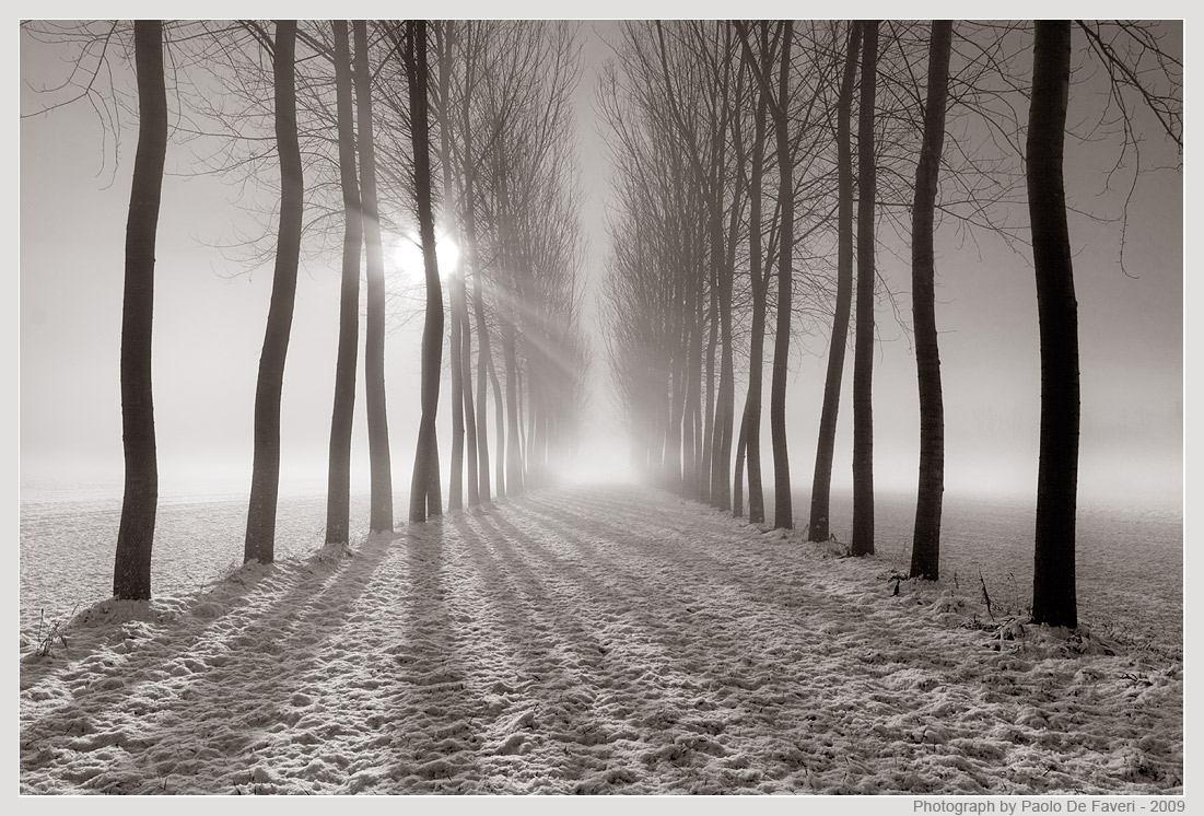
I turned to B&W one of my recent landscapes and I think it works even better than in colour. Would love to hear your thoughts about that, thanks in advance. Paolo

Details: Eos 50D, Tokina ATX-Pro 12-24 f4, tripod

Larger image provided

Comments

16 comments
Comment posted by Nick Bristol on February 6, 2010 at 9:39 AM
I liked the color version of this alot, but this b/w one looks great. I didn't think I would like it better, but it is a close call now that I see it. Just a great shot and well done.
Registered on February 1, 2004, 752 Posts, 14140 Comments
Comment posted by Barry Vangrov on February 6, 2010 at 10:07 AM
Love this shot, Paolo. Almost looks post-apocalyptic. The comp and processing is right on and B&W was definitely the right call.
Registered on September 1, 2009, 148 Posts, 749 Comments
Comment posted by István Pénzes on February 6, 2010 at 11:17 AM
Hi, Paolo.
The colour version was very captivating but this B&W emits calm and etherity. I like it better, great work.

István Pénzes
Győr, Hungary
Registered on January 12, 2010, 35 Posts, 192 Comments
Comment posted by Michael J Greene, on February 6, 2010 at 11:56 AM
Hi Paolo,

This is definitely the right call. I think the black and white works much, much better. Congrats. Michael
Registered on June 18, 2009, 86 Posts, 2317 Comments
Comment posted by Mauro Pasquero on February 6, 2010 at 2:41 PM
Ciao Paolo,
I find beautiful the color version and I told you already. I think it is better than the B&W one, at least on the web. Probably tne B&W version would be more impressive when printed.Mauro.
Registered on January 21, 2010, 650 Posts, 2500 Comments
Comment posted by SandyRichardsBrown on February 6, 2010 at 3:00 PM
Love the patterns and sun here.
Good choice for the B&W, although I'm always curious about the coloer version too.
Sandy r
Registered on November 24, 2003, 3937 Posts, 12909 Comments
Comment posted by Stephen Cunliffe on February 7, 2010 at 12:28 AM
I am envious of this one Paolo. The two bright areas, rather than the conventional one, make a good image very good indeed.
Registered on May 25, 2009, 62 Posts, 202 Comments
Comment posted by Cezar Mart on February 7, 2010 at 2:55 AM
They both look fantastic. At first I thought that the color was much better, but now as I keep looking at the b/w, I start to think I like this one too. Yes, the other one was beautiful, offered amazing gamut of colors and lights, but this one offers the minimalistic mood. Stripped of colors it has something different - it appears more spiritual.
Registered on January 31, 2007, 65 Posts, 444 Comments
Comment posted by Daniel Ewert on February 7, 2010 at 9:20 PM
Awesome shot, Paolo! This is beautiful!
Registered on June 2, 2009, 103 Posts, 1500 Comments
Comment posted by R.Bill Moser on February 8, 2010 at 3:03 PM
The color version was already gorgeous but i agree with you that this also works very well in b/w. I don't know which one i like better....both of them are great. Maybe the b/ w one is more impressiv and is reduced to the essential things
Registered on January 29, 2010, 285 Posts, 4281 Comments
Comment posted by Chip Phillips on February 8, 2010 at 9:06 PM
Beautiful work Paolo. Tons of mood and depth. I like how the rows of trees are completely isolated from anything in the distance.
Registered on November 26, 2007, 128 Posts, 1436 Comments
Comment posted by Albert Darmo on February 9, 2010 at 9:12 PM
Hi Paolo :wavey: The sublime light . and the beautiful lines makes this a fascinating scene to enjoy. The B&W version is superb. :cool: :smile:
Registered on November 25, 2008, 1386 Posts, 11978 Comments
Comment posted by Sam Chrysanthou on February 12, 2010 at 5:51 PM
Exquisitely framed. The surprising two areas of brightness add an extra element to this otherwise even, balanced composition.
Registered on December 18, 2007, 71 Posts, 1191 Comments
Comment posted by Doug Roane on February 13, 2010 at 9:25 AM
wow, I really like this - the monochrome really adds to the sense of mystery and intrigue. :toast:
Registered on December 12, 2008, 213 Posts, 2226 Comments
Comment posted by Kari Post on February 13, 2010 at 11:41 PM
This is beautiful. I love the light here, and the details bring this to life. The subtle warm tones in the monochrome processing are lovely.
Registered on January 27, 2007, 13 Posts, 195 Comments
Comment posted by Zack Schnepf on February 24, 2010 at 2:56 PM
Wonderful ethereal image. I think the B&W treatment is perfect, well done.
Registered on November 1, 2003, 403 Posts, 2528 Comments