Nature Photographers Network
This is the preserved archive of the original Nature Photographers Network. The community continues at naturephotographers.network.
Cacophony
‹ PreviousLandscape GalleryNext ›

Cacophony

by Morris McClung

Gallery: LandscapePosted February 3, 2010193 views19 comments
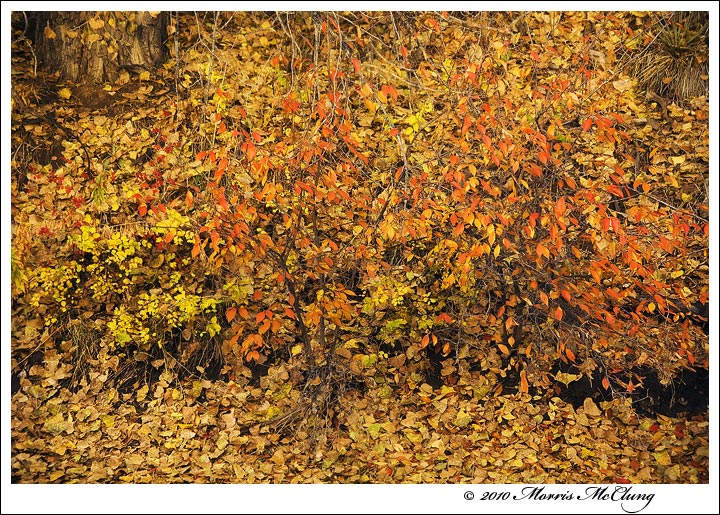
Since Phil had the courage to post his beautiful shot of muted colors, I thought I would finally post this "Ball of Confusion". A reference to a great song by the Temptations. I have a hard time resisting the color red. If I see it, I try to find a way to photograph it as it is a powerful color. I tried to anchor this with the tree trunk in the ulc and the yucca in the urc, as well as a base of leaves at the bottom, but I'm not blind to the fact that there is a lot of chaos here. Yet, I feel a sense of rhythm. Probably based on personal experience more than my ability to translate here.

Thanks to all who commented on my last post, and for any critiques or comments on this one.

Morris

Comments

19 comments
Comment posted by Phil Pogledich on February 3, 2010 at 11:30 AM
As you aptly pointed out in response to my post, compression doesn't help in evaluating images of this nature (though I think it was kinder to you than to me). Nonetheless, I find this shot very enjoyable . . . particularly if I pull a little ways back from my monitor and just appreciate the colors and textures, rather than strain to identify all the details. I actually don't think eliminating the tree trunk and yucca hurts this any, since it's all about the color in the first place.
Registered on August 24, 2009, 123 Posts, 3099 Comments
Comment posted by Dorin Bofan on February 3, 2010 at 2:10 PM
I see what you're saying here and it does make sense for me. Although the composition isn't very strong, the color combination and the leaf textures make for a nice abstract which, in the end, I feel it gives that sense of rhythm.
Registered on April 30, 2007, 122 Posts, 3086 Comments
Comment posted by Paul Marcellini on February 3, 2010 at 2:44 PM
wow, at this size it kills the eyes to focus on it. =) It is chaos and I have a hard time with it here. I do see some pattern to the left side with the smaller brighter leaves. Love the color for sure. As I stare longer there is some downward flow.
Registered on November 27, 2007, 250 Posts, 2468 Comments
Comment posted by Rudy Ruberti on February 3, 2010 at 3:37 PM
I agree with Phil. For some reason this really pops out at a distance. Great colors.
Registered on October 28, 2008, 179 Posts, 1875 Comments
Comment posted by Vance Gese on February 3, 2010 at 3:49 PM
Beautiful detail and color and while not obvious, there is a definite flow to your composition; almost a waterfall of leaves. Beautiful work.
Registered on November 13, 2008, 298 Posts, 6629 Comments
Comment posted by Stan Rose on February 3, 2010 at 4:08 PM
It looks like a cacophony, Morris...ah wait, that's the title! :biggrin: Personally, i love chaotic images, so if it were me id go with the flow--no top corner anchors, just the 'mess' in the middle and bottom. :smile:
Registered on September 15, 2005, 836 Posts, 17099 Comments
Comment posted by Justin Reznick on February 3, 2010 at 4:44 PM
I think it's fantastic Morris. I'm a huge fan of impressionism, and I think you captured the art perfectly here. Awesome work!
Registered on November 24, 2009, 79 Posts, 515 Comments
Comment posted by Gabi Lach on February 3, 2010 at 8:00 PM
Nice collection of leaves, Morris. :smile: Very pretty image.
Registered on May 1, 2007, 101 Posts, 3187 Comments
Comment posted by Anthony Vincent on February 3, 2010 at 8:18 PM
Hey Morris

Your last two posts have been awesome. This has touches of Tal but it is your own :wink:
Very graphic image and pleasing to view.
Great job on this one
Registered on February 5, 2009, 199 Posts, 2775 Comments
Comment posted by Daniel Ewert on February 3, 2010 at 8:37 PM
I am enjoying those colors. The eye does wander a bit but this is a nice scene.
Registered on June 2, 2009, 103 Posts, 1500 Comments
Comment posted by Brian Schrayer on February 3, 2010 at 9:00 PM
I think this works well, Morris. It is very busy and at this size it is hard to appreciate all of the subtle nuances of the full resolution image. However, viewing it at this size also makes the image more about the splashes of color throughout the image than about crisp detail. Based on your description this is what attracted you to the scene in the first place so I think it is a successful image in that regard.
Registered on May 28, 2004, 114 Posts, 2890 Comments
Comment posted by Marc Ward on February 3, 2010 at 10:45 PM
Morris,
This is a riot of leaves with a wonderful flow. Just a suggestion if you have the evil photoshop. Run a Gaussian blur over the image... not heavy, maybe in the 3-5px range, then go in with a soft art history brush set at about 50% and start "painting" in focus. This might give some depth and focal point to the image. After that a bit of vignetting might help isolate the central detail. There's some great stuff to work with here. :toast:
Registered on February 26, 2009, 304 Posts, 1365 Comments
Comment posted by Anil Rao on February 4, 2010 at 1:21 AM
Very lovely, Morris. The caophony of colors is awesome. A complex image for sure, but I love it for that very reason. :toast:
Registered on November 15, 2003, 234 Posts, 4923 Comments
Comment posted by David Edwards on February 4, 2010 at 4:38 AM
Love this, Morris. Nature's beautiful color pallete and perfect sense of balance. It's very Claude Monet in it's abstraction. If you squint in varying degrees, several different patterns and colors emerge. Excellent work!!
:toast:
Registered on December 6, 2008, 142 Posts, 2623 Comments
Comment posted by Bruno Silva on February 4, 2010 at 5:49 AM
I like the mix of colors and textures all around. busy but because of that is looks like a painting to me, even more if the top corners were croped. I feel the corners unbalance the comp a bit. the yellows & reds/orange are beautiful morris. works nicely for me.
Registered on May 6, 2009, 132 Posts, 1406 Comments
Comment posted by Kevin Trinkner on February 4, 2010 at 7:41 AM
I really like it Morris, the colors are very strong and I love all the details.
A little chaos is good for all of us.. :wavey:
Registered on June 30, 2008, 203 Posts, 2641 Comments
Comment posted by John&Patty Benway on February 5, 2010 at 2:53 PM
Chaos in color Morris, I;m loving this, it definitely flows.
John
Registered on May 12, 2006, 626 Posts, 8700 Comments
Comment posted by Eric Good on February 5, 2010 at 6:54 PM
This would make an epic jigsaw puzzle. :smile: I can see why you chose to use the anchor points you did, but I'd also like to see a tighter comp focusing on just the center portion of the image, for comparison. That might be nice as well. This would be fun to explore in a large print... good stuff!
Registered on March 17, 2007, 116 Posts, 4764 Comments
Comment posted by Albert Darmo on February 5, 2010 at 9:12 PM
Hi morris :wavey: Havent been commenting lately Resting my eyes., But must .... for this coloristic extravagance :eek: To me, its a superb capture :toast
Albert Darmo Canada:
Registered on November 25, 2008, 1386 Posts, 11978 Comments