Nature Photographers Network
This is the preserved archive of the original Nature Photographers Network. The community continues at naturephotographers.network.
Lay of the Land(+edit)
‹ PreviousLandscape GalleryNext ›

Lay of the Land(+edit)

by Paul Marcellini

Gallery: LandscapePosted January 18, 2010565 views29 comments
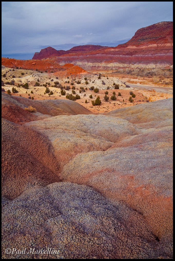
An elevated view in the Land of the Sleeping Rainbows, Grand Staircase-Escalante.

I dunno why this doesn't seem to work as well as I thought it would. Get critical on this one please.

Thanks for the comments on the last,
Paul

5d2, Tamron 28-75
Lens (mm): 32
ISO: 100
Aperture: 16
Shutter: 1/15

Comments

29 comments
Comment posted by Daniel Ewert on January 18, 2010 at 7:38 PM
This is probably the second or third time I have posted a photo right next to yours. I hate doing that because mine don't look quite so nice when that happens :) I really like the colors in this one, but if you are asking for a tough critique I will add the sky looks good but it does not have the color, light or other drama that the skies in some of your other shots have. I think the lighting and shadow in the foreground looks like nice but the light on the mountains/ridges in the background is just a bit flat. Those are small nits though. Your comp is excellent and there is enough color and nice light in to make for a very appealing and popular image for your clients.
Registered on June 2, 2009, 103 Posts, 1500 Comments
Comment posted by Bret Edge on January 18, 2010 at 7:38 PM
The only critique I can offer is that it feels a touch heavy on the right side. That's really grasping though, Paul. The colors and textures are outstanding. Really cool how the FG hills are kind of like pillows, if that makes any sense.
Registered on November 1, 2003, 711 Posts, 6363 Comments
Comment posted by David Cobb on January 18, 2010 at 8:48 PM
I love the foreground texture, and the color throughout Paul.

David M. Cobb
Registered on December 14, 2007, 312 Posts, 3243 Comments
Comment posted by Ben Horne on January 18, 2010 at 9:32 PM
You have a lot of great things going on in this photo, but I just don't get the feel that it is being tied together. The right side in particular feels a bit heavy. This is because of the distant formation. With the 2:3 aspect ratio, I feel as though the image is being "pulled apart" because the vertical composition is not necessarily drawing attention to a vertical element in the photo. The layered feel of this photo would likely be best suited for either a horizontal composition, or perhaps cropping off some of the foreground.

Registered on August 27, 2009, 51 Posts, 959 Comments
Comment posted by Rick Goldwasser on January 18, 2010 at 9:37 PM
I actually like this one quite a bit. It's funny, but I've been to this area probably four or five times and never come away with anything that I really like - you'd think it would be easier to take something really nice here. I love your fg, great lines, color and texture. I see two things that I don't like as much - 1) I think the reds are a bit strong in the bg formations and 2)the way it is composed, it's tough to see any of the spectacular details (the layers) of those formations. Overall, this is a pretty strong image - way better than anything I have from there.
Registered on May 10, 2009, 127 Posts, 970 Comments
Comment posted by Marc Ward on January 18, 2010 at 10:04 PM
Paul,
I was surprised and pleased to see your name associated with this image... You're far afield, but that is never a bad thing. There are some sumptuous colors and details going on here, but the bottom is a bit overwhelming. If you've got the pixels, I might like to see this as a square format starting at the top and cutting off most of the bottom. If necessary, you could then rotate the image a bit CCW to make the balance a bit better. Great Colors :toast:
Registered on February 26, 2009, 304 Posts, 1365 Comments
Comment posted by Tony Kuyper on January 18, 2010 at 10:21 PM
It's a good image, Paul, as others have mentioned. The textures and colors in the foreground are exquisite. While the background colors are complimentary, the saturation seems a bit over the top (wait, did I just write that :confused: ). I think pulling it back to match the foreground would maybe help, especially the oranges.

The center area with the trees also looks a little too light to me. While it adds contrast to the scene, it also feels like the scene should have softer light than this highlight region seems to have.

Those are all minor quibbles though. I would love to have this in my portfolio as is.
Registered on November 1, 2003, 364 Posts, 22328 Comments
Comment posted by Eva McDermott on January 18, 2010 at 10:22 PM
I like this Paul. I think Daniel mentioned the dark sky, but I like dark brooding skies. Sky aside, the rest of the elements stand on their own and I think this is great, Great color and composition/
Registered on January 4, 2009, 1015 Posts, 13229 Comments
Comment posted by Robert Dayton on January 18, 2010 at 10:31 PM
This is good, Paul, but as I'm sure as you have; I've seen so many great
images from the Southwest that this doesn't quite measure up. Nevertheless,
to your credit it's different than any other compositons from the red rock
country that I've seen. It does have varying colors, textures, and lines. So
don't be too hard on yourself.
Registered on November 11, 2008, 281 Posts, 3958 Comments
Comment posted by Albert Darmo on January 18, 2010 at 10:34 PM
Hi Paul :wavey: Never having the good fortune to see this part of the country, I am amazed at the beauty here. I am impressed with the beautiful images taken by you. here. Sorry, But I like the color, texture, and composition of this scene :biggrin:
Albert Darmo Canada
Registered on November 25, 2008, 1386 Posts, 11978 Comments
Comment posted by Reed Bowman on January 19, 2010 at 12:12 AM
Paul, I read all the comments before writing this. I agree it feels a little heavy on the right, but I love the fg, the colors and textures. I think cropping from the top might work, eliminating the sky, which isn't quite dark enough to be really dramatic, and the heavy tops of the mountains on the right. I tried cropping down to just above the red top of the mid-ground hill and above the broad whitish band on the distant mountains. This seems a bit more balanced and accentuates the lovely fg... in any respect, its still a great shot
Registered on March 2, 2009, 166 Posts, 1058 Comments
Comment posted by Dietrich Gloger on January 19, 2010 at 12:56 AM
This is excellent Paul. A very well structured composition - simple forms and appealing curves. The red-blue combination looks great too - I like that sky color!
Registered on January 26, 2007, 360 Posts, 9876 Comments
Comment posted by David Edwards on January 19, 2010 at 2:07 AM
This is beautiful, Paul. I like the rock texture and various colors, as well as the dotted trees in the mg. I'd like to see the midtone contrast pumped up a little bit as it seems a little flat overall to me. Great comp, and fabulous detail throughout.
:smile:
Registered on December 6, 2008, 142 Posts, 2623 Comments
Comment posted by Verena & Georg Pop on January 19, 2010 at 2:32 AM
works well for me. maybe the bushes bring the landscape a bit too much back to "reality", otherwise it would look more "otherworldish" maybe...? b ut dunno, as said it works for me...
georg
Registered on July 5, 2006, 272 Posts, 2823 Comments
Comment posted by Stan Rose on January 19, 2010 at 3:29 AM
The fg textures are absolutely fabulous! I like the comp overall, no real issues with it. My only nit, which most people are going to disagree with, is that i find the sky clashes or competes with the fg (most people apparently like this effect--see my comment on Chip's Tetons shot). Id prefer to see the fg colors dominate in this atmosphere. How would you describe the atmosphere that day? I suspect it was kind of a 'gray' day, no? If so, then the sky ought to be more gray. I still think the sky should be there, but let it play a supporting role, in comparison the fg should shine.
Registered on September 15, 2005, 836 Posts, 17099 Comments
Comment posted by Roberto Fernandez on January 19, 2010 at 3:43 AM
Hi Paul

IMO (as other told you) the problem is the sky, maybe an horizontal version would be better because the ground elements are very atractive (the textures of the foreground and the trees of the mid)

Anyway good job in that Utah corner

Regards
Registered on November 21, 2009, 36 Posts, 95 Comments
Comment posted by Guy Tal on January 19, 2010 at 7:31 AM
Paul, to my eye a small crop from the bottom to 4x5 ratio makes the composition stronger. Regardless, I love the palette of rich pastels (is that an oxymoron?) you captured here.

Guy
Registered on November 1, 2003, 566 Posts, 15507 Comments
Comment posted by Kevin Trinkner on January 19, 2010 at 8:37 AM
Love the textures and colors Paul, they contrast nicely with the dark sky. I like the various layers throughout as well. No nits from me, sorry...
Registered on June 30, 2008, 203 Posts, 2641 Comments
Comment posted by Paul Marcellini on January 19, 2010 at 9:47 AM
Thanks so much everyone for the in depth comments, just what I needed..

Here's a mix of different suggestions...crop more from top, some off bottom...desat top, less blue in sky, darkened midground, little more contrast in foreground...think that covers it.

I had a landscape orientation ready to go, but the sky broke and I never got the soft light back, and the clock was ticking....Jay gave us a 2pm deadline to meet back at the car. =) I could have a week in this area and never shoot all that I wanted, from macro on up, so many cool things to see.

Thanks again everyone,
Paul
Registered on November 27, 2007, 250 Posts, 2468 Comments
Comment posted by Nicolas Belokurov on January 19, 2010 at 10:50 AM
The tight comp really stands out. Nice textures.
Registered on July 22, 2009, 41 Posts, 533 Comments
Comment posted by Morris McClung on January 19, 2010 at 10:59 AM
The middle ground really makes this one shine. Nice work on the comp to give it depth.
Registered on May 7, 2007, 670 Posts, 19650 Comments
Comment posted by Carlos Molina on January 19, 2010 at 11:25 AM
This is very nice. Your repost definitely catches the eye alot more.
Registered on March 17, 2009, 40 Posts, 393 Comments
Comment posted by Jay Patel on January 19, 2010 at 12:24 PM
I like the original post better. The corp version with a bit more situation in the mid ground does not quite work for me.

Someone has to check up on you every now and then in the Wilderness. :-))) And without a 2 PM deadline you would have gotten nothing at the Paria River Overlook...which we have not yet seen on this forum. :cool:

-Jay
Registered on August 28, 2008, 87 Posts, 566 Comments
Comment posted by Vance Gese on January 19, 2010 at 12:29 PM
Gorgeous colors and textures, Paul. While your original is outstanding, your second post nails it perfectly, really focusing the viewers attention on what make this sing, color and texture. The second image is stunning, absolutely stunning.
Registered on November 13, 2008, 298 Posts, 6629 Comments
Comment posted by Phil Pogledich on January 19, 2010 at 1:17 PM
This is quite nice, and I do tend to prefer the original over the repost. I like the way the landscape seems to unfold as your eyes work their way back into the scene, and the 4x6 format helps enhance that IMO. The only improvement I was inclined to suggest prior to reading through the comments was a bit of a crop from the bottom, perhaps to a 4x5 format as Guy suggested. And that's still my feeling after reading the thoughts of others.
Registered on August 24, 2009, 123 Posts, 3099 Comments
Comment posted by Steve Sieren on January 19, 2010 at 10:04 PM
My guess would be more color seperation in foreground, sweet background!

SS
Registered on January 2, 2008, 360 Posts, 5321 Comments
Comment posted by Mark Pelton on January 19, 2010 at 10:53 PM
It works for me. Good composition of an impressive scene. And I like the level of contrast and saturation.
Registered on November 25, 2003, 380 Posts, 4647 Comments
Comment posted by Warren Xato on January 20, 2010 at 2:00 AM
The second one is the better one for me. It makes the foreground subject loom larger. The original was too balanced with three elements, the cliff, the trees and the foreground, demanding equal attention.
Registered on November 17, 2003, 2 Posts, 18 Comments
Comment posted by Chris Chamberlain on January 20, 2010 at 9:52 PM
Seems fine to me. Great detail in the foreground, giving way to beautiful layers, and colors. Yup, seems fine!

Chris
Registered on March 13, 2007, 500 Posts, 8365 Comments