Nature Photographers Network
This is the preserved archive of the original Nature Photographers Network. The community continues at naturephotographers.network.
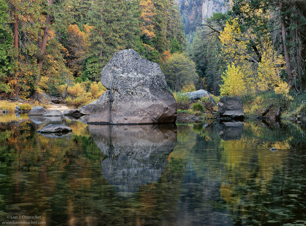
Yosemite Autumn #7
‹ PreviousLandscape GalleryNext ›

Yosemite Autumn #7

by Lon Overacker

Gallery: LandscapePosted December 13, 2009407 views27 comments
Still trying to squeeze as much out of my early November trip to Yosemite as possible. I had recently posted in CANP and received some really good suggestions so I wanted to post this to ES&S after I made some changes and hopefully improvements.

As always I would love to hear your thoughts and critiques.

4x5, V100F, Nikkor 210mm, F/32 @3s w/ Polarizer
TK's masks and actions

Thanks!

Lon

Comments

27 comments
Comment posted by Tony Kuyper on December 13, 2009 at 8:57 PM
This feels like a color John Sexton image to me. Quiet Light and Listen to the Trees combined. Very well done.
Registered on November 1, 2003, 364 Posts, 22328 Comments
Comment posted by Anthony Vincent on December 13, 2009 at 9:29 PM
There is a certain peace in the air here Lon
Love the big rock in the scene combined with the nice colors.
Great painting like comp
Registered on February 5, 2009, 199 Posts, 2775 Comments
Comment posted by Daniel Ewert on December 13, 2009 at 9:47 PM
I agree with Anthony that this has the feel of a painting. Beautiful scene.
Registered on June 2, 2009, 103 Posts, 1500 Comments
Comment posted by Wayne Simpson on December 13, 2009 at 10:08 PM
Lon,
As others have mentioned, this does have a very nice painterly feel to it! I particularly like the large rock and the depth that is created by including the distant rock wall. To be honest, it's not one of my favourite images of yours since the comp is not as "tidy" as your usual, however it does keep me looking. I have come back to this image a few times not quite knowing what to say... there obviously is something that keeps me coming back!

Wayne
Registered on December 11, 2006, 303 Posts, 924 Comments
Comment posted by Ian Cox-Leigh on December 13, 2009 at 10:28 PM
This is really great. You get no complaints from me. I think this is a lovely depiction of a specific place and time: it really feels like I am there with you.

Tony is absolutely right about this having a very similar effect on the viewer as much of John Sexton's work.
Registered on August 8, 2008, 25 Posts, 228 Comments
Comment posted by Kevin Trinkner on December 13, 2009 at 10:31 PM
Very nice Lon, wonderful colors and reflection. I like the little window into the distant bg as well.
Registered on June 30, 2008, 203 Posts, 2641 Comments
Comment posted by Albert Darmo on December 13, 2009 at 10:44 PM
Hi Lon :wavey: This image has an atmosphere that reminds me of a japanese garden.. The natural placement of the rocks is so zen like. The light , reflections and color are very reposing and pleasing.:cool: :smile:
Albert Darmo Canada
Registered on November 25, 2008, 1386 Posts, 11978 Comments
Comment posted by Eva McDermott on December 13, 2009 at 11:09 PM
Beautiful color Lon but I really like the reflection and clarity of the rocks underwater.
Registered on January 4, 2009, 1015 Posts, 13229 Comments
Comment posted by usha peddamatham on December 13, 2009 at 11:27 PM
Very serene,calm image. Makes you want to be silent and be lost in the beauty of the place.
Registered on June 25, 2009, 82 Posts, 389 Comments
Comment posted by Phil Pogledich on December 14, 2009 at 2:04 AM
I saw this posted over in CANP during one of my rare visits there and really liked it. I like the edits you've incorporated and think this is very solid. Every part of it has something that holds my interest.
Registered on August 24, 2009, 123 Posts, 3099 Comments
Comment posted by Bret Edge on December 14, 2009 at 2:47 AM
Love it! The colors are subdued but lovely and the reflection is sublime. This has a very "Zen" feel to it, Lon. Another quietly stunning image.
Registered on November 1, 2003, 711 Posts, 6363 Comments
Comment posted by Youssef Ismail on December 14, 2009 at 2:52 AM
Lon,

This does not look like a photograph, it look like I am looking at it for real, as if I was looking through a window.
Registered on November 1, 2003, 474 Posts, 5555 Comments
Comment posted by Stan Rose on December 14, 2009 at 4:17 AM
Excellent, Lon! Lacks a strong focal point, but it works for the detail and mix of colors/textures. As Youssef mentions, great clarity.
Registered on September 15, 2005, 836 Posts, 17099 Comments
Comment posted by John&Patty Benway on December 14, 2009 at 4:25 AM
My first thoughts were warm, tranquil, very pleasant to view, so I sat here for a while enjoying the warmth and beauty of this scene as I get ready to leave for the cold Adirondacks. Beautiful work Lon.
John
Registered on May 12, 2006, 626 Posts, 8700 Comments
Comment posted by David Edwards on December 14, 2009 at 5:13 AM
A beautiful image, Lon. Very Zen and peaceful. The comp is wonderfully balanced and I love the reflections in the water. It's just my taste, but I find the image (rocks mainly) a little blue, so I'd be tempted to warm up the color overall. An excellent shot all the same. Beautiful work.
Registered on December 6, 2008, 142 Posts, 2623 Comments
Comment posted by Igor on December 14, 2009 at 7:54 AM
Wonderful image, Lon. I can't imagine what the folks on CANP could have suggested.

Another idea: To me the rock, the far bank, the small rocks, and the bank trees are the heart of the matter. The image looks a little static. I find the foreground water and rocks to be subordinate. If you cropped top and bottom creating different frame proportions that bank comes foreward and IMO the image more pusposeful. I don't know if that makes any sense to you (or me either :biggrin: ).

I just saw the large image on the big screen and no longer agree with my earlier statement about the water. The water is great here. Another suggestion: The trees on the left side lack some of the vibrancy of the remainder of the picture (the distance canyon isn't important). I'm wondering if that foliage can be made to have the same vibrancy as the right side.
Registered on February 22, 2009, 12 Posts, 618 Comments
Comment posted by Paul Marcellini on December 14, 2009 at 8:50 AM
I keep staring, and i think its the large amount of water that doesn't add much for me. MY eye sees it as water and not the reflective shapes, i guess because of the mottling of whats under the water. I really like a pano crop of the top. Concentrating on the good stuff...to me. =) Beautiful tones though. :toast:
Registered on November 27, 2007, 250 Posts, 2468 Comments
Comment posted by Richard Bernabe on December 14, 2009 at 9:29 AM
Perfect balance to the scene, quiet, serene, beautiful reflections...
Registered on November 24, 2004, 180 Posts, 1545 Comments
Comment posted by Chris White on December 14, 2009 at 11:58 AM
Lon,

I agree with other comments that the composition is more diffuse than some of your, but to me it still seems strong. While I understand the suggestion of a crop at t&b here, that would be a very different image, I think.

I feel that the near-centered horizon locks this down and makes it a more serene if slightly less dynamic composition. But the reddish conifers, canyon cut, and far cliff face echoing the liet motif of the foreground boulder move my eye around and make the image serene rather than staid. Rocks. We don't have those down here!

Of course, nowhere near too chaotic for me!

Cheers,
Chris
Registered on February 27, 2007, 61 Posts, 945 Comments
Comment posted by Paul Breitkreuz on December 14, 2009 at 12:11 PM
Lon, I have to say this really did make a big difference with the overall changes you made since the original CANP posted image. It's truly amazing how some of the simplest adjustments can tweak our eyes and brain into seeing things quite differently. This truly is the case here from my perspective. :toast:
Registered on February 25, 2006, 525 Posts, 8448 Comments
Comment posted by Laurent Baig on December 14, 2009 at 12:19 PM
This has a subtle mesmerising quality to it, haven't figured it out, but I really like this.
Registered on January 12, 2005, 206 Posts, 6784 Comments
Comment posted by Bruno Silva on December 14, 2009 at 1:02 PM
this works very nicely for me. wouldn´t mind sitting here for a while, very pleasent image lon. nice detail and colors all way threw. I like the reflection a lot too. great comp.
Registered on May 6, 2009, 132 Posts, 1406 Comments
Comment posted by Morris McClung on December 14, 2009 at 2:07 PM
I caught this over on CANP and I really like what you have done with it. It has a certain crispness now. Beautifully done!
Registered on May 7, 2007, 670 Posts, 19650 Comments
Comment posted by Michael J Greene, on December 14, 2009 at 2:56 PM
Hi Lon,

Lovely image. The reflections and the foreground are what really caught my eye. My only small suggestion is the conifers behind the rock seem like the shadow/highlights have been turned up on them a little much. Maybe a slight darken to the highlights/midtones on the trees on the left hand side would work well. Excellent work!
Registered on June 18, 2009, 86 Posts, 2317 Comments
Comment posted by Vance Gese on December 15, 2009 at 12:16 AM
Beautiful Lon. Love the quality of the light and the colors. The remark that this is like a John Sexton image but in color is spot on. Superb.
Registered on November 13, 2008, 298 Posts, 6629 Comments
Comment posted by Chris Chamberlain on December 15, 2009 at 11:04 AM
A lot of people shoot 4x5, and use velvia. Even so, your work is instantly recognizeable to me. It has a look that is unique to you, or your workflow. Anyway, this does look like I could step right into it. I have no nits at all. Beautiful shot!

Chris
Registered on March 13, 2007, 500 Posts, 8365 Comments
Comment posted by Jimmy Gekas on December 15, 2009 at 1:03 PM
Gorgeous shot, Lon. The soft, quiet mood that is evident here is quite nice. The colors seem spot on and I really am enjoying all the great reflections and shapes underneath the water. Cool indeed.
Registered on July 26, 2007, 244 Posts, 2807 Comments