Nature Photographers Network
This is the preserved archive of the original Nature Photographers Network. The community continues at naturephotographers.network.
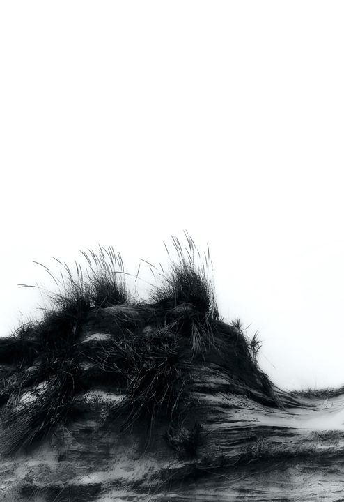
Blowout, study
‹ PreviousLandscape GalleryNext ›

Blowout, study

by Jim Sabiston

Gallery: LandscapePosted November 11, 2009141 views17 comments
I've been experimenting with different processing techniques and have started building a series of high contract, black & white dune studies from Fire Island. This image is a fairly typical example of the series.

Canon 5D, 24-105mm @65mm, 1/200 sec, f8, iso 200, freehand

Thanks in advance for comments.

Comments

17 comments
Comment posted by Rodney Dugmore on November 11, 2009 at 10:12 PM
When I first glanced at this I thought it was water.
I like the textures evident in the dunes there is however a lot of white space which
doesn't do much for me.

Just my humble opinion not sure if it is helpful?
Registered on January 3, 2004, 76 Posts, 1028 Comments
Comment posted by Shane McDermott on November 11, 2009 at 10:54 PM
Good on you to experiment, pushing the edges of creativity is never a bad thing. This however does not personally appeal to me. Not saying it wouldn't work for some folks though. I've stranger things hanging in high end galleries for thousands of dollars!
Registered on November 12, 2007, 49 Posts, 1074 Comments
Comment posted by Steve Sieren on November 11, 2009 at 10:55 PM
How daring of you Jim to post some blown out sky here. You are brave!

I like the odd feel in the dune but maybe a little less white in the top?
Registered on January 2, 2008, 360 Posts, 5321 Comments
Comment posted by Erik Stensland on November 11, 2009 at 10:59 PM
Honestly, I really like this Jim, especially the way the grasses stand out against the sky.
Registered on September 27, 2004, 121 Posts, 718 Comments
Comment posted by Scott Fricke on November 11, 2009 at 11:13 PM
I like the composition and the concept you have here. I wish you could see more detail in the vegetation though.
Registered on January 19, 2007, 133 Posts, 1448 Comments
Comment posted by Stuart Williams on November 12, 2009 at 4:53 AM
crop off top to make a square and a touch more luminosity in the ground bit? Just my 2c! I like the grass details against the sky!
Registered on December 7, 2007, 247 Posts, 4792 Comments
Comment posted by Verena & Georg Pop on November 12, 2009 at 5:07 AM
like it. it somehow speaks to me. (I wish my own photos would do that more often! :wink: )
Georg
Registered on July 5, 2006, 272 Posts, 2823 Comments
Comment posted by Verena & Georg Pop on November 12, 2009 at 5:07 AM
like it. it somehow speaks to me. (I wish my own photos would do that more often! :wink: )
Georg
Registered on July 5, 2006, 272 Posts, 2823 Comments
Comment posted by Paul Wegemann on November 12, 2009 at 7:40 AM
I love the processing, Jim. The comp isn't sitting quite right with me though. I think there is a bit too much sky, and the image just feels too heavy in the bottom left. I'm glad you posted this. I love seeing non-typical images on NPN.
Registered on December 14, 2006, 58 Posts, 1888 Comments
Comment posted by Bill Chambers on November 12, 2009 at 8:14 AM
I like this a lot Jim, and like also that you're experimenting. Always nice to try something different. I might crop a bit off the top, but that's minor.
Registered on April 10, 2005, 753 Posts, 21216 Comments
Comment posted by Sam Chrysanthou on November 12, 2009 at 12:02 PM
This is great! How wonderful to see something fresh in ESS. I love all the white space--your dune crests in the bottom third of the image, so compositionally the 2/3 of white at the top is balanced by the dark bottom third. Uncomfortable for many, but compositionally sound IMO. I really like the moode to this and look forward to more of your daring work.
Registered on December 18, 2007, 71 Posts, 1191 Comments
Comment posted by andy puttbach on November 12, 2009 at 1:15 PM
I love this. I do think perhaps alittle more contrast in the dune.
Haven't been out to Fire Island in a year. great place to shoot.
look foward to more shots like this.
Registered on January 23, 2007, 0 Posts, 299 Comments
Comment posted by Jim Sabiston on November 12, 2009 at 2:56 PM
Wow! Thanks for all the comments. This image received a much stronger response than I expected, which speaks well for its impact. I really liked the way the experiments were progressing and I am pleased by the reception here with my first post from the series. Very good constructive comments, too.

The greatest number of comments regard the amount of sky in the frame. The comp is balanced, but most are unaccustomed to large empty fields in an image, something I happen to use often. The 'blown out' sky is intentional and unique to this image so far. Others in the series retain some cloud detail or at least a smooth gradient, but I was going for 'extra stark' here. Framing is affected by the 'full frame' ratio of the 5D, as this is uncropped. That said, I had played with a more typical 4:3 ratio (think 11 X 14) by trimming a bit from the sky *and* the forground. This retains the balance, and brings the eye a bit more strongly to the image details, but loses some of the visual space that I find appealing. I'll post the cropped version for comparison later when I am home.

The details suffer a bit in the compression of the image for posting. There is far more visible in the print version, but it is a bit of a difficult balancing act in the processing between retaining detail and retaining the full effect of the high contrast punch, especially at the grass/sky intersection. Some additional judicial dodging might improve that a bit.

This was fun! :biggrin:

Thanks again for the the excellent comments!
Registered on April 7, 2007, 134 Posts, 443 Comments
Comment posted by Jim Sabiston on November 12, 2009 at 9:25 PM
I've incorporated the suggestions from the comments as follows: Overall crop to a 4:3 aspect ratio and discreet dodging to bring out a bit more foreground detail. Here is the result.
Registered on April 7, 2007, 134 Posts, 443 Comments
Comment posted by Tony Kuyper on November 12, 2009 at 10:55 PM
Innovative and very appealing, Jim. Too bad the thumb doesn't look better. This larger version really makes clicking the thumb well worth it.
Registered on November 1, 2003, 364 Posts, 22328 Comments
Comment posted by Steven M Kahn on November 12, 2009 at 11:15 PM
May be the hour, but I see a face. Paws or a paw. Ears perked up. Crouched, ready to pounce. Or just stalking. It must be the hour. After all, it is sand. And grass. Not the kind one smokes. Very graphic. Which can be interpreted as - artistic. Not necessarily photographic. Yet photographic

Fire Island? Long Island - New York? Oh boy. To be continued? The dialogue that is? And the series? :toast:
Registered on July 20, 2009, 140 Posts, 1198 Comments
Comment posted by Youssef Ismail on November 13, 2009 at 7:34 PM
Jim,

Fantastic image. The contrast works so well here. The blank empty sky contrast well with the detail textured duen and grass. Very neat.
Registered on November 1, 2003, 474 Posts, 5555 Comments