Gallery: Photo ArtPosted October 23, 2009950 views8 comments
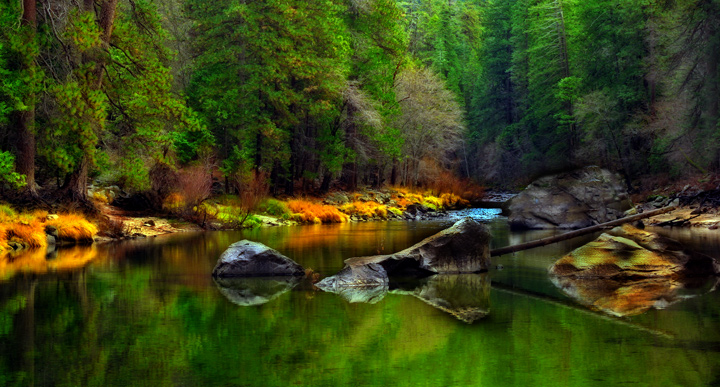
This is my first and maybe my last attempt using the "Orton Effect" I'm not sure if I like this effect. Any and all comments and help would be appreciated.
Comments
8 comments
Comment posted by Jim Harris on October 24, 2009 at 7:54 AM
its a beautiful scene, but this particular shot looks to me to be way over saturated, maybe try backing off the effect somewhat
Registered on August 31, 2009, 74 Posts, 368 Comments
Comment posted by Bob McQuade on October 24, 2009 at 11:23 AM
I am not familiar with this effect, but I don't care for what it has done to this image
Registered on October 8, 2009, 214 Posts, 432 Comments
Comment posted by Carrie O'Brien-Sib on October 24, 2009 at 11:50 AM
Floyd, I really like it, even with the over saturation! It's unique and colorful!
COS
Registered on August 4, 2009, 149 Posts, 889 Comments
Comment posted by David W. Kelly on October 25, 2009 at 12:11 AM
I like the pano crop and the Orton Effect works well here. Nice work.
Registered on October 7, 2005, 883 Posts, 6590 Comments
Comment posted by Robert Dayton on October 25, 2009 at 10:06 AM
I like the Orton affect, and overall I like the vibrant saturation with the exception of
the orange patches of grasses which may be a little too much.
Registered on November 11, 2008, 281 Posts, 3958 Comments
Comment posted by Eric Good on October 27, 2009 at 8:06 PM
Congratulations! I like what you've created here. While the colors are over the top they work very well with this effect. This has a very nice mood and balance to it. If I was to recommend anything it might be to increase the saturation and contrast of the LRC area a little (rock/river edge). I think that got a little muddy looking in the processing and would strike a better balance, if it had a little more punch similar to what the left. Other than that, this image definitely works for me.
Registered on March 17, 2007, 116 Posts, 4764 Comments
Comment posted by SandyRichardsBrown on October 30, 2009 at 10:17 PM
Unique and colorful!
Congrats on the EP !
Sandy r
Registered on November 24, 2003, 3937 Posts, 12909 Comments
Comment posted by Mark Metternich on November 10, 2009 at 4:15 PM
Nice shot. I like the effect but not as strong. Still beautiful.
Registered on June 19, 2009, 276 Posts, 6240 Comments

Comments
8 commentsCOS
the orange patches of grasses which may be a little too much.
Congrats on the EP !
Sandy r