Silt Design
by Kent Mearig
5D2 ISO 1600
135mm - f/14 - 1.6 sec
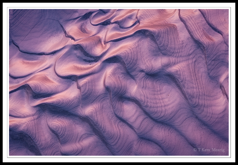
I set the ISO to record texture in fast moving water in fading light, and I forgot to adjust back to normal before I started working on compositions of this beautiful patch of silt. As I was walking away from the scene, I noticed and returned for a parting photo at base ISO. Light was almost gone by that time though, and I was late in starting my trip back to the car. Thankfully, the details are well preserved and noise was nearly a non-issue.

Comments
56 commentsThese can be tough to pull off, but you've done very well with this one. There is a lot more interest here than the thumbnail led me to believe, and I bet the full rez image is even better yet. Overall, a very interesting and engaging image.
The secondary contour lines are fascinating. Any ideas what caused that?
This is just magical. The patterns in the silt really make this wonderful, not to mention the wonderful light.
Ben G. - I've already pushed this photo a ways from the relatively flat original file, but having just looked at it on a second monitor, I can see how you might feel like there's room for a little more. I really have to get around to some monitor calibration one of these days. I'm pretty far behind the power curve in that regard.
Aaron - Clearly the "secondary" curves are the key to appeal this image has. I haven't really given too much thought to the phenomenon behind them. They are not physical surface changes, but rather, they result from alternating light and dark silt layers. I don't know if that's obvious, and I'm not really sure why the layers alternate. I'll have to give it some more thought.
Regards,
Giovanni
john
- Dan.
Quite a fascinating image.
Yikes! This is awesome. I get a range of feelings that extend from prehistoric to elegant. A unique and amazing capture - congrats!
If I was to make any suggestion, it would be to drop the shadows a bit in the lower diagonal 2/3rds if that makes sense. I realize the light and angles are different in the two areas, but I personally think darkening the blacks would take this over the top for me.
Lon
Chris
Ben O. - A tighter composition, especially at the expense of the upper left corner, would cram the stripe of light in the upper left all the way into that corner. In my opinion, the placement of that stripe is crucial to the composition. Additionally, I feel that all the corners provide some degree of closure (as corners often should), but I appreciate your alternate perspective.
Lon - Though I do tend to agree that deeper shadows would be more visually appealing. I'm battling against a few factors if I decide to make that adjustment. First of all, I botched the ISO setting, and the one place where that begins to be visible is in the areas approaching shadows. Secondly, The curve for this photo has already been steepened dramatically, and darker shadows stretches the original (very flat) file even more. Last of all, I feel like it becomes to distant from the reality of the scene. There just wasn't that much separation in tones. With all that said, I actually might go back and try to find a way to push the darks "in the lower diagonal 2/3rds just a little darker.
Chris C. - I've long admired the work of Charles Cramer, and I would say his similar photos (with mud) were a partial inspiration for this photograph.