Nature Photographers Network
This is the preserved archive of the original Nature Photographers Network. The community continues at naturephotographers.network.
Contrast + colour version!
‹ PreviousWildlife GalleryNext ›

Contrast + colour version!

by Jorne de Bruin

Gallery: WildlifePosted October 10, 2009135 views12 comments
Hi all,

first of all my apologies for not posting/commenting a lot lately, I've started working on a new job for a while, which does not leave me a lot time to visit the site.

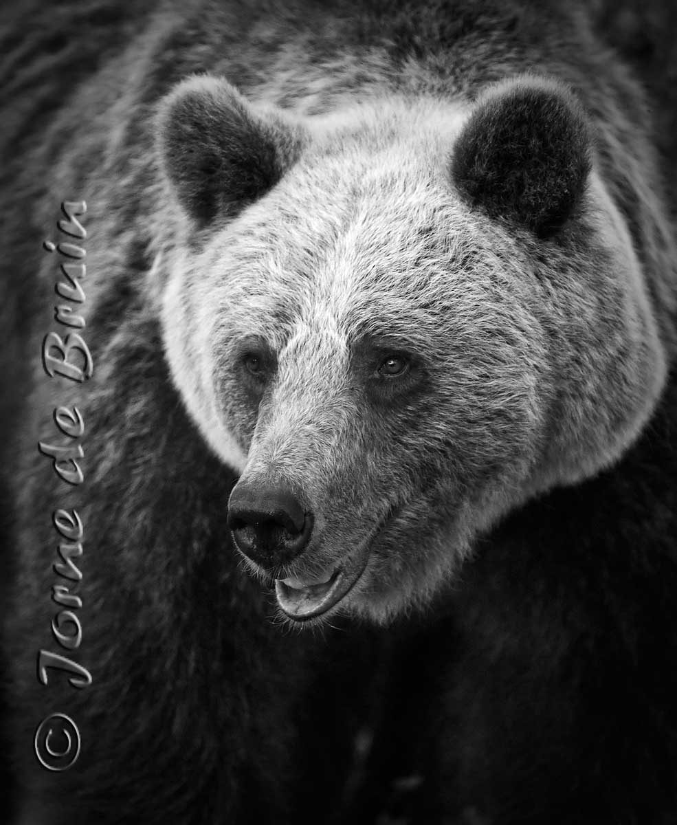
I wanted to share another image from Finland, this time a portrait of a bear with a very light furred head. At first I made a normal color version, but when looking at it I found the light head very suited for a b&w, so I converted it. I am curious to see what other think, so share your thoughts!

Tech: Sony a700, 300mm @ f2.79999(really!:biggrin: ) iso 1600 & 1/200th

Comments

12 comments
Comment posted by Jim Harris on October 10, 2009 at 10:41 AM
wonderful shot !! love the conversion to b&w, great pose and expression, super sharp, excellent work
Registered on August 31, 2009, 74 Posts, 368 Comments
Comment posted by Andrey Antov on October 10, 2009 at 1:07 PM
A very nice portrait in B&W. Love the contrast and detail in the fur of the animal.
Registered on March 18, 2008, 292 Posts, 341 Comments
Comment posted by Ken Canning on October 10, 2009 at 9:47 PM
Must be B&W week!

I like this very much Jorne. The contrast is great - particularly the dark inner ears versus the light head. Well done!
Registered on February 10, 2004, 88 Posts, 549 Comments
Comment posted by Lon Sharp on October 10, 2009 at 9:50 PM
One of your best, Jorne!
Registered on December 9, 2007, 258 Posts, 9892 Comments
Comment posted by Gary Gulash on October 11, 2009 at 1:28 AM
The tight crop makes him look even bigger. A bit more dof/or sharpening the entire bear to some degree might be an option here as well. Great photo Jorne! :toast:
Registered on January 28, 2005, 879 Posts, 12098 Comments
Comment posted by bill meikle on October 11, 2009 at 12:02 PM
Looks great to me Jorne, good idea to convert to black and white.
Registered on May 21, 2006, 173 Posts, 663 Comments
Comment posted by Sally King on October 11, 2009 at 12:55 PM
This is just gorgeous. One of my favorites of yours so far. The black and white really makes the fur details pop.
Registered on December 2, 2008, 416 Posts, 4450 Comments
Comment posted by Jorne de Bruin on October 11, 2009 at 1:03 PM
Thanks for the kind words everyone!
Registered on June 26, 2008, 178 Posts, 2136 Comments
Comment posted by Tom Theodore on October 11, 2009 at 5:12 PM
Beautiful image!! You made the right choice with the b&w. :toast:
Registered on May 7, 2008, 18 Posts, 54 Comments
Comment posted by Floris van Breugel on October 11, 2009 at 9:39 PM
Superb contrast Jorne, this is such a beautiful portrait! Really nicely done, you sure had a productive time in Finland.
Registered on December 19, 2008, 306 Posts, 4840 Comments
Comment posted by Brad Hill on October 12, 2009 at 10:33 AM
Hi Jorne,

This is a really intriguing shot. My guess is that you've pushed the contrast a long ways past the original, but as a work of art this image works very well. The detail on the bear's head is excellent.

I'd be really interested in seeing the colour version of the image. While I like this B&W conversion very much, I always have a hard time judging the success of the choice to convert without seeing the colour version...

Cheers...good work...

Brad
Registered on May 29, 2007, 431 Posts, 6061 Comments
Comment posted by Jorne de Bruin on October 12, 2009 at 11:24 AM
Thanks for the comments all!

Brad: here is the colour version. I quite like this one to, but the b&w feels a little more artistic for me. Not sure yet which one I will print though :wink:
Registered on June 26, 2008, 178 Posts, 2136 Comments