Gallery: LandscapePosted June 19, 20082,267 views30 comments
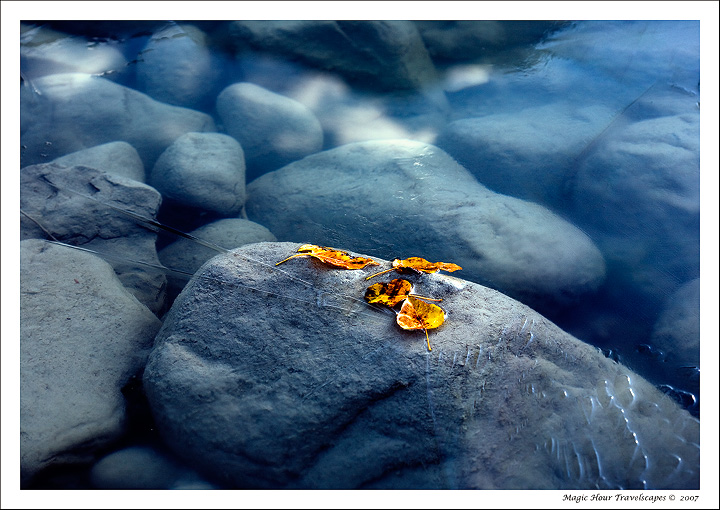
Columbia Icefields, Jasper, CANADA
Canon 5D, 100mm macro 2.8 USM, f5.6, 1/20, ISO 100
Comments
30 comments
Comment posted by Kent Mearig on June 19, 2008 at 1:05 AM
Love this! Looks pretty heavily processed in some spots, but I like the result. This photo adds a contrast to your portfolio of wonderful work from the other hemispheres.
Registered on September 4, 2006, 237 Posts, 4748 Comments
Comment posted by David Fernandez on June 19, 2008 at 1:49 AM
Kah,
Wonderful texture and color contrasts. I love this work.
Registered on May 4, 2008, 69 Posts, 668 Comments
Comment posted by Eric Good on June 19, 2008 at 2:40 AM
The look of this image is not one I would normally associate as yours, but I quite like it nonetheless. It has the hallmarks of a very well arranged composition. There's continuous subtle lines comprised of stone edges and shadows that allow my eye to flow from opposite corners of the image very nicely. I very much like the contrast in color and sharpness between the exposed leaves and rock and the submerged parts of the image. That said, I might favor a little less contrast and additional softening of the exposed areas... at least in this web version. Other than that, this more than works for me. Good stuff!
Registered on March 17, 2007, 116 Posts, 4764 Comments
Comment posted by Andreas Resch on June 19, 2008 at 3:26 AM
I don't know, Kah Kit. I like the idea and the colors are great of course, but for me there are just too many distractions in the shot like the lines in the LRC, a little overprocessing and some other minor things. Sorry to say that.
Registered on November 14, 2007, 322 Posts, 6101 Comments
Comment posted by Vincent FAVRE on June 19, 2008 at 5:12 AM
Tres beau.
Very beautiful !
Vincent
Registered on September 2, 2007, 37 Posts, 213 Comments
Comment posted by HuHu Lin on June 19, 2008 at 5:40 AM
Hi:
its a very cool presentation for this kinda picture .is it the original color?
Registered on April 8, 2007, 19 Posts, 147 Comments
Comment posted by Rafael Ferrando on June 19, 2008 at 6:35 AM
Beautifull contrast cold-neutral/warm with the frozen water-grey stones and the centered yellow leafs. Really love the icy texture in the LRC.
I agree with some minor points that were observed, (litttle less contrast and sharpening), at least on my screen and this resolution... Nice work!
Registered on November 9, 2007, 3 Posts, 24 Comments
Comment posted by Kah Kit Yoong on June 19, 2008 at 6:37 AM
Thanks for your comments. It would be very helpful if people could state what aspects of the photo are over-processed please. Although having just received the print this evening it's pretty much where I want it. I used an auto-curves layer, increased contrast with levels (mainly to bring out those clouds reflected in the ice), increased the saturation by +6 and used a warming filter to reduce the natural blueness in the scene.
Registered on September 27, 2006, 636 Posts, 10682 Comments
Comment posted by David W. Kelly on June 19, 2008 at 7:39 AM
A very quiet and peaceful image. Well done.
Registered on October 7, 2005, 883 Posts, 6590 Comments
Comment posted by Mark Pelton on June 19, 2008 at 7:39 AM
very nice, Kah, I love it.
Registered on November 25, 2003, 380 Posts, 4647 Comments
Comment posted by Arnab Banerjee on June 19, 2008 at 10:04 AM
I dont find it overprocessed, but shallow DOF is little bothering me. I think a little bigger DOF would improve this. But very uniquely composed - the cloud reflection and underwater rocks are awesome with that blue tone broken by the yellow leaves
Registered on January 3, 2007, 313 Posts, 2270 Comments
Comment posted by Tom Nevesely on June 19, 2008 at 10:14 AM
Very nice and it does not look overprocessed to me.
Registered on June 14, 2005, 147 Posts, 1550 Comments
Comment posted by Kah Kit Yoong on June 19, 2008 at 11:44 AM
Some interesting suggestions. The RLC was the problem area for me. As Arnab mentions the DOF is shallow but I believe the main reason the apparent lack of DOF is the thickness of ice over the boulders coming to a thin film just below the leaves. That said I might have liked a bit more DOF to get the ice patterns in the LRC sharper - or perhaps that may be distracting, who knows The slight crop from the right as Wayne suggests may help this issue.
Registered on September 27, 2006, 636 Posts, 10682 Comments
Comment posted by Marc Adamus on June 19, 2008 at 12:15 PM
One of your most original works, Kah. This has a certain dreamy quality that's tough to describe. It works well for me. Keeps me looking.
Registered on September 17, 2005, 780 Posts, 8091 Comments
Comment posted by Paolo De Faveri on June 19, 2008 at 1:12 PM
That's a stunning composition, Kah Kit, and the blues are really breathtaking. I feel cold! Regarding the overprocessing others have mentioned, I think indeed the leaves are a bit too saturated, and there seem to be bright spots on that area. Though it could only be a result of sharpening and resizing for the web presentation. I'm sure your original file is simply fantastic.
Paolo
Registered on August 29, 2007, 318 Posts, 1651 Comments
Comment posted by Bill Chambers on June 19, 2008 at 1:44 PM
A real beauty IMO. I love the stillness of the water and the calming blue color.
Registered on April 10, 2005, 753 Posts, 21216 Comments
Comment posted by Slavomir Dzieciatk on June 19, 2008 at 2:06 PM
Oh yeah, this is perfection! Way beautiful.
Registered on November 24, 2004, 61 Posts, 708 Comments
Comment posted by Wayne Jones on June 19, 2008 at 3:20 PM
Kah Kit, Beautiful contrast between the leaves and the blue ice and water. I find the LRC ice patterns a bit distracting. Perhpas cropping to exclude the brightest reflections there would help me concentrate on the in-focus leaves and the interesting cloud reflections. Somehow those clouds seem to belong there more than the highlights in the LRC. I really enjoy the left 90% of this.
Registered on April 18, 2007, 953 Posts, 6435 Comments
Comment posted by Richard Wong on June 19, 2008 at 4:14 PM
Wow. That ice and color makes for a unique image. I like this a lot.
Registered on February 2, 2006, 79 Posts, 2629 Comments
Comment posted by Peter Carroll on June 19, 2008 at 8:30 PM
The lower right doesn't thrill me but I love everything else. This is the definition of colour pop. Great to see you going back through old files and sharing these types of images. Definitely not a deal breaker but comp wise I'd like to see the leaves a bit more to the right and less centred.
Registered on August 19, 2005, 132 Posts, 983 Comments
Comment posted by Emmanuel Coupe on June 19, 2008 at 10:22 PM
Really nice, the colors and composition work for me.
Registered on March 17, 2007, 83 Posts, 341 Comments
Comment posted by Vincent Grafhorst on June 20, 2008 at 11:31 AM
A lot of talking about this image Kah. I simply say this is very beautiful and I am sure it will make a fantastic print!
Registered on February 24, 2006, 504 Posts, 7203 Comments
Comment posted by Dietrich Gloger on June 21, 2008 at 2:20 AM
Hi Kah Kit, I think this is one of your best intimate scenes! The complementary colors work so well, but it is the composition which I like most. It is the softness in the background that works so well for me and that indication of frozen ice in the lower right corner.
Registered on January 26, 2007, 360 Posts, 9876 Comments
Comment posted by Stan Rose on June 21, 2008 at 1:08 PM
I think this is fabulous photography! I love 95% of it. My one nit is that the leaves do look oversaturated and/or over-contrasty. I dont know if this is the result of the pp or exposure, but to a photogrpaher, it looks like that specific area was either dodged or saturated or something was done in an attempt to make it 'stand out' (at least that is the perception) IMHO, the leaves would work better if they were more subtle, to make the viewer work through the scene first.
Registered on September 15, 2005, 836 Posts, 17099 Comments
Comment posted by Lon Overacker on June 21, 2008 at 4:09 PM
Kah,
I think this is dreamy and gorgeous. I echo Stan's comments as well. It's nice to see some intimate diversity from you!
Lon
Registered on November 24, 2006, 521 Posts, 19147 Comments
Comment posted by Jimmy Gekas on June 23, 2008 at 12:09 AM
Very cool, Kah Kit. Agree that it may be a bit oversharpened and processed where the leaves are, but overall I do like it. This image adds more depth to your portfolio.
Registered on July 26, 2007, 244 Posts, 2807 Comments
Comment posted by Larry Lynch on June 23, 2008 at 9:37 PM
Congrats Kah on your EP. Well deserved. Exceptionally fine work.
Registered on September 16, 2006, 773 Posts, 9940 Comments
Comment posted by Zack Schnepf on June 23, 2008 at 11:42 PM
Wow, I can't believe I missed this one. I had a really busy week last week. This is just stunning! Grats on the well deserved EP.
Registered on November 1, 2003, 403 Posts, 2528 Comments
Comment posted by beth summer on June 24, 2008 at 4:43 PM
Fabuulous, Kah...congrats on the EP
Registered on November 1, 2003, 437 Posts, 5220 Comments
Comment posted by Michael Anderson on August 21, 2008 at 7:06 PM
Kah Kit,
I thought I had commented on this, but now I see that I didn't. This is absolutely fantastic, one of my favorites from your extensive portfolio. The contrast of the yellow and blue and the simple but very effective comp are outstanding. Congratulations on the EP!
Registered on January 31, 2006, 228 Posts, 3072 Comments

Comments
30 commentsWonderful texture and color contrasts. I love this work.
Very beautiful !
Vincent
its a very cool presentation for this kinda picture .is it the original color?
I agree with some minor points that were observed, (litttle less contrast and sharpening), at least on my screen and this resolution... Nice work!
Paolo
I think this is dreamy and gorgeous. I echo Stan's comments as well. It's nice to see some intimate diversity from you!
Lon
I thought I had commented on this, but now I see that I didn't. This is absolutely fantastic, one of my favorites from your extensive portfolio. The contrast of the yellow and blue and the simple but very effective comp are outstanding. Congratulations on the EP!