Curves Primer
Copyright Tim Grey
All rights reserved.
There is a certain mystique about the Curves control in Photoshop. If you have mastered Curves, you are looked upon as a Photoshop guru. If you have only dabbled with Curves, you have likely been intimidated by it, and decided to stick with Levels or even Brightness & Contrast for your tonal adjustments.
Curves is an incredibly powerful tool in Photoshop, which allows you to exercise tremendous control over your tonal (and even color) adjustments. That power is accompanied by complexity and a steep learning curve (pun very much intended). However, the Curves control isn’t as challenging as it first appears, and with some practice it can be mastered by all photographers using the digital darkroom to optimize their images.
A Basic Understanding
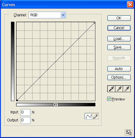
I’ve always like the Levels dialog box because it allows you to make adjustments to your image while also providing you with information about the tonal values contained within your image. Curves doesn’t provide this information, but rather provides a “raw” interface for adjusting your image.
The basic concept you need to understand when using curves is input and output values. Think of these as “before” and “after” values, respectively. For a given tonal value (the “before” value) you can specify a new value (the “after” value). So, if you want to lighten up the medium gray areas of your image, you can specify that medium gray should be adjusted to light gray. These adjustments can be applied to each and every tonal value in your image.
When looking at the Curves dialog box, you can interpret how the image is being adjusted for any tonal value. Simply look at the bottom gradient for the tonal value you want to translate, and then moving up vertically until you reach the curve. At that point, move directly to the left to determine which tonal value the original will be changed to.
Once you understand how the “before” and “after” values work with the Curves dialog box, you can start to understand how to make adjustments to your image using Curves.
Getting Started
If you read my December 2002 column for NPN, you know I strongly recommend the use of adjustment layers when editing your images. The same holds true for the Curves control, so the first step is to create a Curves adjustment layer by clicking the “New Adjustment Layer” button on the Layers palette and selecting Curves. This will create a Curves adjustment layer on the Layers palette and open the Curves dialog box.
Once you have created a Curves adjustment layer, the first step is to configure the dialog box to make editing as easy as possible. In the bottom-right corner of the Curves dialog box is a button to increase or decrease the size of the dialog box. You can have the dialog “large” or “small”, and the button will toggle the size accordingly. I would recommend always working with the larger size if your monitor resolution allows.
The next step is to ensure the grid is helping you break down the tonal values into manageable sections. I prefer to break the tonal scale of the grid into tenths rather than quarters. To toggle between the two, hold the Alt key (Option key on Macintosh) and click in the grid area. Keep in mind that this grid is only for your reference, and doesn’t affect the actual adjustments to your image.
The gradients that define the “before” and “after” values in the Curves dialog box can also be toggled depending on how you prefer to think about your images. If you generally think in terms of ink on paper (which is my preference), you’ll want to have black to the right and top of each axis. That way, when you want to increase the amount of ink on paper (darken a tonal value) you move the curve upward to increase ink. If, on the other hand, you prefer to think about light, you can have white to the right and top of each axis. Then, moving the curve up coincides with increasing the amount of light, or lightening the given tonal value. To switch between these options, click your mouse anywhere on the bottom gradient.
Once you have configured the Curves dialog box the way you want to work, you are ready to actually start adjusting your image.
Making Adjustments
While it is possible to set the black and white points in Curves, I strongly recommend using the Levels control for this because it actually provides feedback on where the data begins at each end of the tonal range. Refer to my December 2002 NPN column for details on setting the black point and white point using Levels.
Before starting to work on your image with the Curves control, you’ll want to have an idea of what you’re trying to accomplish. The Curves dialog box doesn’t really lend itself to “playing around” with your image. You’ll want to know what areas need lightening, and which need darkening, and then take steps to put those ideas into action.
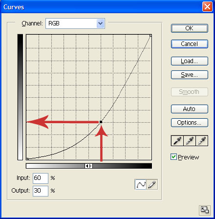
When you know what area of your image you want to adjust, you’ll need to know what part of the curve relates to that area. Fortunately, this is easy to accomplish. Simply click and drag your image over the area of the image you want to adjust. A “bouncing ball” will show up on the curve line, showing you where on the curve the tonal values you are dragging over correspond.
Once you know where on the curve you want to adjust, you can create anchor points so you can change the shape of the curve in that location. Simply click on the location you want to edit, and then drag the newly created anchor point up or down to adjust the tonal values represented by that portion of the curve. Note that when you have several anchor points, the black one is the currently selected point. You can use your mouse to move the anchor point, but you can also use the arrow keys on your keyboard to move the selected anchor point.
I’ll often actually create three anchor points when I really only need one. Between these two I’ll place an anchor point that I’ll actually use to adjust tonal values. The outer anchor points simply define the outer limits of the tonal range I want to adjust.
When you make adjustments using curves, you will generally affect the whole curve, not just the area you created an anchor point for. To correct for this, create new anchor points outside the area you were adjusting, and drag them to a location that allows the rest of the curve to return to “normal”. When I’m finished, I can add anchor points outside my original two, placing them very close to the anchor points that define the outer edges of the tonal range I’m adjusting, so that the rest of the curve will be virtually unaffected by the changes I made.
If you create an anchor point you don’t want, it is easy to get rid of it. Simply click on the anchor point, and then drag it off the Curves grid. Once outside the grid area you can release the mouse and the anchor point will be removed.
As you are adjusting the curve for an image, note that areas that are steeper than the original 45-degree line represent an increase in contrast. Areas on the curve that are shallower than the original 45-degree line represent a reduction in contrast. Therefore, you can increase or decrease contrast to different degrees for a variety of tonal values in your image.
One common cause for alarm with Curves is that it can have a dramatic impact on the hue and saturation of the colors in your image. If your Curves adjustments are causing these problems, simply set the blending mode for the Curves adjustment layer to “Luminosity” rather than the default of “Normal”. This will cause the Curves adjustment layer to only affect brightness and contrast, with no change in color values.
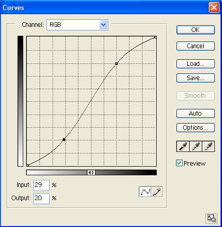
The “S” Curve
You may have heard about the desire to use an “S” curve within the Curves dialog box. While every image calls for a unique curve to obtain the best results, many images will improve by applying an “S” curve. To create an “S” curve, you would generally set an anchor about 20% in from the dark and light ends of the curve. Slide the upper anchor to the left, and the lower anchor to the right, to produce an “S” curve. The net effect is that highlights are brightened, shadows are darkened, and contrast is increased in the middle tones. Every image requires different adjustments, but the “S” curve is a good place to start with many images.
Getting Advanced
Anchor points provide an excellent way to manage the adjustments you make with Curves. The net result is a new curve that defines the “before” and “after” values for the pixels in your image. Once you have a better understanding of how the curve affects your image, you can draw it freehand. Simply select the pencil button in the curves dialog box and draw the curve in the grid. You can click the “Smooth” button to clean up jagged areas of the curve when you are finished drawing.
The Curves control can also be used for color balance adjustments. The Channel option at the top allows you to adjust RGB for overall tonal adjustments, and also select individual color channels for color balance adjustments. If you want to make color balance adjustments in Curves, I would recommend starting out very basic. On each color channel, create a single anchor point halfway up the curve. Then drag the anchor point for each channel directly up and down to adjust color balance for that channel, repeating for each of the color channels to perfect the color balance. As you gain experience with Curves, you’ll be able to apply much more sophisticated adjustments to the individual channels.
Practice, Practice, Practice!
The key to getting comfortable with the Curves control is to practice until you have a firm understanding of how it works, and you are able to apply complex changes to your images. If you take the time to practice, before long you’ll be wondering how you ever got by without Curves!
Tim Grey - NPN 019
Comments on NPN digital photography articles? Send them to the editor.
 About Tim Grey...
Tim enjoys sharing information about digital imaging as much as he enjoys learning it in the first place. Tim publishes an almost-daily Digital Darkroom Questions (DDQ) e-mail service that provides a forum for photographers to have their questions related to the digital darkroom answered. He is editor of The Digital Image, a quarterly journal published by George Lepp. He also teaches courses to help photographers master the digital darkroom at the Lepp Institute of Digital Imaging.
Tim can be contacted at tim@timgrey.com.


|