Tonal Adjustments
Copyright Tim Grey
All rights reserved.
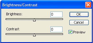 Figure 1.
|
In last month’s column, I provided a basic workflow for the digital darkroom. This month I will build upon that with a discussion of tonal adjustments. These adjustments represent a significant portion of the basic work you will do to an image, and your technique will have a significant impact on the final quality of your images.
Brightness/Contrast
The most basic and easiest to use tool for tonal adjustments in Photoshop is Brightness/Contrast (see Figure 1). Don’t use it. It doesn’t offer anywhere near the amount of control you’ll want to exercise over images you will print. If you are preparing images for display on a website, then Brightness/Contrast may be acceptable. However, I would recommend pretending like it doesn’t even exist.
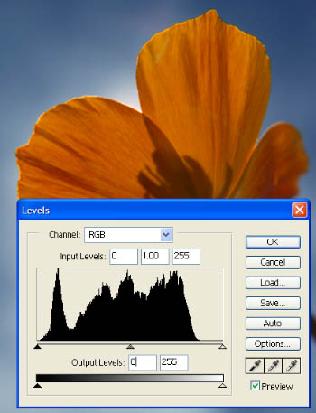 Figure 2.
|
Levels
Many photographers start out with the Brightness/Contrast tool because they don’t understand the alternatives. The Levels dialog box can be a bit intimidating at first, but it is actually relatively straightforward to use once you understand it.
I recommend working with adjustment layers, so the first step would be to create a new Levels adjustment layer. You can click the New Adjustment Layer button on the Layers palette and select Levels from the list, or select Layer > New Adjustment Layer > Levels from the menu.
The Levels dialog box revolves around a histogram representing the data in the image (see Figure 2). This histogram is a composite of the tonal values on each of the three channels in an RGB image. Black is represented at the extreme left of the histogram, and white is represented at the extreme right. The gradient at the bottom of the dialog box provides a visual indication of the relative tonal values represented by each point along the horizontal axis of the histogram.
The histogram is visually showing you, in relative terms, how many pixels are at each tonal value. The taller the chart is at any given point, the larger the number of pixels in the image that have the tonal value represented by that point. If the histogram bottoms out at any point, that is an indication that there aren’t any pixels in the image with that tonal value.
The histogram itself can tell you a lot about the image. If the histogram chart appears to be cut off at the left end, it indicates that there is a lack of detail at the extreme dark end of the tonal range. Likewise, if the chart appears cut off at the right end of the chart, it represents a lack of detail in the highlights. This isn’t always necessarily a problem, but it should certainly raise a red flag in your mind. A loss of detail in the highlights is a particular problem. If you lose detail in the shadows they will look dark, which isn’t necessarily bad. With some images, such as silhouettes, this is actually a good thing. However, if the highlights have significant loss of detail, it will generally look “wrong” in the final image. This concern for loss of detail at either end of the tonal range directly relates to the method used to actually set the black and white points in the Levels dialog, which is the first step in making tonal adjustments with Levels.
As a general rule, with most photographic images you will want to make the darkest pixel black, and the lightest pixel white (see Figure 3). To accomplish this, you would simply slide the black point slider in to where the histogram data ends at the left end, and the white point slider in to where the histogram data ends at the right end. Keep in mind that sometimes the histogram can flatten out at the end, and there may be data where there doesn’t appear to be any at first glance. If there is any black at the bottom of the histogram, there are pixels at that tonal value. With some images the ends of the histogram may have a one-point line at the bottom. That means there are still pixels (though not many) at those tonal values, and you need to be concerned about loss of detail if you bring the black or white point past the point where data begins.
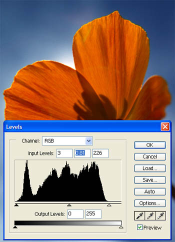 Figure 3.
|
Sometimes you may want to increase contrast considerably, and you may want to bring the black or white points in beyond the point where data begins. You can certainly do that, but just be aware that if you bring the black or white points in beyond the point where data begins on the histogram, there will be a loss of detail in those tonal values.
After setting the black and white points, the next step is to set the middle tone value. This is done by sliding the middle tone slider (gray triangle) left and right. The tonal value represented by the position of the middle tone slider will be set to middle gray, with all lighter and darker values re-mapped accordingly. If you slide the middle tone slider to the right, a lighter tonal value will become middle gray, and the overall image will darken as the other values are mapped, based on the new middle tone. Sliding it to the left will have the opposite result, with an overall lightening of the image.
One of the disadvantages of using an adjustment layer for Levels is that you don’t see how the histogram is affected by previous adjustments (see Figure 4). That means that you can’t see the gaps that would otherwise be visible after you increase contrast. Gaps in the histogram represent areas where tonal values have been compressed, and are an indication that tonal gradations in your image may not be smooth. Using an adjustment layer for Levels helps maintain smooth gradations because you are not compounding the compression of tonal values with successive adjustments. However, it is important to keep in mind that excessive increases in contrast can result in tonal gradations that are not smooth and appear “banded” in the final print.
Setting the black point, white point, and middle tone with Levels allows you to make informed decisions about your tonal adjustments, and provides a method for keeping those adjustments precise. The curves control provides even more control over tonal adjustments, and will be the subject of a future column I’ll write for NPN.
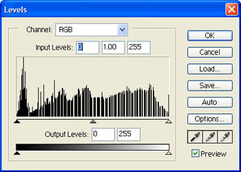 Figure 4.
|
Dodge & Burn
Once you have done your basic tonal adjustments, you’ll often want to fine-tune your image with dodging and burning to lighten and darken selective areas, respectively. Photoshop includes tools for this purpose, but they actually change the pixel values and therefore, are not something I recommend using.
To produce the same effect as the dodge & burn tools without changing the pixel values in the image, you can use the non-destructive dodge & burn technique. Start by selecting the image layer you want to modify and then create a new layer from the Layer menu (Layer > New > Layer). This will bring up the New Layer dialog box. You can give the layer a name, such as “Dodge & Burn”, to help keep the Layers palette organized. The important settings are changing the Mode to Overlay (or Soft Light) and checking the box for “Fill with Overlay-neutral color (50% gray)”. Filling with gray isn’t critical, but it is helpful. Because you selected the image layer first, this new layer will be placed above the image layer when you click OK. It doesn’t need to be immediately above the image layer, but it does need to be above it. It is helpful to keep it directly above, just to keep it clear that it relates to the image layer.
Select the Brush tool (“B” on the keyboard), and press “D” to set the foreground and background colors to the default values of black and white. Select a soft-edged brush so that your adjustments will blend in smoothly with the surrounding areas. On the options for the Brush tool set the opacity to about 20% as a starting value.
Make sure the new “Dodge & Burn” layer you created is the active layer on the layers palette (click on the thumbnail for this layer if it isn’t) and then paint to dodge and burn. Painting with black will darken the underlying image, and white will lighten it. The effect is cumulative if you release the mouse and draw again over the same area. You will generally want to click and hold the mouse button, then drag around the areas you want to adjust. To increase the effect, you can release the mouse and then click-and-drag again. You can adjust the opacity to affect the strength of the dodging and burning.
This technique allows you to bring out subtle details in certain areas of your image, and fine-tune the tonal adjustments. Because you are working on a separate layer, you can easily change the effect later, or remove it altogether, without affecting the original pixel values in your image.
Tonal Perfection
By focusing on the details of your tonal adjustments, and understanding the information presented in the histogram, you can produce images with excellent brightness and contrast. In future columns, I will address the use of curves to further refine your tonal adjustments, as well as techniques for adjusting color once you have the tonal adjustments perfected.
Tim Grey - NPN 019
Comments on NPN digital photography articles? Send them to the editor.
 About Tim Grey...
Tim enjoys sharing information about digital imaging as much as he enjoys learning it in the first place. Tim publishes an almost-daily Digital Darkroom Questions (DDQ) e-mail service that provides a forum for photographers to have their questions related to the digital darkroom answered. He is editor of The Digital Image, a quarterly journal published by George Lepp. He also teaches courses to help photographers master the digital darkroom at the Lepp Institute of Digital Imaging.
Tim can be contacted at tim@timgrey.com.


|