Nature Photographers Network
This is the preserved archive of the original Nature Photographers Network. The community continues at naturephotographers.network.
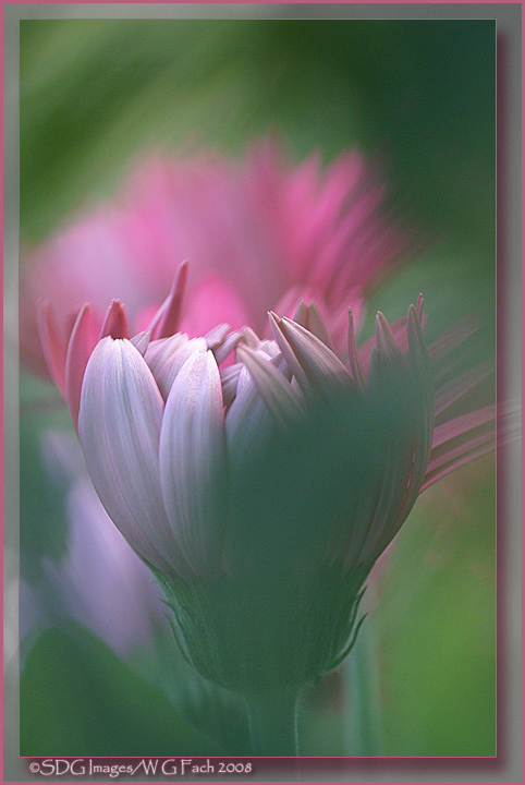
Gerbera Cram 2
‹ PreviousFlora GalleryNext ›

Gerbera Cram 2

by Bill Fach

Gallery: FloraPosted February 11, 20082,573 views21 comments
Sony A100
Minolta 200 mm macro
ISO 400 1/250 @ F4

I had a wonderful weekend with some new gerberas in our garden. This is a different exposure of this image that I posted in the WC gallery. Do you prefer one over the other, both the same, both need to go in the trash, whatever. All comments welcome. >=))>

Comments

21 comments
Comment posted by Michael Lowe on February 11, 2008 at 3:26 PM
Definately not trash can material, Bill. I love them both, but prefer this lighter exposure. It seems to fit the dreamy quality of the image better. :toast:
Registered on February 11, 2004, 777 Posts, 5252 Comments
Comment posted by Nathan Buck on February 11, 2008 at 3:30 PM
I definitely prefer this shot Bill (to the other one), and I really like it. I would definitely NOT 'round file' them. I love the abstract 'brush strokes' throughout the shot. A very nice cram shot.

Nathan
Registered on November 1, 2003, 1101 Posts, 13589 Comments
Comment posted by David Cobb on February 11, 2008 at 6:08 PM
I like this image a lot Bill, the brushstroke effect is tremendous.

David M. Cobb
Registered on December 14, 2007, 312 Posts, 3243 Comments
Comment posted by Amy Hopp on February 11, 2008 at 6:10 PM
I like this one, too, Bill. As Michael posted, the lighter version has a dreamier quality. Love the brush strokes, too! Wish we had flowers growing right now... :frown:
Registered on October 18, 2007, 234 Posts, 655 Comments
Comment posted by Jeffrey Mitchell on February 11, 2008 at 6:35 PM
Hey Bill I think you should trash this one. Please send it to my email and I will make sure it gets handled promptly. :wink: WOW, look out Nathan, there's a rising star in the crammin' world. I LOVE this image, the colors are so beautiful and the image just reminds me of a MONET' painting. This must be hanging on your wall already! I like the other one, but I LOVE this one. Super job Bill. :toast: :toast: :toast: :toast:
Registered on April 7, 2005, 171 Posts, 1106 Comments
Comment posted by Ian Wolfenden on February 11, 2008 at 7:02 PM
Definitely prefer this image, Bill. A wonderful softness about it - everything seems to blend so well. Magical !!
Registered on May 18, 2007, 1108 Posts, 7647 Comments
Comment posted by Pat Sampson on February 11, 2008 at 8:26 PM
Bill,

I also like them both very much but prefer the lighter. I don't think I would have known why but agree with Michael's reasoning now that I've read it. Beautiful work.

Pat
Registered on May 19, 2007, 953 Posts, 15989 Comments
Comment posted by Jack Mroz on February 11, 2008 at 8:30 PM
Another vote for this one Bill. I like the softer light much better. The other one is wonderful as well. Great DOF. :toast:
Jack
Registered on July 12, 2006, 114 Posts, 1476 Comments
Comment posted by May Haga on February 11, 2008 at 9:49 PM
Simply beautiful. I do prefer this lighter version. I find the other one too dark.
May
Registered on February 22, 2007, 714 Posts, 8470 Comments
Comment posted by Terri Sampson on February 12, 2008 at 12:03 AM
Hi Bill - very tough call, but I have a slight preference for the WC post beause of the light, shadows, and colors. But they are both gorgeous. Terri
Registered on August 13, 2007, 110 Posts, 517 Comments
Comment posted by Wayne Rhodus on February 12, 2008 at 1:01 AM
What immediately catches my eye are the brush stroke effects. I like the combination of tones and colors here too. I'm undecided about the UR, it comes off a bit too dark for me. Nice work Bill.
Registered on November 16, 2003, 157 Posts, 3326 Comments
Comment posted by Larry Lynch on February 12, 2008 at 8:04 AM
There is nothing "throw away" about this image Bill. This is an exceptional piece of fine crafting. Store this in your preferred files.
Registered on September 16, 2006, 773 Posts, 9940 Comments
Comment posted by Bill Whitney on February 12, 2008 at 12:53 PM
Bill...couple of well crafted images. Think my preference would be the WC image although it is real close. Great job with the CRAM and wonderful lighting. :toast: :toast:

Bill
Registered on May 31, 2006, 135 Posts, 1232 Comments
Comment posted by Angela Classen on February 12, 2008 at 2:12 PM
I definitely prefer this image as the soft pastel coloring appeals to me. The comp, lighting and color are just wonderful. I can't wait for spring :biggrin:
Registered on June 13, 2007, 434 Posts, 2742 Comments
Comment posted by Mary Christopher S on February 13, 2008 at 1:15 AM
Just love it! The color palette is just wonderful! Well done, Bill.
Registered on May 21, 2007, 398 Posts, 2605 Comments
Comment posted by Toni Lankerd on February 13, 2008 at 12:07 PM
Trash them? No way, Bill! Both are very well done, but this one has my vote of the two, because of the composition and the lighting. Very nice!
Registered on January 3, 2005, 360 Posts, 4004 Comments
Comment posted by Pam Colander on February 15, 2008 at 2:51 PM
Huh, I didn't realize this was a named shooting technique. I've done it many times :wink: Love this Bill. The colors are amazing and the focus creates a very painterly feel. Great job!

Pam
Registered on December 7, 2006, 210 Posts, 1062 Comments
Comment posted by Giuseppe Guadagno on February 16, 2008 at 2:32 PM
Bill, I have losted this one. I think that both pictures should go in the trash, in my trash so I can recover them. They are splendid! Lights and colors make a creative, dreamy image.
These photos brought me to your article that I read with great pleasure admiring beautiful images too. Thanks for sharing.
Cheers.
Registered on February 3, 2007, 827 Posts, 5052 Comments
Comment posted by Danny on March 13, 2008 at 6:18 AM
Gees.......... :eek: , print it large and approach a few calendar companies with your work Bill. They do sell. The other ones to approach, are interior designers M8t. They will love your work for walls. This and the others, are just too good not to be used IMO.

Danny.
Registered on November 25, 2003, 165 Posts, 1345 Comments
Comment posted by Andrey Antov on April 4, 2008 at 10:02 PM
Intriguing.
Registered on March 18, 2008, 292 Posts, 341 Comments
Comment posted by Lucy VanSwearingen on August 26, 2010 at 10:56 AM
What can I say? A work of art....just beautiful
Registered on May 23, 2009, 800 Posts, 2042 Comments