Nature Photographers Network
This is the preserved archive of the original Nature Photographers Network. The community continues at naturephotographers.network.
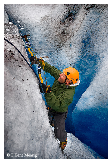
Climb Art
‹ PreviousPhoto Art GalleryNext ›

Climb Art

by Kent Mearig

Gallery: Photo ArtPosted July 31, 20071,554 views6 comments
When I first reviewed this photo on my computer, I was immediately attracted to the point of impact of the ice tool and the surrounding spray of ice chunks. I didn't get the impression that it would be a focal point for the average viewer though, so I pushed and pushed the image to bring that area, and the climber himself, to the forefront. It's only by comparison to the original that the extent of processing is understood, but I thought the photo would be most appropriate for this forum.

I would love to hear whether I've reached my goal of attracting your attention to the area I chose, and your general reaction to the image is also appreciated.

Comments

6 comments
Comment posted by Alice Scoggins on July 31, 2007 at 8:09 PM
Well done, I think you achieved your goal of having the climber and the ice jump out at the viewer! Wonderful clean colors. I'd be interested in what you did to process the image, as well as seeing the original. :toast:
Registered on February 21, 2005, 430 Posts, 5959 Comments
Comment posted by Kent Mearig on July 31, 2007 at 8:47 PM
This is the photo before all the PS work but after I already made a fair amount of adjustment to the raw file. From here, there were three heavy localized curves adjustments, a saturation layer for everything but the blues, and selective sharpening that gives a slightly blurred look to the unsharpened areas.
Registered on September 4, 2006, 237 Posts, 4748 Comments
Comment posted by Brian Monk on August 1, 2007 at 7:53 PM
Kent -

The action was the first thing I noticed after the palette. I really enjoy his face, the intense concentration and strength is well portrayed here.
Registered on June 22, 2006, 109 Posts, 452 Comments
Comment posted by beth summer on August 1, 2007 at 10:18 PM
One of the things I like is how the you can see the ice "flying" from the pick at the tip better in the processed than the original.(Oops..just read your notes) Shows better action. I also like the saturation you used in the BG and the climber really stands out better in the processed version. The ice in the Bg is better with more texture in the processed version. Overall, I think you've achieved your goal in the processed version, Kent. Nicely done....love your ice photos.
Registered on November 1, 2003, 437 Posts, 5220 Comments
Comment posted by Michael Anderson on August 9, 2007 at 5:48 AM
Kent,

Fantastic shot! Your perfect processing makes it look three dimensional like we're right there with you. Well deserving of the EP!
Registered on January 31, 2006, 228 Posts, 3072 Comments
Comment posted by Derrald Farnsworth on August 28, 2007 at 9:16 AM
It appears your end result was well worth the effort. Excellently processed.
Registered on August 27, 2007, 56 Posts, 548 Comments