Nature Photographers Network
This is the preserved archive of the original Nature Photographers Network. The community continues at naturephotographers.network.
Arroyo
‹ PreviousLandscape GalleryNext ›

Arroyo

by Tony Kuyper

Gallery: LandscapePosted April 13, 20072,382 views32 comments
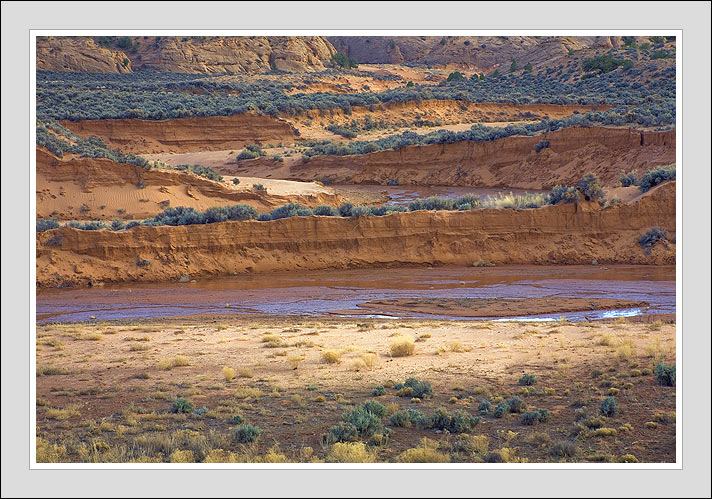
The Southwest is full of wonderful icons and iconic light. But it's also a place of quiet beauty--landscapes where the glowing stones and weirdly shaped rocks are absent, but that have interesting patterns and textures that are probably worth exploring with the camera. It's easy to ignore these places with so many stunningly sensational places nearby and it's a personal evolution of sorts that I'm starting to looking at these places and trying to compose pictures of them.

This image is something along that line. It's an arroyo I've driven past many times whose lines and layers I've always found attractive, but didn't think worth a picture. However, I think maybe I was wrong. This place has a subtle beauty, and though it might only appeal to the long-time resident, at least for me there is something here that describes this place better than glow light and sandstone swirls.

Would really enjoy hearing your opinion, good or not-so-good. Thanks.

Canon 5D, Tamron 24-135.

Comments

32 comments
Comment posted by Joel Truckenbrod on April 13, 2007 at 12:38 AM
What? No sandstone!? :wink:

This is excellent, and superbly processed as usual. The zig-zag of the landforms is what really gets my attention, and I find myself following them back and forth. While I'm don't think this will have the impact of many of your most popular images, it certainly conveys that feeling that one gets when experiencing these wide open spaces. Very nice.
Registered on January 27, 2006, 17 Posts, 751 Comments
Comment posted by Lon Overacker on April 13, 2007 at 1:02 AM
Tony,

It's refreshing to see another view of the desert SW that so many would pass on by. Congrats for recognizing the beauty here. I love the criss-crossing patterns and lines as Joel pointed out. The quality of light is quite nice and this just resonates.

Lon
Registered on November 24, 2006, 521 Posts, 19147 Comments
Comment posted by Prashant Khapane on April 13, 2007 at 2:34 AM
I love the use of lines and zigzag pattern. Lovely.
Registered on November 1, 2003, 492 Posts, 4580 Comments
Comment posted by Robert Helms on April 13, 2007 at 3:27 AM
I'm no resident, but I really like this image a lot. The lines, the layers, the colors all work together very well here, Tony. Really a sweet shot that takes on a 3D feel for me when viewing it.

Thanks for sharing
Registered on November 28, 2003, 37 Posts, 1005 Comments
Comment posted by Verena & Georg Pop on April 13, 2007 at 4:18 AM
Tony, this is a very nice view. I really enjoy images that do not show the typical icons much more lately. I feel, in shooting landscapes like this, a photographer can work with much more freedom not having to include a specific landmark. And, as it is here, these kind of images very often do show much more of the feel of the place and tell more about that area.
this is a nice shot that speaks quietly and doesn't scream. good one.
Georg
Registered on July 5, 2006, 272 Posts, 2823 Comments
Comment posted by Julian Barkway on April 13, 2007 at 6:16 AM
The lines and comp are spot-on but it's the soft light that really makes this shot. There's a glow about the light and a wonderfully 'still' quality that just enhances the soft lines of the arroyo.

:toast: :toast:
Registered on January 18, 2007, 344 Posts, 1961 Comments
Comment posted by Darwin Wiggett on April 13, 2007 at 7:02 AM
The zig-zaging lines of the upper half of the photos are given a base with the horizontal layers in the lower half. The tones of light and dark are distributed in a pleasing manner all through the frame. The only thing that draws my eye slightly from the layers, zigs and tones is the small green bush in the lower left corner up against the edge of the frame. Totally minor though. Darwin
Registered on November 1, 2003, 100 Posts, 1327 Comments
Comment posted by Dietrich Gloger on April 13, 2007 at 7:41 AM
I always appreciated a non-iconic approach. This one came out very well - the light is beautiful and the zig-zag layers are very interesting. I also love the reflection of sky in the water - adds even more interest to this.
Registered on January 26, 2007, 360 Posts, 9876 Comments
Comment posted by Jos De Braekeleer on April 13, 2007 at 7:46 AM
I like the different browns and layers :toast:
Registered on November 1, 2003, 455 Posts, 1648 Comments
Comment posted by Josh Anderson on April 13, 2007 at 8:18 AM
It does appeal to me Tony. I think you have done a fantastic job capturing the different layers in the subtle light. Nice.
Registered on June 2, 2005, 493 Posts, 2996 Comments
Comment posted by Bill Stice on April 13, 2007 at 8:40 AM
Tony, a wonderful image. I agree wtih your assessment of the Southwest and the patterns and textures. This image appeals to me for that very reason. I like your selection of the layers and the textures of the sand and vegetation. Some of my favorite shots of the Southwest are similar to this. Great job!
Registered on November 17, 2003, 20 Posts, 185 Comments
Comment posted by Adam Kavalunas on April 13, 2007 at 9:07 AM
This is certainly a departure from your usual glowing sandstone. I think the small traces of water really help to give the image more feeling rather than being totally dry.
Registered on June 22, 2006, 73 Posts, 464 Comments
Comment posted by Mary Dennis on April 13, 2007 at 9:07 AM
Tony,

I honestly don't think of this image as having a "subtle beauty." To me it is quite overtly beautiful and an open invitation to explore. It really gives me a fuller sense of the environment you live and work in and produce all of your exquisite sandstone close-ups in. I wanna walk right in there and poke around in the water and explore all the cool nooks and crannies. The quality of color, the very earthy feel of the place, is great.
Registered on November 1, 2003, 290 Posts, 2897 Comments
Comment posted by Allen Maestas on April 13, 2007 at 9:12 AM
This is just delightful Tony, I feel and see exactly what you are saying. For me this is a powerful image full of life and natural beauty. Thanks for sharing your vision, it's very inspiring.

Al
Registered on August 11, 2006, 24 Posts, 212 Comments
Comment posted by Bret Edge on April 13, 2007 at 9:16 AM
This is fantastic, Tony. Beautiful layers, lots of great little details to appreciate and wonderful, subtle colors. As I've said before, I really enjoy it when you deviate from your usual work. That isn't to say that I don't appreciate your usual sandstone swirls cuz I sure as heck do!
Registered on November 1, 2003, 711 Posts, 6363 Comments
Comment posted by Dan Baumbach on April 13, 2007 at 9:27 AM
I love this, Tony. I'd expect more intense colors from you but I like the muted tones of this. No nits from me, just a desire to see a nice print of it.

- Dan.
Registered on November 1, 2003, 473 Posts, 7980 Comments
Comment posted by Richard Bernabe on April 13, 2007 at 9:37 AM
Love the layers here, Tony. I could sit here and look at all the details for a long time.
Registered on November 24, 2004, 180 Posts, 1545 Comments
Comment posted by Paul Breitkreuz on April 13, 2007 at 9:47 AM
Tony, this is a special image to a lot of us who have access to the high desert chaparral environments of the southwest region. It is very typical of the terrain and overall scenery we photograph. I never get tired of this type of view. The various layers with the water flow FG area, along with the ever present sagebrush, makes it a real winner IMO.
Registered on February 25, 2006, 525 Posts, 8448 Comments
Comment posted by Guy Tal on April 13, 2007 at 10:56 AM
Tony, I think this bears on the recent discussion we had. This could be a startling revelation to anyone who has traveled through these places in the sense that it looks so real and familiar yet its beauty is usually taken for granted. Seeing it portrayed as it is, my first reaction was "wow, I never realized..." and I'm sure the same is true for many others. Talk about being original and creative in a landscape of so many interpretations.

Guy
Registered on November 1, 2003, 566 Posts, 15507 Comments
Comment posted by David Chauvin on April 13, 2007 at 11:03 AM
Beautiful color and composition, Tony. Just goes to show that there's beauty all around if we just slow down and look.
Registered on August 5, 2004, 1007 Posts, 5595 Comments
Comment posted by Bill Fach on April 13, 2007 at 12:03 PM
Tony: I really like this image. The tonal range is very nice as is the color palette. I also like the lines and textures. Perhaps not a :eek: -meter spike type image but certainly one with enduring qualities. Well seen and presented. >=))>
Registered on November 1, 2003, 1805 Posts, 26981 Comments
Comment posted by Laurent Baig on April 13, 2007 at 1:48 PM
Tony, I know what you mean. I feel drawn to photograph certain things when I'm up on the plateau. But I love the entire place. There's so much simple beauty that gets overlooked and passed by.
Registered on January 12, 2005, 206 Posts, 6784 Comments
Comment posted by Kent Mearig on April 13, 2007 at 2:12 PM
I really like the way the lines are close to horizontal, but not horizontal; and the way that they're close to straight, but not straight. It's that subtle variation from a stack of horizontal layers that I find most appealing about this. I also don't feel like I have to compliment the photo to impress people with my appreciation for subtlety because, like Mary D said, this picture is overtly beautiful and classically composed. The one thing I'm not completely sold on are the gold bushes right on the bottom edge of the frame. Maybe cropping them out would be nice, but I couldn't be sure without seeing it first.
Registered on September 4, 2006, 237 Posts, 4748 Comments
Comment posted by Nye Simmons on April 13, 2007 at 7:42 PM
Tony - the layers and zig zags are very efffective though I thought even more so in the thumbnail for some reason - yes I can udnerstand the subtle appeal - restful tranquil not the usual in your face color and lines
Registered on December 12, 2004, 112 Posts, 1111 Comments
Comment posted by Eric Good on April 14, 2007 at 4:46 AM
These are the types of photos that are slowly growing on me. This would not normally be a meter spike for me, but definitely a location that would catch my eye if I was there. From the photograph I can surely tell why you found this attractive... great lines, textures and colors. I too might play around with Kent's suggestion of croping out those gold bushes at the bottom. For some reason I think that may make for a stronger composition. Again, well seen!
Registered on March 17, 2007, 116 Posts, 4764 Comments
Comment posted by Kah Kit Yoong on April 14, 2007 at 10:45 AM
Great capture of those soft earthy tones. I like the layered pressentation too. Real nice work.
Registered on September 27, 2006, 636 Posts, 10682 Comments
Comment posted by Bill Chambers on April 15, 2007 at 7:16 PM
Lovely image Tony. I really like the zig zag pattern of the river bed and the differeing trerrain colors. Different form your usual fare, but just as nice.
Registered on April 10, 2005, 753 Posts, 21216 Comments
Comment posted by Paul Breitkreuz on April 16, 2007 at 9:35 AM
Congratulations Tony on this fine image receiving the EP selection in this category for last week. A truly very nice scene overall, it seems very natural in appearance and an excellent choice for that reason IMO. :toast:
Registered on February 25, 2006, 525 Posts, 8448 Comments
Comment posted by Anil Rao on April 17, 2007 at 1:16 AM
Congratulations on the EP, Tony.

This photograph gives me the feeling that I am looking out of a window and seeing the southwest for myself. It is so real!
Registered on November 15, 2003, 234 Posts, 4923 Comments
Comment posted by Carol Hyman on April 20, 2007 at 8:15 PM
I'm so glad I've re-discovered this image, Tony.

I saw it when you first posted it and then I lost it.

I like the depth in the image but what I really like about this image is the wonderful criss-crossing layers. They remind me of a capital Z

I'm glad you shot and shared it.


Carol

Registered on January 18, 2007, 597 Posts, 8062 Comments
Comment posted by Carol Hyman on April 20, 2007 at 8:18 PM
Tony,

One last comment after reading what others have said.

I personally would not remove the tiny gold brushes. They lead the eye into the gold layer of the image very nicely and that in turn is echoed throughout the other layers.

My 2 additional cents.

Carol
Registered on January 18, 2007, 597 Posts, 8062 Comments
Comment posted by Carsten Ranke on August 10, 2007 at 1:15 PM
Not spectacular at first sight - but extremely well composed. The different layers provide intriguing colors and color contrast, lots of nice details. A masterwork
Registered on May 31, 2007, 20 Posts, 411 Comments