Gallery: FloraPosted January 7, 20072,604 views17 comments
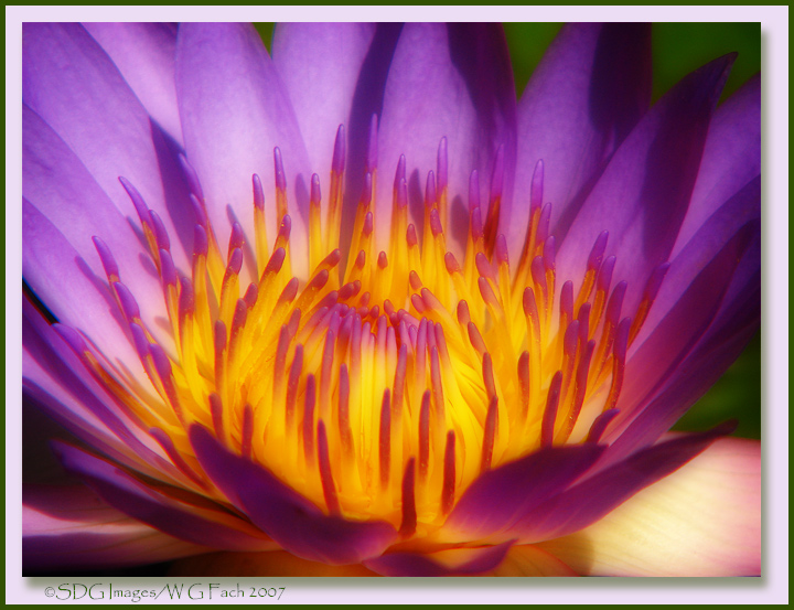
Another old favorite given the treatment. >=))>
Comments
17 comments
Comment posted by Darwin Wiggett on January 7, 2007 at 4:01 PM
Lovely! It has a wonderful luminescent quality. I just wish that bright petal in the lower right corner was not brighter than the yellow central part of the flower - it is slightly distracting. Maybe it could be toned down a bit. Otherwise, I really think the Orton treatment and the subject are a perfect match. Darwin
Registered on November 1, 2003, 100 Posts, 1327 Comments
Comment posted by Steve Zimic on January 7, 2007 at 4:05 PM
Bill,
Beautiful soft colors. Although the light is rather harsh you've managed to open up the shadows quite nicely. I do find that bright petal on the bottom right pulling my eye away from the flower. Great treatment whatever it is.
Registered on November 23, 2003, 176 Posts, 727 Comments
Comment posted by David Redding on January 7, 2007 at 8:07 PM
Love this, its almost abstract with the great colour saturation and soft focus
Registered on April 24, 2006, 26 Posts, 77 Comments
Comment posted by Larry Lynch on January 7, 2007 at 8:22 PM
Beautiful image. Love the warm glow from the center. Well done!
Registered on September 16, 2006, 773 Posts, 9940 Comments
Comment posted by Bill Whitney on January 7, 2007 at 10:14 PM
Bill....very nice.the flower seems to radiate.
Bill
Registered on May 31, 2006, 135 Posts, 1232 Comments
Comment posted by Mike Moats on January 7, 2007 at 10:18 PM
This came out really nice Bill, treatment works well.
Registered on October 20, 2004, 892 Posts, 6324 Comments
Comment posted by Nathan Buck on January 7, 2007 at 11:48 PM
Gorgeous...just gorgeous Bill. I love the color and the glow.
Nathan
Registered on November 1, 2003, 1101 Posts, 13589 Comments
Comment posted by Kah Kit Yoong on January 8, 2007 at 3:30 AM
Stunning. Looks like the centre is on fire.
Registered on September 27, 2006, 636 Posts, 10682 Comments
Comment posted by Catherine Reilly on January 8, 2007 at 4:22 AM
Hi Bill,
Yellow and purple is always so good together! And the yellow in this really has its glow on high. But darn than RLC petal; looks like it's misplaced. I haven't made up my mind yet on the dark shadows on the rightÉ Overall, I sure do like it, though. The Orton effect looks more gentle than the usual and has an unobtrusive softening effect that is very pleasing.
Here's to Spring and more FLOWERS and COLOR.
Registered on August 16, 2006, 603 Posts, 9192 Comments
Comment posted by Bob Mullen on January 8, 2007 at 9:53 AM
Striking!
Registered on June 4, 2006, 133 Posts, 1056 Comments
Comment posted by Bernie Kasper on January 8, 2007 at 11:31 AM
Beautiful image Bill, the center seems to glow like a campfire, very well done
Registered on June 5, 2005, 251 Posts, 3734 Comments
Comment posted by David Weber on January 8, 2007 at 11:53 AM
I love the glow of the waterlilly, Bill. Well-ortonized! My only nit would be that the bright petal in the LRC.
Registered on February 7, 2005, 296 Posts, 2737 Comments
Comment posted by beth summer on January 8, 2007 at 1:03 PM
Beautiful.....loves the colors.
Registered on November 1, 2003, 437 Posts, 5220 Comments
Comment posted by Michael Anderson on January 8, 2007 at 1:29 PM
Bill,
Awesome image. Amazing colors and just the right amount of ortonization.
Registered on January 31, 2006, 228 Posts, 3072 Comments
Comment posted by Bill Chambers on January 15, 2007 at 11:18 AM
Great job on the Orton effect. Beautiful comp and colors. Congrats on the EP!
Registered on April 10, 2005, 753 Posts, 21216 Comments
Comment posted by Catherine Reilly on January 15, 2007 at 2:00 PM
Way to go, Bill. for the EP.
Registered on August 16, 2006, 603 Posts, 9192 Comments
Comment posted by Paul Breitkreuz on January 18, 2007 at 6:04 PM
Congratulations Bill on your recent EP selection here. This is a very unique image and the Orton treatment seems to make it even nicer.
Registered on February 25, 2006, 525 Posts, 8448 Comments

Comments
17 commentsBeautiful soft colors. Although the light is rather harsh you've managed to open up the shadows quite nicely. I do find that bright petal on the bottom right pulling my eye away from the flower. Great treatment whatever it is.
Bill
Nathan
Yellow and purple is always so good together! And the yellow in this really has its glow on high. But darn than RLC petal; looks like it's misplaced. I haven't made up my mind yet on the dark shadows on the rightÉ Overall, I sure do like it, though. The Orton effect looks more gentle than the usual and has an unobtrusive softening effect that is very pleasing.
Here's to Spring and more FLOWERS and COLOR.
Awesome image. Amazing colors and just the right amount of ortonization.