Gull on Post
by Jim Erhardt
This photo, and this thread is specifically intended to illustrate good photo critique. My thanks to those who have posted their critiques as examples of "how it's done"!
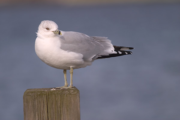
This photo of a gull was taken at a local dock using a Canon 10D digital camera and a 300mm lens though an open window in my car. I used a beanbag to steady the camera.
I like this photo because it shows a gull in its typical environment - near water perched on a man made object. However, I'm not sure about the composition or if I should crop tighter to the subject. This is the full photo from the camera - I did not crop it.
I prepared the RAW file from the camera using Photoshop CS, making adjustments to levels, contrast and saturation, and sharpened the photo before "saving for web."
Any suggestions on improving this photo are appreciated!
Canon 10D
Canon 300 f/4 lens
Kinesis Safarisack beanbag
f/4 in AV (aperture priority) mode at 1/250th shutter speed

Comments
14 commentsPermission granted!
I love the eye contact made with the bird. I personally think the bird is to far to the left in the frame. I would also crop out the small section at the top or clone it to match the rest of the upper background. I like the soft colors but the whites look a little blown in areas of the face and neck. Overall the bird looks tack sharp in the important areas.
Excellent capture of the Ring-billed gull. I really like the head turn and the background is outstanding. I would like to see a little more space at the top of the photo and a bit less at the bottom. Not crazy about the 4x4 perch and would clone out the drop on top. Congrats on a fine image!
overall a nice photo; the clean out of focus BG provides separation from the subject. The techs are fine as well; the whites are well exposed and the detail is excellent
My only suggestion for composition would be to crop a little from the top to eliminate the (tilted?) horizon line, IMHO it is the sole minor distraction in this photo.
...Ken
first of all the technical execution of this image looks very good. The exposure is well done, because the whites show details everywhere. The image itself looks also very sharp. From composition point of view, I like the placement of the bird in the frame, since it fits with the pose of the bird, which sugest a view to the right site of the image. Here one finds open room into which the bird is "looking" to. The clean and uncluttered background it another plus for this image, also because of its blue color, which lets the gull stand out very nicely. I agree with previous comments to crop a bit from the top, to eliminate the slightly tilded shoreline at the horizon. I would also rotate the picture a bit clockwise to level the pole on which the gull is standing. I am sugesting this, since usually the poles are placed perpenticular, which is typical for this man made object
Your technical execution looks real good. And the composition works fine for me. The head turn is just enough to get good eye contact, a very important attribute to successful bird images in my opinion. As to the suggestion of my colleagues to rotate the image to straighten the pole, I'll have to disagree. The bird looks perfectly balanced as is, if you rotate the pole level, he'll look like he's falling over backward! My suggestion for the image would be to clone out the extraneous matter on the perch by his feet. It really doesn't add to the image, and is a slight distraction with its brightness. Overall I think you succeeded in making a fine portrait of this adult Ring-billed Gull.
the exposure of the whites and blacks looks very good as well as the sharp details of the bird, and nice OOF BG.
Because the Ring-billed Gull is looking back into and through the frame I feel the left side compostion is very good for this subject. My only suggestion might be, because of the body frame and positon of the gull, to make this a vertical pano image by cropping off most of the perch at the bottom and maybe only leaving about a ½ inch of the perch. And I also agree with the clone suggestion that the others have made with the matter at the gulls feet.
Well done. Thanks for sharing.
I'll chime in too since you asked.
First, the technical aspects of this image are good. The details in the whites and the shadows are there although there is a little loss of detail in the black feathers that could have been helped with a little flash.
Second, the composition works pretty well too. Leaving room for the bird to look into is important as is leaving space in that direction. The space suggests that if the bird were to take off at this moment it would have room to move into.
Third, the question of impact. Here there is definite room for improvement I think. While this is the type of scene we often see, if you had been able to get the gull doing something like calling or preening the shot would have had much more punch and attracted the viewer's attention and interest.
In all I feel this is a good photo for an identification purpose but would like to see some more dramatic behaviour to put this into the WOW category.
Hope this is of some help.
1 - agree about the cleaning up the top of the post.
2 - rotating the image. I think I might rotate so the the back leg is vertical. The bird shouldn't feel like it is toppling, but the post will be a little straighter.
3 - I agree that a small amount of cropping might improve things.
4- background. The background is nice but to me is very bright relative to the bird. It tends to take my eyes away from the bird. I've read about people burning it the edges to push the eyes back into the photo. I might try it on something like this photo. (although, I wonder what the experts think about this idea.)
Nice shot and clean image. I like the ruffle in the feathers, adds a little dynamic element.
A gull on a post is typical but you have turned this image into something special.
The turn of the gull's head toward the center of the image, the tuft of feathers on his neck, and the post production work are great.
You asked for suggestion on improving the image. I might consider adding a deeper shade of blue to the background in to lower portion of the photo and graduating it to the present shade of blue at the top. And without trying it, I'm not sure if it would work. Simply an idea.
Thanks for sharing.
Carol