Comment posted by Cay-Uwe Kulzer on July 21, 2005 at 2:55 PM
Marsel,
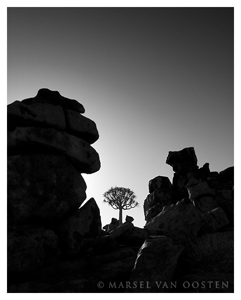
the converstion to black & white was a good idea for this picture in my opinion. I find the overall appeal of the image very nice.
Registered on January 27, 2004, 494 Posts, 4021 Comments
Comment posted by Minna Kinnunen on July 21, 2005 at 3:14 PM
B&W makes this a graphically strong image, I like it!
Registered on February 13, 2004, 19 Posts, 357 Comments
Comment posted by Bill Chambers on July 21, 2005 at 4:15 PM
Beautiful - B/W makes this much more powerful. Well done.
Registered on April 10, 2005, 753 Posts, 21216 Comments
Comment posted by Ed Lowe on July 21, 2005 at 4:33 PM
Nicely done B&W, Marsel. I would be curious to see the color version.
Ed
Registered on February 7, 2004, 414 Posts, 7115 Comments
Comment posted by Marsel van Oosten on July 21, 2005 at 4:39 PM
Thanks for the kind words.
Ed: The color version is basically the same, but the sky is kind of steel blue and there is a hint of red in the highlights on the rocks.
Registered on March 9, 2004, 285 Posts, 2277 Comments
Comment posted by Jim Erhardt on July 21, 2005 at 4:53 PM
Marsel, superb as always! I especially like the way the tonal gradiant in the sky parallels the rock formations. Nice touch!
Registered on November 1, 2003, 245 Posts, 2421 Comments
Comment posted by Harley Goldman on July 21, 2005 at 7:57 PM
Marsel,
Very nice image! Great balance and like the B&W treatment. Very sweet.
Registered on November 19, 2003, 586 Posts, 11271 Comments
Comment posted by Marko Trebušak on July 22, 2005 at 1:05 AM
Hi Marsel!
Nope, I don't have enough of them !
I think that this interpretation is very strong. Perhaps a bit of dodging of shadows on the left part of the image, but then not much at all.
BDW does 42 means anything to you ?
Good light
Marko
Registered on November 1, 2003, 98 Posts, 1260 Comments
Comment posted by Michael E. Gordon on July 22, 2005 at 2:25 AM
Great image, Marsel; I love your dark treatment. Two things: I think a square crop from the top down would enhance this even further, and I wish I could see a little less rock and more tree (tighter). This is excellent.
Registered on November 1, 2003, 90 Posts, 2482 Comments
Comment posted by Marsel van Oosten on July 22, 2005 at 2:49 AM
Thanks for the comments.
Marko: I don't have a clue what you mean with 42.
Michael: Thanks for the suggestions, I'll try the tighter square crop.
Registered on March 9, 2004, 285 Posts, 2277 Comments
Comment posted by Prashant Khapane on July 22, 2005 at 4:22 AM
really cool image!
Registered on November 1, 2003, 492 Posts, 4580 Comments
Comment posted by Marko Trebušak on July 22, 2005 at 6:23 AM
Marsel, your quote. It's from Hitchhiker's Guide to the Galaxy, isn't it? Well, then you shall know what 42 is all about !
Marko
Registered on November 1, 2003, 98 Posts, 1260 Comments
Comment posted by S. Zeilenga on July 22, 2005 at 8:32 AM
Every time I see a great picture like this I get a bit jealous because I have not been to Africa. I dream of someday making it there!
The photo is great. Strong contrast. Great focal point for my eye.
The rocks seem to be guarding the tree, like two great big brothers.
Registered on July 14, 2005, 2 Posts, 7 Comments
Comment posted by Alice Scoggins on July 22, 2005 at 8:34 AM
I like it. Just enough detail in the rocks. The tree is perfectly placed. Definitely not getting tired of these images!
Registered on February 21, 2005, 430 Posts, 5959 Comments
Comment posted by Marsel van Oosten on July 22, 2005 at 9:23 AM
Marko - 42 is the Ultimate Answer to Life, the Universe, and Everything.
Registered on March 9, 2004, 285 Posts, 2277 Comments
Comment posted by Michelle C. Parent on July 22, 2005 at 9:45 AM
Marsel,
Excellent! I love the slight detail in the rocks leading to the unusual tree and the gradient sky. B&W works great here.
Registered on June 23, 2004, 453 Posts, 5551 Comments
Comment posted by Jess Lee on July 22, 2005 at 12:55 PM
Lovely B&W Not enough.
Registered on November 1, 2003, 114 Posts, 929 Comments
Comment posted by Harley Goldman on July 22, 2005 at 6:49 PM
Marsel,
I like this one as is. The space above does a lot for the image. For my tastes, this one works without the crop.
Registered on November 19, 2003, 586 Posts, 11271 Comments
Comment posted by Chet Loveland on July 23, 2005 at 12:32 AM
Excellent again Marsel...you've given me great motivation to photographic these trees.
Registered on November 11, 2004, 44 Posts, 241 Comments
Comment posted by Dane Glueck on July 23, 2005 at 2:53 PM
Wonderfully compelling image. Enjoying your posts immensely.
Registered on November 10, 2003, 193 Posts, 1748 Comments
Comment posted by Marsel van Oosten on July 25, 2005 at 5:35 AM
Thanks everyone for the kind words. It's good to hear you're not tired of Quivertrees yet - there's more, much more...
Registered on March 9, 2004, 285 Posts, 2277 Comments
Comment posted by Doug Benner on July 25, 2005 at 6:14 PM
Interesting and inspiring composition. Wonderful balance and tones. Congratulations.
Registered on December 8, 2003, 482 Posts, 1868 Comments
Comment posted by INGOMA on July 26, 2005 at 7:35 AM
Fantastic composition. I love it!
Registered on July 2, 2004, 231 Posts, 3110 Comments

Comments
23 commentsthe converstion to black & white was a good idea for this picture in my opinion. I find the overall appeal of the image very nice.
Ed
Ed: The color version is basically the same, but the sky is kind of steel blue and there is a hint of red in the highlights on the rocks.
Very nice image! Great balance and like the B&W treatment. Very sweet.
Nope, I don't have enough of them
I think that this interpretation is very strong. Perhaps a bit of dodging of shadows on the left part of the image, but then not much at all.
BDW does 42 means anything to you
Good light
Marko
Marko: I don't have a clue what you mean with 42.
Michael: Thanks for the suggestions, I'll try the tighter square crop.
Marko
The photo is great. Strong contrast. Great focal point for my eye.
The rocks seem to be guarding the tree, like two great big brothers.
Excellent! I love the slight detail in the rocks leading to the unusual tree and the gradient sky. B&W works great here.
I like this one as is. The space above does a lot for the image. For my tastes, this one works without the crop.