Nature Photographers Network
This is the preserved archive of the original Nature Photographers Network. The community continues at naturephotographers.network.
Clearing Ocean Mist + rp
‹ PreviousLandscape GalleryNext ›

Clearing Ocean Mist + rp

by Igor Doncov

Gallery: LandscapePosted August 22, 201810,099 views11 comments
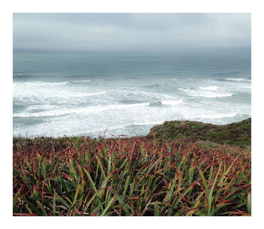
This was shot overlooking Montara Beach on the San Mateo Coast. I would often look for compositions of the beach and surf. Then one day I thought to myself "Why am I omitting these plants I always stand on?" So that's how this composition came about. Nothing complex to see here.

There was little processing done for this image. I could have pushed the colors or add more contrast but it all started to look contrived.  This is pretty much as it came from the camera.

Comments

11 comments
Comment posted by gary phillips on August 22, 2018 at 10:43 PM
I’m glad you did not push the color, Igor.  There is a certain rhythmic interplay between foreground, rough surf, and the lack of horizon due to the storm clouds.  I like it. The reds in the sea grasses compliment the blues very well. 
Registered on October 24, 2013, 185 Posts, 4136 Comments
Comment posted by Eva McDermott on August 23, 2018 at 1:02 PM
This looks wonderful just the way it is Igor.  I like the various hues of blue in the water.  The plant leaves serve as a nice lead in to the stormy sea.
Registered on January 4, 2009, 1015 Posts, 13229 Comments
Comment posted by Nick Bristol on August 24, 2018 at 10:21 AM
I just love the looks of the water and waves and how it fades into the distant mist and clouds. The colors look great to me as you have it. Nature knows best! cool Nick
Registered on February 1, 2004, 752 Posts, 14140 Comments
Comment posted by Richard Teller on August 24, 2018 at 4:47 PM
I really like the depth, colors and light of this image. I am just drawn into the image. For me the main subject is the ocean and fog so I think I would crop off some of the green of the sea grass on the bottom so the ocean is high lighted even more.
Registered on August 23, 2010, 1162 Posts, 6692 Comments
Comment posted by Igor Doncov on August 25, 2018 at 12:24 AM
Richard, 

I guess I kind of liked that grass on the bottom and gave it considerable emphasis. But I do see your point. Since this was a vertical there was space available both above and below the image. Here is a crop that gives more attention to the see and less to the 'grass'. I'm interested to know what people think.
Registered on November 22, 2014, 189 Posts, 2733 Comments
Comment posted by Ed Lowe on August 25, 2018 at 2:49 PM
I am a little late to the show, but I think I would like something in between the original and the crop, Igor. For me a crop of about a third from the bottom looks right. Anyway, really nice mood and light and I particularly like the horizon fog along with the mystery it imparts.

Ed
Registered on February 7, 2004, 414 Posts, 7115 Comments
Comment posted by Harley Goldman on August 25, 2018 at 5:47 PM
This turned out quite nice. Nice flow between the grasses, hills and ocean. Colors look spot on. I think I am with Ed on the crop. Maybe something in between. But that is getting nitty. Both versions work for me. 
Registered on November 19, 2003, 586 Posts, 11271 Comments
Comment posted by Mark Seaver on August 26, 2018 at 10:02 AM
Igor, this is a very inviting look at the ocean and the coast.  There's a fine contemplative sense with the balance between the grasses, the surging surf and the fading of the distant ocean into the misty sky.  For me the repost is more dynamic with the surf playing a stronger role than the grasses.  Both versions look good, depends on what mood you want to create.
Registered on January 23, 2011, 1103 Posts, 17270 Comments
Comment posted by Ian Cameron on August 26, 2018 at 10:21 AM
I really like the natural and hazy atmosphere created by the sea but even though there is nothing wrong with the rendition of the tangled grasses with the reddening tops.  I find there appearance overpowers that beautiful backdrop.  I think on the whole I would prefer their omission and/or a mellower foreground that is less of a distraction to the sea view above.
Registered on August 6, 2004, 1125 Posts, 3318 Comments
Comment posted by Doug Koepsel on August 26, 2018 at 12:16 PM
I like the change in detail from front to back, from sharp grass blades, to the waves and to the soft clouds, and also color of reds and green to gentle blue.  I prefer the repost since it places less emphasis on the grass and more on the waves and added clouds. The grass is still there though for foreground and depth.
Registered on April 1, 2010, 196 Posts, 1592 Comments
Comment posted by Anil Rao on August 27, 2018 at 8:38 PM
This picture offers a lovely mood - that of a desolate coastline and its inherent beauty. The inclusion of the foreground vegetation adds to that effect and for that reason I like your composition. The color palette and contrast  is soothing and adds to the grace that you have so successfully captured here.
Registered on November 15, 2003, 234 Posts, 4923 Comments