Nature Photographers Network
This is the preserved archive of the original Nature Photographers Network. The community continues at naturephotographers.network.
Nothing Left to Sell + R x2
‹ PreviousMan & Nature GalleryNext ›

Nothing Left to Sell + R x2

by Marylynne Diggs

Gallery: Man & NaturePosted July 5, 20182,529 views11 comments
Hi Folks,
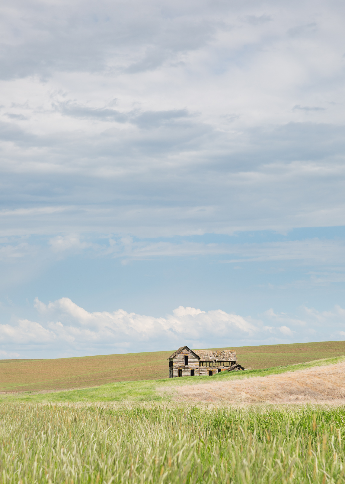
I found one more image that I thought my be worth sharing from my May trip to the Palouse.  At first nothing about this one felt very interesting, but then it kind of worked its way into my heart.  The color palette felt like an Andrew Wyeth painting, and the subject felt similar to his painting "Public Sale."  So, in homage to him, I named this Nothing Left to Sell. 

Let me know if it works for you (with or without title and explanation). As always, I gain clarity and inspiration from your thoughts and suggestions.
ML

Comments

11 comments
Comment posted by Jake Alletson on July 6, 2018 at 1:17 AM
Wow!  What a powerful story this seemingly simple image tells us.  Perhaps the cloudy sky could be made a little more powerful but that is a minor nit.  However, the story comes through anyway.
Registered on May 3, 2016, 12 Posts, 163 Comments
Comment posted by Mark Seaver on July 6, 2018 at 11:39 AM
Marylynne, this does a great job of capturing, the rolling land, a bit of history, and the big sky of the Palouse (or any other high prairie).  While you could tone down the overall brightness just a bit for some extra pop, this does a very good job of capturing the bright open feeling of the prairie.  The abandoned farm is the story of much of the rural western USA.
Registered on January 23, 2011, 1103 Posts, 17270 Comments
Comment posted by SandyRichardsBrown on July 7, 2018 at 6:36 PM
Very appealing image, and a very sad commentary on the demise of  US farms and farming.  
Sandy
Registered on November 24, 2003, 3937 Posts, 12909 Comments
Comment posted by Marylynne Diggs on July 8, 2018 at 12:33 AM
Hi Folks,
Thanks for the feedback on this one.  I have added some contrast and saturation to the sky, a bit more than I think is advisable, but I would love feedback on that.  I think something in between the two might be best for the sky.  I wanted to keep it someone light and airy, as if the investment were evaporating, but perhaps I'm taking the story and the A. Wyeth parallels too far.
ML
Registered on December 14, 2010, 122 Posts, 1034 Comments
Comment posted by John Tobias on July 9, 2018 at 10:13 PM
I must admit I have not spent much time in the gallery, but very pleased that I found your image of the old home.I see why you refer this to Wyeth, it does have that feel to it.  I like both versions, but tend to favor the second one.  A story telling photo.  Did you take any horizontal photos of this scene?  I wonder how this would look as a horizontal scene, maybe even a pano.  Thanks for sharing.
Registered on September 12, 2009, 2120 Posts, 6455 Comments
Comment posted by Marylynne Diggs on July 11, 2018 at 7:36 PM
Thanks for commenting, John.  I do have a couple of horizontal crops, but only one from a similar angle as the first.  Here it is for comparison and further suggestions. 

There were a couple of challenges with going horizontal: the road goes by to the left, and because of the brown patch of grass, I felt like the image should face left, so to speak.  The other issue was the stringy clouds.  I struggled to to find clouds that worked at the top of the image, so letting them evaporate up there made more sense.  Maybe it is because of the crop, but the house feels less alone in this version.  Do others get that feeling?
ML 

 
Registered on December 14, 2010, 122 Posts, 1034 Comments
Comment posted by Stephen Stanton on July 13, 2018 at 1:56 PM
I'm glad I ran into this one, MaryIynne. I think your original posting is the best. I thought the soft pastel colors needed some vibrance or saturation, but after viewing the revisits  the soft effect works best for me. The slightly OOF in the  foreground works nicely and brings the house structure into even more prominence. The vertical image placing the house under the bigger sky is more effective and tells the story of time and change on the prairie.  
Registered on March 1, 2015, 54 Posts, 453 Comments
Comment posted by Igor Doncov on July 21, 2018 at 7:50 AM
The horizontal is the ticket for me. The colors seem a bit softer and the house is bigger.
Registered on November 22, 2014, 189 Posts, 2733 Comments
Comment posted by Eva McDermott on July 25, 2018 at 12:45 PM
I really like the horizontal version Marylynne.  The soft pastel colors are delightful.
Registered on January 4, 2009, 1015 Posts, 13229 Comments
Comment posted by Marylynne Diggs on July 25, 2018 at 11:09 PM
Thanks for all of the feedback, everyone.  I can see the split between vertical and horizontal appreciation here.  I am doing one more horizontal (I have a real problem with the cloud at the top edge and the cut off cloud on the left in the horizontal images).  In this one, I cropped lower and did some work to the cloud on the left, but I'm thinking the clouds are still a problem.  Any thoughts on whether they distract you all would be much appreciado!
ML
Registered on December 14, 2010, 122 Posts, 1034 Comments
Comment posted by John Tobias on August 13, 2018 at 5:15 PM
Thanks for posting the horizontal images.  I think both are fine, but tend to like the second one best.  I do like the horizontal format over the vertical.  Both formats are fine images.
Registered on September 12, 2009, 2120 Posts, 6455 Comments