Nature Photographers Network
This is the preserved archive of the original Nature Photographers Network. The community continues at naturephotographers.network.
Assateague Sunrise # 2 + repost
‹ PreviousLandscape GalleryNext ›

Assateague Sunrise # 2 + repost

by Ed Lowe

Gallery: LandscapePosted May 15, 20186,621 views7 comments
Nikon D800
Nikon 35-70 @ 70 mm
f 18 @ 2.0 sec.
ISO 100
cable release & tripod
Assateague SP, MD

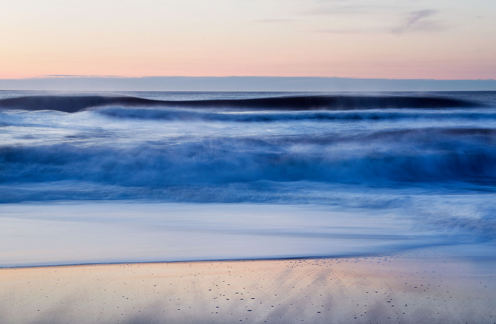
This image was taken a couple of minutes before my last post. In this one the slower SS has imparted a more impressionistic effect where as the other was a little more literal.

As always thanks for taking a look and leaving a comment or suggestion.

Ed

Comments

7 comments
Comment posted by Neale Dyster on May 15, 2018 at 11:24 PM
I really liked the other one Ed, but this one really grabs me, just love it!
Registered on February 19, 2008, 94 Posts, 738 Comments
Comment posted by Tim Gregory on May 16, 2018 at 3:00 AM
I like it, things like this can often be hard to get right, but it works for me 

On a technical note, it looks like the horizon is suffering from a little distortion - with images like this I think it's critical for the horizon to be absolutely perfectly straight, it should be easy to remove in C1 or LR with the distortion removal tools :) 
Registered on October 8, 2008, 24 Posts, 26 Comments
Comment posted by Craig Moreau on May 16, 2018 at 10:45 AM
Very nice, Ed. There is a lot of nice layering to this, and the shutter speed does lend an impressionistic feel, as you say. I love the colors and texture in the foreground sand. The blues in the water are a little too saturated for my taste, but that is subjective.
Registered on April 21, 2015, 64 Posts, 584 Comments
Comment posted by Mark Seaver on May 16, 2018 at 10:18 PM
The symmetry with the sky colors reflecting nicely in the sand and the bold blue in between is quite striking, Ed.  This does a good job of capturing the "feel" of an East coast sunrise.
Registered on January 23, 2011, 1103 Posts, 17270 Comments
Comment posted by Michael Lowe on May 16, 2018 at 11:36 PM
Another fine seascape, Ed. Nice layering. I don't think the blues are too saturated. They suit my tastes just fine. As for the horizon, there is a very miniscule dip, but personally, I think it's impossible to see without putting a ruler on itdevil
Registered on February 11, 2004, 777 Posts, 5252 Comments
Comment posted by Ed Lowe on May 18, 2018 at 4:44 PM
Thanks for your thoughts guys. Here is a repost with Tim and Craig's suggestions of a little horizon distortion correction along with removing some of the blue in the water.

Ed
Registered on February 7, 2004, 414 Posts, 7115 Comments
Comment posted by Brian Schrayer on May 20, 2018 at 5:57 PM
This is very nice, Ed.  I like the soft quality to both the light and textures in this image.  The layering with the alternating light / dark / light also works.  This scene while it has distinctly literal elements takes on more of an abstract quality to my eye.  Nicely done!  devil
Registered on May 28, 2004, 114 Posts, 2890 Comments