Nature Photographers Network
This is the preserved archive of the original Nature Photographers Network. The community continues at naturephotographers.network.
Lobos Gems
‹ PreviousLandscape GalleryNext ›

Lobos Gems

by Igor Doncov

Gallery: LandscapePosted February 25, 201814,418 views20 comments
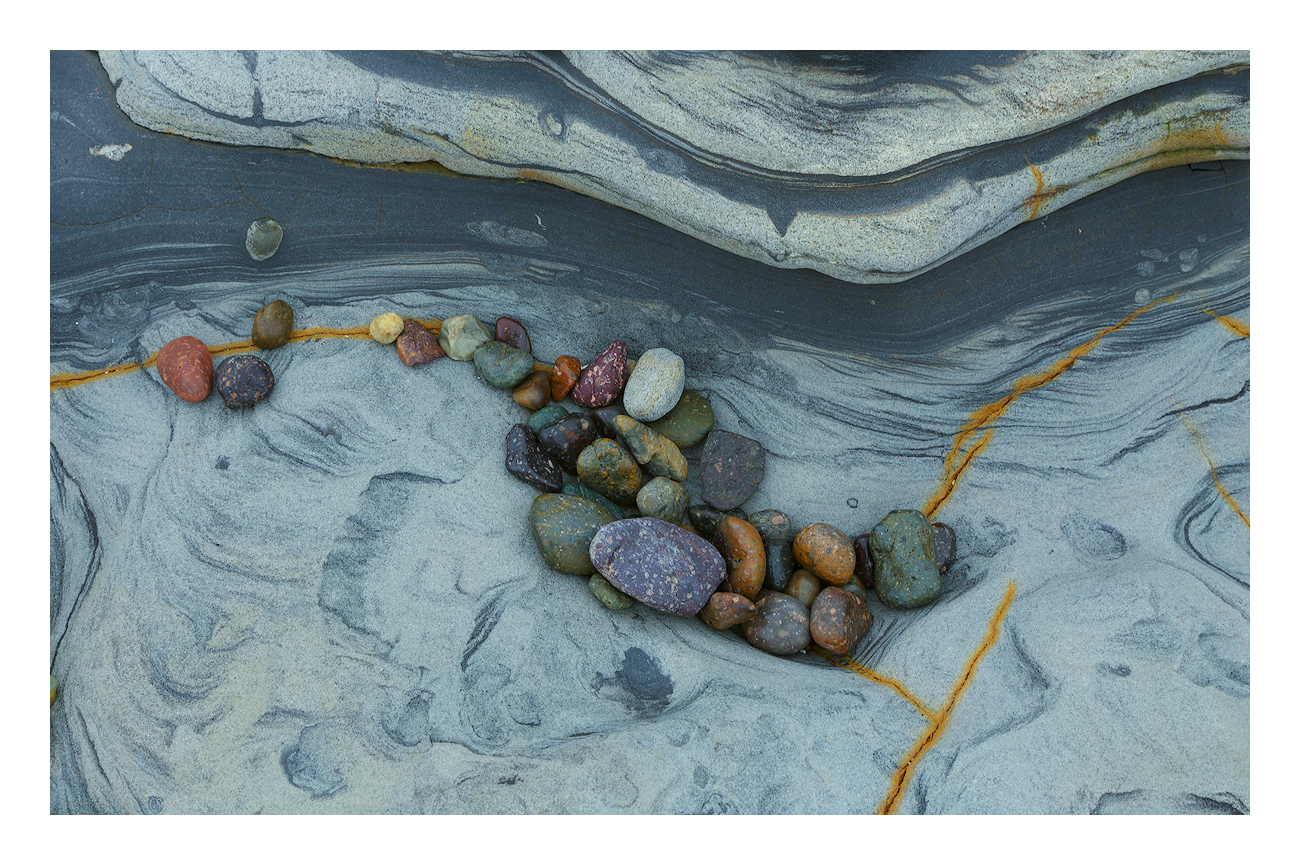
They say that the spirit of Edward Weston still resides at Weston Beach. During high tide he rearranges all the rocks below the surface for us to see during the receding tide. A workshop leader told us this story once and I've never forgotten it. 

This place has some wild patterns and colors. I went with the flow and kept the colors vibrant.

Canon 6D, 24-105@85mm, f/16, ISO 100, 1/13 sec, tripod

Comments

20 comments
Comment posted by Harry Lichtman on February 25, 2018 at 6:36 PM
Beautiful find.  I see several crop options- a tighter horizontal and even a vertical with those central rocks as a focal point. But your crop looks fine as is.  There does seem to be a slight cyan or blue cast which may be natural for that rock, but I might try reducing it a little if you have tried that to see if you like the results - might make the other elements brighter and pop more.  The yellow streaks very cool too.
Registered on September 17, 2010, 304 Posts, 3507 Comments
Comment posted by Doug Koepsel on February 25, 2018 at 6:56 PM
Igor, this is very interesting and visually appealing to me.  Nice composition, shapes and colors. Maybe try just a couple points more of brightness and contrast if it suits your taste. 
Registered on April 1, 2010, 196 Posts, 1592 Comments
Comment posted by Ry Birge on February 25, 2018 at 7:33 PM
Cool pic Igor.  I like the comp. Try turning the frame so the gray streak is along the diagonal.  I think this might improve the flow.  Keep up the good work
Registered on September 23, 2017, 118 Posts, 278 Comments
Comment posted by Dave Dillemuth on February 25, 2018 at 8:00 PM
Exceptional abstract, Igor. The rock has great flowing lines and color, and the assortment of various colored stones make for a strong focal point. Try as I might, I can't think how to improve this. Nicely seen.
Registered on December 10, 2015, 104 Posts, 1112 Comments
Comment posted by Bill Leggett on February 25, 2018 at 8:47 PM
Delightful image, Igor. I lke how the rocks follow the curve of the shelf above. 
Registered on July 21, 2004, 706 Posts, 3233 Comments
Comment posted by Paul Breitkreuz on February 25, 2018 at 11:24 PM
A wonderful image, Igor. I really like this type of scene and this composition works well for me.
I do agree with Harry on the blue/cyan cast. I think if that was removed or dropped a bit those colorful stones and the iron-ore trails would really pop.......laugh
Registered on February 25, 2006, 525 Posts, 8448 Comments
Comment posted by Igor Doncov on February 26, 2018 at 12:16 AM
Harry and Paul -

The cyan color was a change I purposely made using the LAB mode of PS. I liked it over the original color scheme that was shot using daylight color temps. These rocks have been photographed quite a bit by photographers. I found one on a wall in South Lake Tahoe one year. The images are almost always shot with more subdued colors and the blue/grey combination. I liked this cyan interpretation quite a bit more than blue but that's just me. I was less interested in a faithful color representation than a color composition that was slightly different. This is closer to the original which was still more grey:

Harry -

I like the vertical crop suggestion (actually square). However, it would make the pebbles larger and more prominent making the image about them. I prefer this comp because they are part of the whole. Another words I want the eye to wander a bit more. 
Registered on November 22, 2014, 189 Posts, 2733 Comments
Comment posted by Peter Richter on February 26, 2018 at 1:17 AM
Igor, this is a convincing presentation of the scene and an interesting abstract for me. I was sure at first sight that your color treatment was intentional, as part of the artistic process creating a wonderful piece of subjective nature photography.

One minor suggestion - the yellow area the top right draws my attention at bit too much. Maybe reducing its saturation or even cropping it might help. But this is just my personal opinion of course.

Thanks for sharing!

Peter
Registered on November 10, 2010, 218 Posts, 2723 Comments
Comment posted by Ian Cameron on February 26, 2018 at 7:04 AM
Possibly a little rich in colour for my personal taste but I love the rocks and the lichen separators
Registered on August 6, 2004, 1125 Posts, 3318 Comments
Comment posted by Mattia Oliviero on February 26, 2018 at 8:51 AM
Really like this abstract, Igor. The colors of the rocks also for me can be enhanced a little. 
Registered on August 24, 2016, 43 Posts, 254 Comments
Comment posted by Kah Kit Yoong on February 26, 2018 at 6:32 PM
Nice find Igor. I think the colour balance is good in the first post, the coloured rocks standing out nicely from the cool background.
Registered on September 27, 2006, 636 Posts, 10682 Comments
Comment posted by Wayne Jones on February 26, 2018 at 11:12 PM
Lovely composition as is, and like the original post.  Your processing conveys an early morning feeling that I find calming.  The point about that rusty spot in the URC does make sense, but I don't think it ruins the composition.  I would be inclined to go with what Nature provided, but if you are inclined to alter the scene a bit, with such a minor change, that would not be so bad.  Either way, this is beautiful.  Well seen!
Registered on April 18, 2007, 953 Posts, 6435 Comments
Comment posted by Harley Goldman on February 27, 2018 at 9:26 AM
This is outstanding, Igor. Beautiful colors, shapes and textures. I agree with the thoughts to play with the cyan level. Not sure a change would improve it, but it would probably be worth a look. I like this a lot. One of my top favorite Doncovs.

P.S. Just noticed the repost. I prefer the repost/alternative. That is very much a personal preference, of course. 
Registered on November 19, 2003, 586 Posts, 11271 Comments
Comment posted by Bill Chambers on February 27, 2018 at 2:51 PM
Lovely pale blue "base" color in this and then so many different color variations in the pebbles. I really like the flow of the darker strip the upper part as well as the patterns/textures in the pale blue bottom part.  Well seen and captured Igor.
Registered on April 10, 2005, 753 Posts, 21216 Comments
Comment posted by Ed Lowe on February 27, 2018 at 9:16 PM
This really comes alive when opening the large version, Igor. I love the textures and color, but what completes the image for me is the graceful curve of the rock structure along the top edge. Looks like Edward Weston was hard at work. Great eye to spot this beauty.

Ed
Registered on February 7, 2004, 414 Posts, 7115 Comments
Comment posted by Kathy Barnhart on February 28, 2018 at 12:17 AM
This is a great image from one of my favorite places. I like the view that you have taken here and I like that you didn't just try to make it "realistic." The gold line on the bottom right does compete for attention and I might try to burn it a little, especially at the edge. I prefer this one to the second one you posted, though the gold line doesn't stand out as much in the second one. Very nicely seen.
Registered on November 11, 2011, 404 Posts, 1639 Comments
Comment posted by Igor Doncov on February 28, 2018 at 12:58 AM

One minor suggestion - the yellow area the top right draws my attention at bit too much. Maybe reducing its saturation or even cropping it might help

Peter, I agree with you that it's not optimal. I've tried dropping the yellow saturation and/or luminosity and it starts to look like mud. The original has that area like that where the same problem occurs. Cropping is out of the question as the comp starts to break down (horizontals are compromised and yellow entries are lost from the side). When and if I figure how to fix it to my satisfaction I will do so. I agree with you that it's a weak point in the image.
 
Registered on November 22, 2014, 189 Posts, 2733 Comments
Comment posted by Lucy VanSwearingen on March 1, 2018 at 12:11 AM
I love the color and arrangement of the cobbles!  Very nice crying I do tend to favor the second post.
Registered on May 23, 2009, 800 Posts, 2042 Comments
Comment posted by Mark Seaver on March 3, 2018 at 4:24 PM
This is a beautiful, small scene, Igor.  Perfect, especially with those tiny orange stripes.  (Now I see I need to add a couple of magic markers to my kit...sad)  I prefer the hint of green in the original as I think that works better with all of the colored stones.
Registered on January 23, 2011, 1103 Posts, 17270 Comments
Comment posted by Anil Rao on March 7, 2018 at 3:44 AM
This is a beautiful image and has that familiar refined look that I have come to associate with your work. The composition is sophisticated -- simple but not too simple, with enough interesting elements for prolonged engagement. I find the color to be attractive and you have just the correct doze of contrast.

Really well done Igor.
Registered on November 15, 2003, 234 Posts, 4923 Comments