Nature Photographers Network
This is the preserved archive of the original Nature Photographers Network. The community continues at naturephotographers.network.
Abstraction
‹ PreviousWeekly Challenge GalleryNext ›

Abstraction

by scott lanz

Gallery: Weekly ChallengePosted January 21, 201811,318 views8 comments
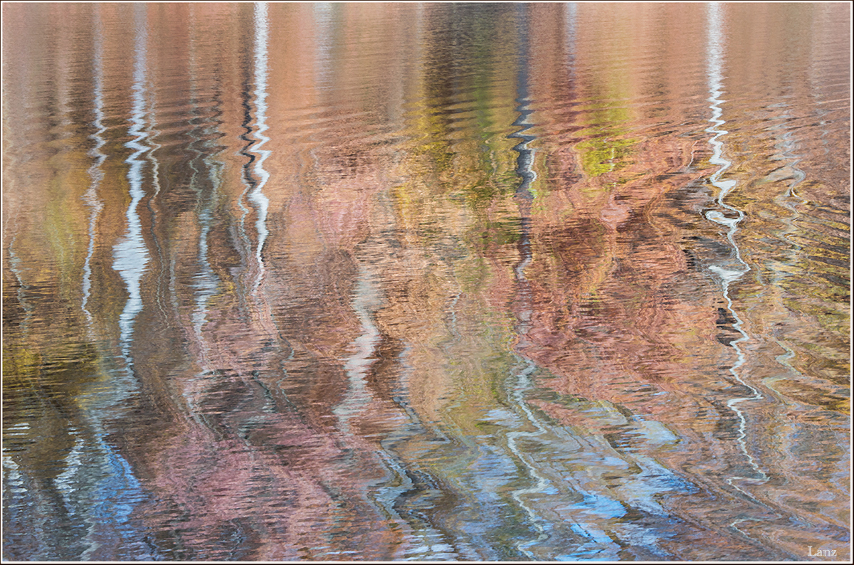
Like Mark, I am a sucker for shooting abstracts. My favorite location is a small pond in the local park about a mile from home. I shot a bunch there mid-November last fall. It was well past "peak" color, but there was nice light and the water picked up the remaining color in the surrounding trees, leaves, and hillsides. The intermittant winds made varying abstract patterns. D600, 80-400 @ 185 and f22, 1/100, f22, tripod. Suggestions and other comments welcome. 

Comments

8 comments
Comment posted by David Schoen on January 22, 2018 at 1:05 AM
Good color and the transition from upper third of image to lower 2/3 is real nice.
Registered on November 6, 2006, 1213 Posts, 4587 Comments
Comment posted by Mark Seaver on January 22, 2018 at 9:47 AM
The colors are lovely, Scott.  It's always fun to see how much color appears in a reflection when the actual colors seem muted.  The transition from nearly still to very agitated is great.  As a very different image, I could also see this with the still portion cropped off and the rest flipped for a very impressionist landscape.
Registered on January 23, 2011, 1103 Posts, 17270 Comments
Comment posted by John Tobias on January 22, 2018 at 10:55 PM
I like the soft colors of this image, but also wonder what it would be like with about the top third taken off.  Thanks for sharing.
Registered on September 12, 2009, 2120 Posts, 6455 Comments
Comment posted by Catherine Reilly on January 23, 2018 at 1:32 AM
Hi Scott,
I sure like the colorful pastel palette in this image! The cool, sky blue reflection at the bottom looks wonderful among all the warm tones. Also the contrast between the straight lines of the tree trunks and the water swirl pattern works very well. 
To cinch the "abstract", it might be nice to lose a little of the top- not much, maybe an inch; and to re-proportion the image, if you want to, my eye likes a little off the right side rather than the left. My thought is that the suggested crop takes most of the connection with "reality" away but still leaves a clue.
Registered on August 16, 2006, 603 Posts, 9192 Comments
Comment posted by Allen Brooks on January 23, 2018 at 3:14 PM
The colors and patterns in the water makes for a very pleasing abstract.  Well done.
Registered on July 27, 2011, 262 Posts, 2597 Comments
Comment posted by Norma Tareila Matl on January 24, 2018 at 10:39 AM
Yes Scott, I agree abstracts are so much fun! Working with beautiful light and capturing it such unpredictible and yet amazing stuff. Your image looks like and artist paint brush vertically swirling the colors of light from bottom to top. Wonderful capture!!!
Registered on October 27, 2016, 229 Posts, 393 Comments
Comment posted by Dennis Plank on January 26, 2018 at 1:40 PM
A sweet image, Scott. I really like the pastel palette and the curves.  Did you experiment with a vertical flip?  It might look like a Dali-esque lolipop scene.
Registered on January 28, 2008, 1767 Posts, 23192 Comments
Comment posted by scott lanz on January 26, 2018 at 2:16 PM
Thanks, Dennis. Actually, I did try a vertical flip before posting. Even ran it past my wife. She thought it made the image look top heavy, and I thought it was disorienting.  It is interesting how a photographer's own eye sees order out of chaos because the scene was orderly when it was taken.  This is often why images may seem much busier to strangers than to the photographer who took the photo. When I flipped this one, it seemed plain weird and disorienting since my mind did not remember it this way and I was not used to seeing it this way, though it probably would not seem much more abstract to others.  
Registered on November 14, 2003, 840 Posts, 12902 Comments