Nature Photographers Network
This is the preserved archive of the original Nature Photographers Network. The community continues at naturephotographers.network.
Filling the Hollows
‹ PreviousLandscape GalleryNext ›

Filling the Hollows

by Preston Birdwell

Gallery: LandscapePosted December 15, 20179,127 views12 comments
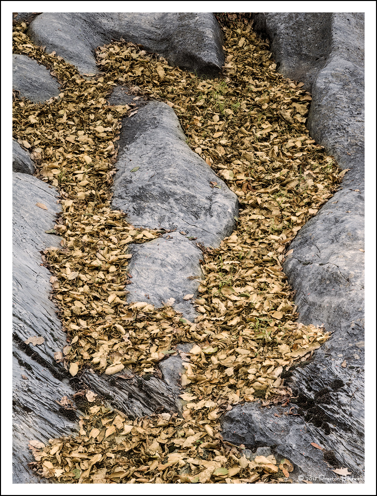
I found this intriguing rock formation in Columbia with the hollows filled with Autumn leaves.

In particular, I am curious what you think of the color of the dry oak leaves. Suggestions are welcome.

Nikon D-7100
Nikkor DX 16-85 @ 68mm
4-image stack; f-8 @ 1/20, ISO 160
TK's masks and some selective warming.

Please see the large version. Thanks!

Thanks for your comments on my previous image, and I will appreciate your comments on this one, too. cool
--P

Comments

12 comments
Comment posted by Igor Doncov on December 15, 2017 at 7:44 PM
Very nice composition, Preston. This works as an intimate and as an abstract. The colors are very restrained but realistic. This needs to be seen in the large version which has a glow to it that the other lacks. I think that it's this luminosity that I like most about this image. The image jumps out at you. One of your recent best.
Registered on November 22, 2014, 189 Posts, 2733 Comments
Comment posted by Harley Goldman on December 15, 2017 at 7:51 PM
Nice take of Sleepy Hollows in Columbia. Well seen and composed. I would be tempted to ramp up the vibrance on the image, which is really just on the leaves. Looks nice as presented, but strikes me as a little flat. Good take. 
Registered on November 19, 2003, 586 Posts, 11271 Comments
Comment posted by Stephen Stanton on December 16, 2017 at 1:33 PM
The image is beautifully balanced. The oak leaves show their natural but somewhat drab color.
Registered on March 1, 2015, 54 Posts, 453 Comments
Comment posted by Paul Breitkreuz on December 16, 2017 at 2:03 PM
Preston, I really like this one. Always a big fan of rock formations in general, but the unique ones are a big draw for me. One can wander around mentally with interpretations of what they might look like or represent. But that is all subjective in personal thoughts there. On a basic view I especially like how the leaves here are bordered all around and then seemingly have an outlet at the base of the image. That adds a bit more to the wandering impressions or thoughts on the scene. Very cool.....laugh

I might dampen down the brightness very slightly. All kinds of choices on that process, just seems slightly bright to me. Also slight boost in sat/vibrance maybe?.....enlightened
Registered on February 25, 2006, 525 Posts, 8448 Comments
Comment posted by Lon Overacker on December 16, 2017 at 2:37 PM
Preston,

This is excellent! I think this is composed perfectly and I really like the balance between the rock (same marble stone as previously?) and the oak leaves.  There's a nice flow to this top to bottom, bottom to top.  One of my first impressions or observation was that this is like a negative or inverse of your previous image.  Previous image had the marble stone as the main focus and the leaves were the accent fill.  Here, although there's nice balance between the rock and leaves, for me, the flow of the leaves is the main story and the stone is the supporting cast.  Not sure if that makes sense.

Very little suggest - perhaps burning down the rock on the middle right edge, but that's minor.

Regarding the color of the leave, they look like I think they might look - given the assumption these have been on the ground for a while, or a case where the leaves on the tree went straight to brown (like we saw in many of the oaks in Yosemite this year.) Could you squeeze some pop or color out of this, I suppose you could, but I would be wary of letting those little green blades of grass to neon on you. ;-)  

This is wonderful and beautifully seen!

Lon
Registered on November 24, 2006, 521 Posts, 19147 Comments
Comment posted by Michael Lowe on December 17, 2017 at 3:03 AM
The composition is what I like most about this image. Nice flow throughout. The leaves seem a tad flat to me but certainly not enough to keep me from enjoying this well seen image.
Registered on February 11, 2004, 777 Posts, 5252 Comments
Comment posted by Ed McGuirk on December 17, 2017 at 10:07 AM
Preston, I really like the visual flow you have achieved in this image, this composition is very well thought out. It does almost look like a waterfall of leaves flowing out of the bottom of the frame. I think the color of the leaves is fine, to punch that up risks drawing too much attention to them, while I think the pleasing arrangement of rocks is what the viewer should be focused on.
Registered on November 29, 2017, 19 Posts, 260 Comments
Comment posted by Ed Lowe on December 17, 2017 at 6:45 PM
This has such a wonderful flow and balance to it, Preston. Color wise everything looks very natural to me. I think this is a scene a lot of us would not have noticed, but I am glad you did.

Ed
Registered on February 7, 2004, 414 Posts, 7115 Comments
Comment posted by Kah Kit Yoong on December 17, 2017 at 6:51 PM
Love the composition Preston, or river of leaves among the curves of those rocks. A lot warm tones throughout the scene, I'm wondering about going a touch cooler in the rocks to complement the leaves.
Registered on September 27, 2006, 636 Posts, 10682 Comments
Comment posted by gary phillips on December 18, 2017 at 12:04 AM
This is really well seen, Preston.  I do agree with Harley that I would bump the luminance and the saturation a little.  It does have a subtle feel to it as presented that's very appealing.
Registered on October 24, 2013, 185 Posts, 4136 Comments
Comment posted by Craig Moreau on December 18, 2017 at 11:43 AM
I like this image a lot. The shape of the rocks is very interesting, and the contrast with the texture and color of the leaves is nice. The color of the leaves is perfectly natural to me, but I could see it punched up a little bit (maybe this looks better in my head than it would in reality).
Registered on April 21, 2015, 64 Posts, 584 Comments
Comment posted by Ed Williams on December 18, 2017 at 6:07 PM
Preston, my first impression on viewing the thumbnail was veins of gold. I really like this one for that reason. Nice fall photo, well seen to capture it. I could see a bit more vibrance added to this one as well.
Registered on December 28, 2010, 636 Posts, 3499 Comments