Nature Photographers Network
This is the preserved archive of the original Nature Photographers Network. The community continues at naturephotographers.network.
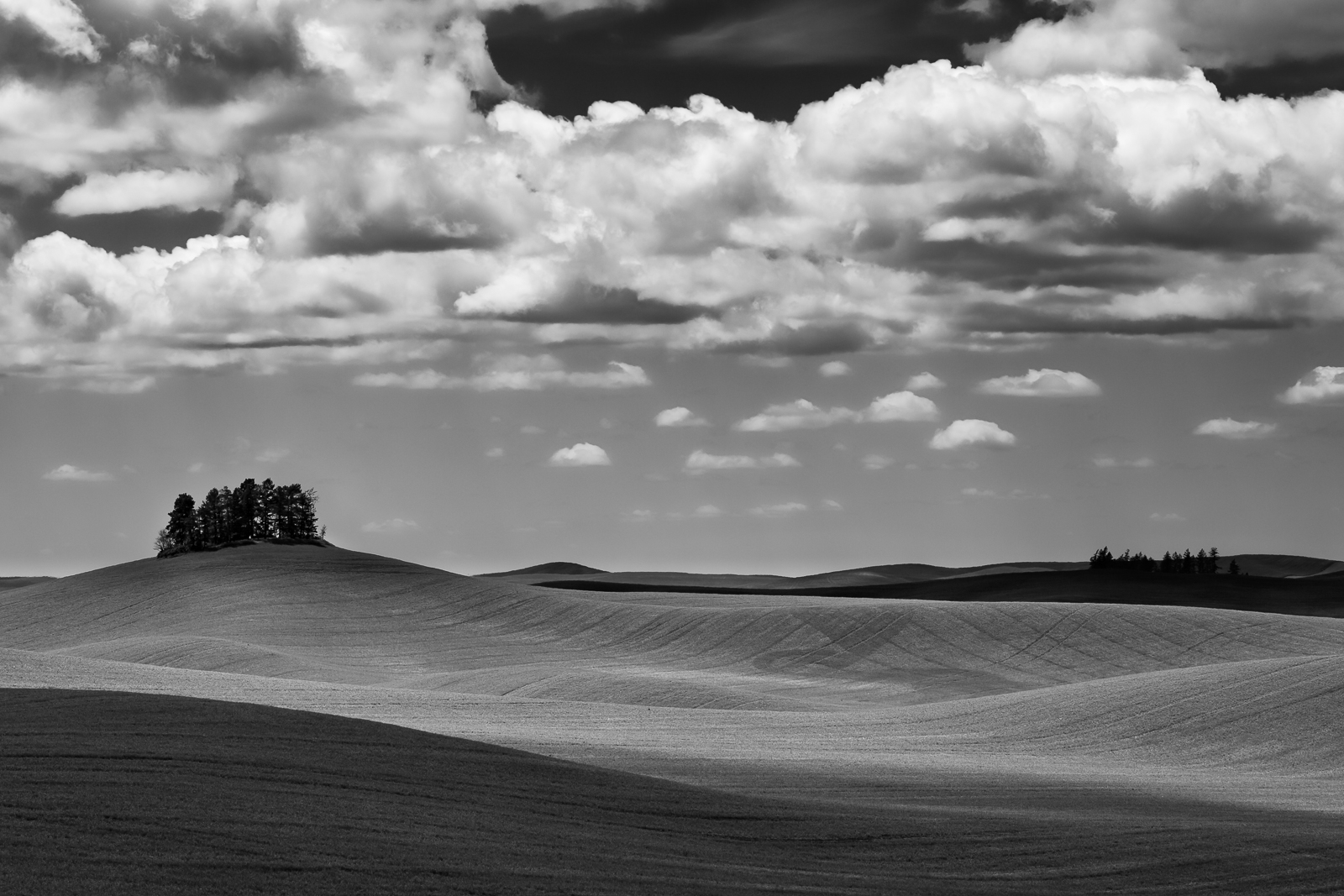
Palouse B/W Repost
‹ PreviousLandscape GalleryNext ›

Palouse B/W Repost

by Marylynne Diggs

Gallery: LandscapePosted December 12, 20172,070 views12 comments
Hi Folks,
I've been lurking a bit, posting feedback occasionally, but generally in a bit of a photographic funk for the better part of a year now.  I figured it might help to return to images from my last truly rewarding photography excursion and look for missed opportunities.  This is my first effort at that, a black and white conversion (using Silver Efex Pro) of a Palouse landscape.  While this location is typically rendered in color to exploit the greens, I'm returning to my love for black and white for a while.  

Let me know what you think and as always, feel free to offer suggestions for further processing.
Canon 5D3 with 100-400mm at 120 mm
ISO 200, 1/1000s, f/9

Comments

12 comments
Comment posted by Harley Goldman on December 12, 2017 at 6:36 PM
Real nice image. I like the B&W presentation, a totally different mood and impression than if it were color. Great tones and lines throughout. 
Registered on November 19, 2003, 586 Posts, 11271 Comments
Comment posted by Igor Doncov on December 12, 2017 at 7:52 PM
Nice layers created by hills and shadows. I would raise the blacks in the upper blue sky to be closer to the blues below the clouds.
Registered on November 22, 2014, 189 Posts, 2733 Comments
Comment posted by Philip Hodgkins on December 12, 2017 at 9:30 PM
I like the rolling and textured earth forms, as well as the tonal range thereof. I am ambivalent about the sky, but I can't think what might make it better. Perhaps just fooling around with it a bit tonality wise and sharpening wise?
Registered on July 24, 2006, 2741 Posts, 12349 Comments
Comment posted by Lon Overacker on December 12, 2017 at 9:51 PM
Marylynne,

Great take from the Palouse; I think the b&w here works wonderfully. Can't say I've ever seen a b&w rendition from this area. Kudos for holding back on the color.

I think there's great balance between the textured rolling hills, the gentle curves and layers, and the terrific sky. Great set of clouds.  At first, and from a distance, I thought the cluster of trees on the left was a butte or some rock formation - say from Monument Valley or something; but of course they're trees - And I think well placed in the frame and adds nice interest.

For me, I think the tonal range between the top sky and the sky below the clouds to be a little wide.  The clouds aren't influencing that much and from distance and perspective I wouldn't think the top area would be so dark.  Now, I love the contrast and these clouds are perfect for b&w.  But just for experimentation sake you might play around with lightening to tones up top - in combination with darker and more contrast below the big cloud line.  Just a thought and one person's opinion.

Lon
Registered on November 24, 2006, 521 Posts, 19147 Comments
Comment posted by Ed McGuirk on December 13, 2017 at 6:29 AM
I think a B&W treatment for this scene is very effective, given the textures and clouds that you had. The processing of the light and shadow in the land is very well handled, nice job. I'm really glad you chose to do this in B&W instead of color.

I would crop a bit off the bottom, enough so that the triangular shadow area on the left merges with the bottom frame edge a little more than halfway through the scene. I think this small crop places even more emphasis on the stands of trees and the textures in the fields. And I agree with Lon, the tonality difference in the sky above vs. below the clouds just doesn't look right. I think the sky tonality below the clouds, and the clouds themselves, are good. But the sky above the clouds is too dark to my taste, I would lighten it a bit.

 
Registered on November 29, 2017, 19 Posts, 260 Comments
Comment posted by Preston Birdwell on December 13, 2017 at 12:18 PM
It's nice to see you posting again Marylynne. I love the tones and textures here. The rolling hills are wonderful, and I like the clump of trees. I do agree with the comments about the tones in the open areas of the sky. Your conversion works very well.
--P
Registered on November 1, 2003, 471 Posts, 5188 Comments
Comment posted by Marylynne Diggs on December 13, 2017 at 1:30 PM
Thanks for the feedback, everyone.  I definitely went overboard on the blue/cyan sensitivity filters in Silver Efex.  I'll attach a color version below so you can compare and see how the blues differ. There is a haze at the horizon and brilliance above, but the Silver Efex treatment accentuated it too much.  I think I got the right balance now.  I did lose a tish of drama in the clouds in the process, but it doesn't have to compete with the dark mass of sky, so I think it still works, but I'm open to tweaking the clouds and rolling hills further if this version took too much contrast out of the mix.

I'm still debating on the crop.  I like the idea of diagonals for the foreground shadows, but I also like the way the lines cup the scene as is, so please: chime in with your thoughts on a crop from the bottom and whether that should scooch the trees to the right or left in the frame to keep the aspect ratio the same (or make it 12x20 instead of 4x6).

Thanks as always for your invaluable assistance in helping me get perspective. 
ML
Registered on December 14, 2010, 122 Posts, 1034 Comments
Comment posted by Marylynne Diggs on December 13, 2017 at 1:31 PM
And here is the color version for comparison:
 
Registered on December 14, 2010, 122 Posts, 1034 Comments
Comment posted by Igor Doncov on December 13, 2017 at 2:23 PM
Thanks for showing the color version. It seems like by going to b&w you gained with the sky but the color in the land was better in the color version. I think the repost is a definite improvement over the original. However, I would darken the sky below the clouds just a tad while brightening up the small clouds below the large clouds. I can see why you decided to try b&w for this image. The pale blue sky and wispy clouds didn't go well with the dramatic land.
Registered on November 22, 2014, 189 Posts, 2733 Comments
Comment posted by Michael Lowe on December 14, 2017 at 12:53 PM
Love your B&W take on this area. The FG is just mesmerizing with the lines and rolling hills. I would lighten the sky above the clouds, though.devil
Registered on February 11, 2004, 777 Posts, 5252 Comments
Comment posted by Craig Moreau on December 15, 2017 at 10:02 AM
The greens are beautiful in the Palouse, but I think that you made a great choice going with B&W here. The color version doesn't have the same appeal to me. The B&W repost looks good for the sky balance. I might try a small crop off the top to eliminate the thin bands of cloud at the top edge of the center dark area.
Registered on April 21, 2015, 64 Posts, 584 Comments
Comment posted by Marylynne Diggs on December 21, 2017 at 1:41 PM
Thanks, everyone. I'm going through more of the Palouse images to look for other opportunities. 

Craig: I debated that thin wisp of cloud. Without the wisps, I felt like the clear sky became too semi-circular and drew the eye too much, whereas the wisps functioned like a vignette and pulled the eye back from the edge.  I might be overthinking it though, and the fact the you noticed this and I debated it suggests there is a distraction there.  I'll keep thinking about how to handle that.  

Thanks again to all.  I cannot do this without feedback, and I appreciate all suggestions and feedback every time I post.
ML
Registered on December 14, 2010, 122 Posts, 1034 Comments