Nature Photographers Network
This is the preserved archive of the original Nature Photographers Network. The community continues at naturephotographers.network.
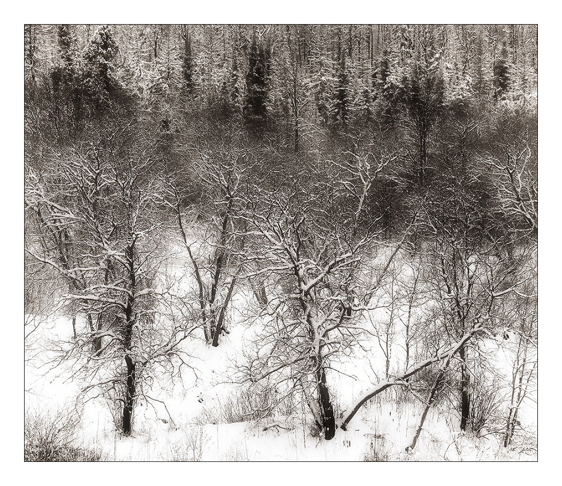
Winter in the UP +Toned
‹ PreviousLandscape GalleryNext ›

Winter in the UP +Toned

by Nick Bristol

Gallery: LandscapePosted December 10, 201716,001 views18 comments
This picture is one I made 3 or 4 years ago while on a winter trip in Upper Michigan. I was looking back for the original file so I could reprocess it for a print I want to make. Thought I would save a web version of it as well and post it here for any thoughts. I may have posted one back then or similar to it but I'm not quite sure, kind of seems like I did. Anyway this is a new version of that older image that I have ready for printing now. 
Canon 5D3 and 24-105L lens.

Comments

18 comments
Comment posted by Igor Doncov on December 10, 2017 at 6:27 PM
Wow! What incredible vision. This is really special. You had an excellent comp without the pines but the pines take it to another level. I bet this will be a good seller for you. I'm not sure if this is b&w but I would suggest trying to replace the blacks with very dark browns. It sort of looks that way to a degree. Just a fascinating composition.
Registered on November 22, 2014, 189 Posts, 2733 Comments
Comment posted by Preston Birdwell on December 10, 2017 at 7:46 PM
Ship it, Nick! This is simply gorgeous. All of the elements work very well together. No nits, here! Very nicely done!
--P
Registered on November 1, 2003, 471 Posts, 5188 Comments
Comment posted by Harley Goldman on December 11, 2017 at 12:25 PM
Beautiful winter scene!! Peaceful and cold!  Excellent stuff, Nick. 
Registered on November 19, 2003, 586 Posts, 11271 Comments
Comment posted by Harry Lichtman on December 11, 2017 at 1:54 PM
Fine image.  The comp and positioning of the trees makes them stand out well from the back ground.  Dark tones seem a little warm, might try adjusting the blacks with less yellow to see how that might affect the image.  Looks like a pencil etching in some ways, very nice.
Registered on September 17, 2010, 304 Posts, 3507 Comments
Comment posted by Richard Teller on December 11, 2017 at 3:07 PM
This is just a great image all the way around. I can see it very large on a wall. Very well seen and photographed. 
Registered on August 23, 2010, 1162 Posts, 6692 Comments
Comment posted by Lon Overacker on December 11, 2017 at 3:50 PM
Love this Nick! I love the arrangement of the trees - right down to the leaning/fallen trunks in the LR.  What I also find that works beautifully here is the somewhat elevated view. I don't think this would have as much impact if the viewpoint was closer to ground level. And just the perfect balance between the fallen snow and all the trees and branches.  Oh, the backdrop of snowy pines up top just really tops this one off.  Gorgeous image, no nits or suggestions. 

devil

Lon
Registered on November 24, 2006, 521 Posts, 19147 Comments
Comment posted by Nick Bristol on December 11, 2017 at 7:13 PM
Thanks guys for your thoughts and suggestions.
Igor and Harry, Thanks, I have versions pretty much just as you both mentioned but ended up liking this one best for a print. The full b&w version did not really work for me but I did like the version with the blacks more brown, but overall liked this one in between the two versions best.cool Nick
Registered on February 1, 2004, 752 Posts, 14140 Comments
Comment posted by Dave Dillemuth on December 11, 2017 at 8:51 PM
This is lovely, Nick. Really fine job composing and making order out of a chaotic scene. I'm with Harry that the blacks look a bit warm - almost like a toned image to me. I think stronger blacks would make this sing. Great work. 
Registered on December 10, 2015, 104 Posts, 1112 Comments
Comment posted by Ed Lowe on December 11, 2017 at 10:14 PM
Flat out gorgeous work here, Nick. Lots of details and textures in the large version which my eye can wander around and savor. No suggestions from me other than print it and enjoy.

Ed
Registered on February 7, 2004, 414 Posts, 7115 Comments
Comment posted by Craig Moreau on December 12, 2017 at 10:59 AM
I'm really enjoying this, Nick. I like the slight warm tone you have going on here, and the comp is just wonderful. I would love to see all the fine detail in this in a nice big print.
Registered on April 21, 2015, 64 Posts, 584 Comments
Comment posted by Anil Rao on December 12, 2017 at 11:00 AM
Superb photo Nick. A quiet but strong depiction of winter in the wilderness. The composition offers so many wonderful elements that are all working together in harmony. Something that is not easy to pull off in such a complicated scene. 

Photographs such as this one have a lasting effect on the viewer. One can't help but relect on the image long after the actual viewing has been completed. 
Registered on November 15, 2003, 234 Posts, 4923 Comments
Comment posted by Ed McGuirk on December 13, 2017 at 5:33 AM
Nick this is a great image, and I'm sure it makes a very stunning print. I also like the warm tone in the scene, it really works well for this scene.
Registered on November 29, 2017, 19 Posts, 260 Comments
Comment posted by Mark Seaver on December 13, 2017 at 9:28 AM
Nick, the starkness and the way that the shapes of the foreground trees are emphasized by the snow, makes this a very wintery scene.  Given the graphic detail, it's easy to see why someone would want a print.  I'm with Igor in thinking that sepia toning this would look good also.
Registered on January 23, 2011, 1103 Posts, 17270 Comments
Comment posted by Michael Lowe on December 14, 2017 at 1:06 PM
Igor's thoughts echo mine, esp. about the browns. Well done.devil
Registered on February 11, 2004, 777 Posts, 5252 Comments
Comment posted by Nick Bristol on December 14, 2017 at 5:22 PM
Thanks so much to all of you for your thoughts and suggestions on this one. I have a version here with more of the brown tone if anyone is interested in seeing it. Again thanks! Nick
Registered on February 1, 2004, 752 Posts, 14140 Comments
Comment posted by Igor Doncov on December 14, 2017 at 6:11 PM
I like it but it's a matter of taste. You might want to dodge that middle pine near the top. I'm not sure.
Registered on November 22, 2014, 189 Posts, 2733 Comments
Comment posted by Peter Richter on December 15, 2017 at 12:01 PM
Nick, there is a wonderful subtlety to your image for me. I enjoy the nicely balanced composition that leads me through the diverse layers, always keeping my attention within the frame.

Personally I prefer your first version. The comparison with the second one makes me think about a color version with moderately reduced saturation. But I am sure you presented the image after weighing up all the various alternatives. Thanks for sharing this wintry scene full of expression.

Peter
Registered on November 10, 2010, 218 Posts, 2723 Comments
Comment posted by Nick Bristol on December 15, 2017 at 12:35 PM
Thanks Igor and Peter. 
Peter, The first image is the one I'm printing from but I did have 3 version from full b&w to the brown tones and the middle one of the 3 is what the first post here is and I like it best too. Thanks. Happy Holidays to you and your family. Nick
Registered on February 1, 2004, 752 Posts, 14140 Comments