Nature Photographers Network
This is the preserved archive of the original Nature Photographers Network. The community continues at naturephotographers.network.
Standing at the Alder
‹ PreviousLandscape GalleryNext ›

Standing at the Alder

by Lon Overacker

Gallery: LandscapePosted December 5, 20179,575 views16 comments
Love the play on words... ;-)  First, thank you so much for your comments and observations on my previous image. And thanks as well to Preston and Mark for chiming in on the geology.

This one here starts a series of images mostly about trees, that may last til Christmas. (Great... I know what you're thinking...) angel

Still posting in chronological order from the trip to Yosemite with Harley and Kyle a month ago - in fact this was captured exactly one month ago.  After leaving the Bridal Veil area, we made a stop at a place most noted for it's views the the Three Brother's, somewhat famous peaks on the north rim of the valley.  But in typical fashion, I find myself looking down or ahead and as hard as it is, try to keep from looking up all the time in Yosemite Valley.

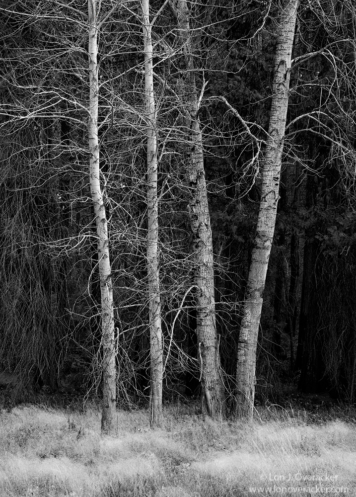
Just a simple stand of Alder.  I knew and only photographed this knowing this was to become a b&w. As it is with most b&w's, it's about tones and contrasts and I knew the bare trunks against the darker woods behind might work.

I'll be curious as to your thoughts, critiques and suggestions.  Didn't do much other than run this through the Nik plugin.  I cloned out a couple distracting white leaves and also dodged and burned the grasses to give them a bit more definition.

Single image at f/11 iso 200

Thanks!

Lon

Comments

16 comments
Comment posted by gary phillips on December 5, 2017 at 11:06 PM
This is beautifully seen Lon.  I love how this very symmetric clump of alders is framed against the dark backdrop.  I'm torn on the dark lower right being evened out a little or darkening the rest of background to match.  If you do nothing, it's still a crazy good image. Love it.
Registered on October 24, 2013, 185 Posts, 4136 Comments
Comment posted by Igor Doncov on December 5, 2017 at 11:54 PM
For something different I'm wondering how dropping the clarity slightly would affect this image. The reason I bring it up is because the image on the comments page started to look more interesting than the large version. I would keep the darks as is, however. Just something different to try.
Registered on November 22, 2014, 189 Posts, 2733 Comments
Comment posted by Peter Richter on December 6, 2017 at 1:23 AM
Lon, what makes this image special to me are the tangible details of the barks. This is indeed a "b&w scene" to me, I do not miss colors at all.

My only suggestion would be to open up the shadows  in depth of the forest at the right, I just wish to see some more details also there.

Peter

PS: it is somehow comforting to me that single shot images still work nowadays
Registered on November 10, 2010, 218 Posts, 2723 Comments
Comment posted by Mark Seaver on December 6, 2017 at 9:53 AM
Lon, what a difference the large version makes.  The small one seems very flat, but in the larger version, the alders and the grass really stand out.  The symmetry of the four and their separation from the background make this very attractive.  In contrast with Peter, I'd like to see the background on the left a bit darker to let the alder branches stand out a bit more.  (Yeah, NPNer's...they're never satisfied...enlightened )
Registered on January 23, 2011, 1103 Posts, 17270 Comments
Comment posted by Nick Bristol on December 6, 2017 at 10:58 AM
Lon, What a great looking b&w image. At first I though about bringing up the darkest shadows a little but then when I clicked on the black arrow in the detail box everything was right there. This is excellent when looking at the largest detailed view!! 

Nick Bristol
Lone Rock, WI.
Registered on February 1, 2004, 752 Posts, 14140 Comments
Comment posted by Harry Lichtman on December 6, 2017 at 7:41 PM
Crisp, stark, and lots of details to engage the mind.  Really had no suggestions until I saw the comments below, and then thought maybe either bringing up the levels on th lower right to match a little more closely the lower left, or tone down the left a bit to more closely resemble the lower right.
Registered on September 17, 2010, 304 Posts, 3507 Comments
Comment posted by Jim Hansen on December 6, 2017 at 10:22 PM
Love the simple arrangement of alders Lon.  I think the foreground grasses add a lot as well.  Nice B&W treatment.
Registered on May 5, 2011, 161 Posts, 908 Comments
Comment posted by Ed Lowe on December 7, 2017 at 9:27 AM
The large version is a must see to really enjoy this "simple stand of alder" Lon. First off great eye to spot this and visualizing this as a B&W. This has such a wide range of rich tones and the details in trees and the FG grasses are mesmerizing. I look forward to seeing more of your tree images as you do them so beautifully.

Ed
Registered on February 7, 2004, 414 Posts, 7115 Comments
Comment posted by Ed McGuirk on December 7, 2017 at 10:30 AM
Lon, this is a lovely B&W treatment of this scene, really outstanding job. The tonalities in the grass and the shadows are handled perfectly, leave the shadows just as they are. The texture in the bark looks wonderful as well. Just a simple stand of Alder, but this image has a lot of depth and character to it. Bring on the rest of your trees, I can't wait to see them.
Registered on November 29, 2017, 19 Posts, 260 Comments
Comment posted by Lon Overacker on December 7, 2017 at 12:21 PM
Thank you all for your comments and suggestions.  I've definitely been playing around with opening up the darker area on the right to at least bring out a little more detail.  I was wondering about that and you all confirmed, so thanks!
Registered on November 24, 2006, 521 Posts, 19147 Comments
Comment posted by Preston Birdwell on December 8, 2017 at 1:07 PM
This is lovely, Lon. The tones, especially in the Alders are spot-on. I do find the dark area on the right slightly distracting, so it would be a nice exercise to see if you can bring it up a notch. The grasses add a fine sense of scale. Well done, sir!
--P
Registered on November 1, 2003, 471 Posts, 5188 Comments
Comment posted by Harley Goldman on December 9, 2017 at 5:22 PM
My kinda image, beautiful!!!!! Channeling your John Sexton! I would not change a thing. 
Registered on November 19, 2003, 586 Posts, 11271 Comments
Comment posted by Bill Chambers on December 11, 2017 at 5:19 PM
As usual of late, I am very tardy to the party!  I like the choice of B&W here, Lon, but would love to the color version as well.  Very elegant in it's presentation and composition.  To me, the grass is a little too bright and seems to draw my eye downward away from the true subject matter, therefore I would suggestion burning that somewhat.  Other than that, I find myself really enjoying this.
Registered on April 10, 2005, 753 Posts, 21216 Comments
Comment posted by Anil Rao on December 12, 2017 at 11:05 AM
A very, very elegant photo. Simple and yet so complex. I especially love the darkness of the background. 
Registered on November 15, 2003, 234 Posts, 4923 Comments
Comment posted by Kah Kit Yoong on December 14, 2017 at 9:06 AM
I like very much the image as posted, the asymmetry in light levels of the background works for me and of course the way the subjects stands out from the background is a big part of the success of the photo.
Registered on September 27, 2006, 636 Posts, 10682 Comments
Comment posted by Jeffrey Sipress on December 15, 2017 at 7:38 PM
This is very effective and a pleasure to view.  Less is more!
Registered on February 17, 2004, 236 Posts, 1197 Comments