Nature Photographers Network
This is the preserved archive of the original Nature Photographers Network. The community continues at naturephotographers.network.
Ground Swell
‹ PreviousLandscape GalleryNext ›

Ground Swell

by gary phillips

Gallery: LandscapePosted November 29, 20177,495 views11 comments
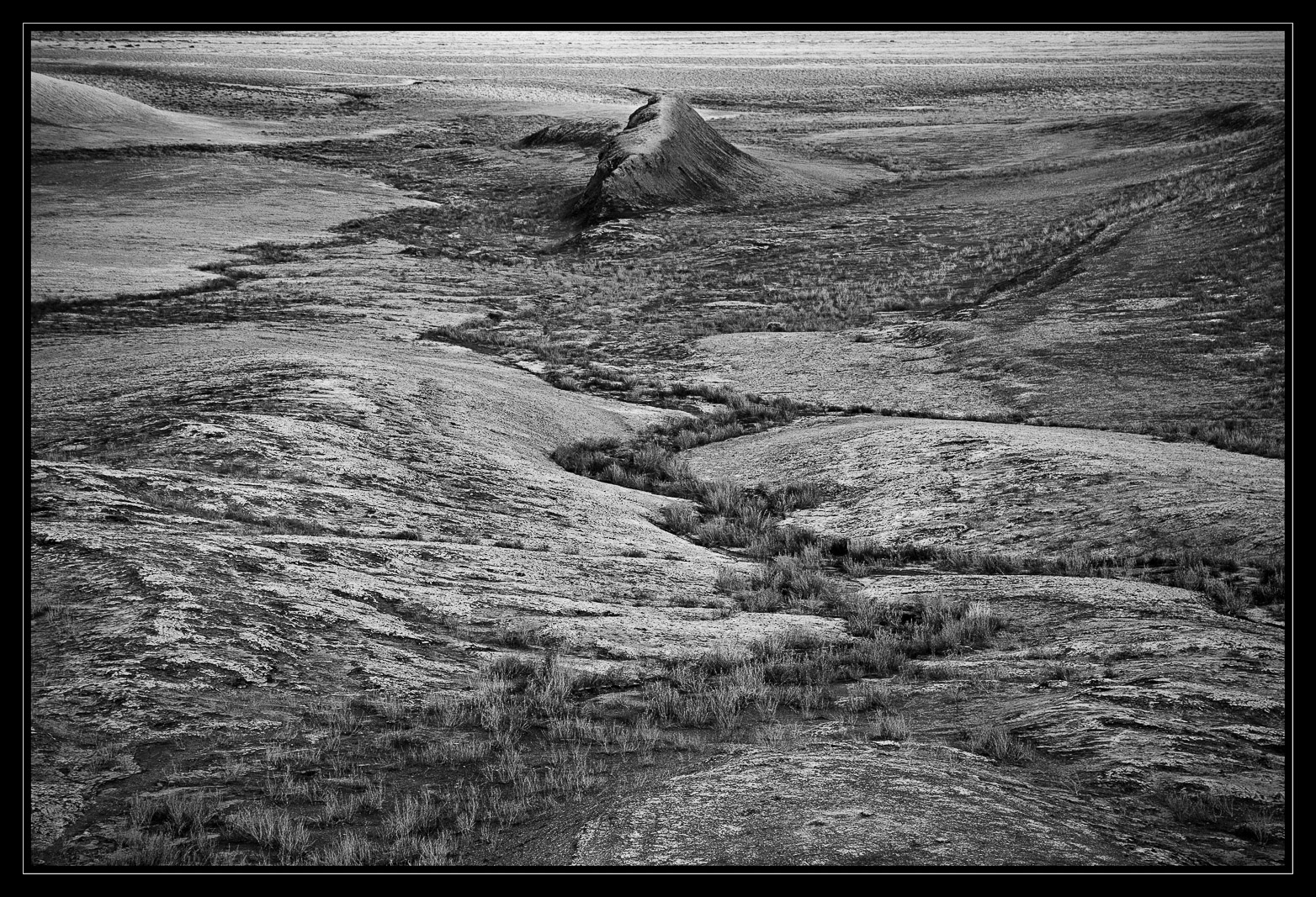
I was returning from a short hike from the Smoky Mtn Road near Page, when this scene unfolded as the last light faded away.  I have processed this several times over the last couple of years.  This version has held my interest, and short of posting more fog images, I thought I'd see what you guys think.  This image is in the same boat as Harley's rock image a week or so back, in that it's an image that I like a lot, but I'm not sure of it's appeal to others.

iso 100, 24-105 @ 88mm, f//8, 1/15s

Better large.

I would greatly appreciate your comments and suggestions.

Comments

11 comments
Comment posted by Kathy Barnhart on November 29, 2017 at 10:56 PM
Lots of texture going on here! I like the curvy line of shrubs leading up to the little (?) mound. It's hard to tell scale but that's not so important---it could be a grand vista or a little mini landscape. I do prefer the fog images, but not sure if I can say why. I guess they have more mood and intrigue for me.  I hope you are planning to do a book of all these wonderful black and white images of your area.
Registered on November 11, 2011, 404 Posts, 1639 Comments
Comment posted by Igor Doncov on November 30, 2017 at 3:32 AM
Your b&w images recently are not really abstracts but the medium and the subject always take you in other directions and seem suggestive. They're very open to interpretation. To me this suggests a fist coming out of the ground in a fairly violent manner. The composition is treating this as a landscape with a distant rock. If I had wanted the viewer to think of this as a symbol for a fist I would perhaps use a closer crop. Have you ever seen 'Planet of the Apes'? The last scene reminds me of this image. It's not the fact that Heston realizes the historical significance to the statue of liberty poking out the sand. It's the impact of the unexpected statue rising out of a beach seascape. The brilliant scene works at both levels. This image is like that imo.
Registered on November 22, 2014, 189 Posts, 2733 Comments
Comment posted by Dan Kearl on November 30, 2017 at 9:27 AM
This is a bit more straightforward than a lot of your  previous images.
Nice lead in, overall it appears a bit bland to me compared to a lot of your processing.
I think some burning for some darker tones would look nice,
Registered on September 2, 2013, 209 Posts, 1514 Comments
Comment posted by Mark Seaver on November 30, 2017 at 11:30 AM
Gary, I think the line of zig-zag grass leading to that small ridge works very well at creating a strong sense of depth and showing the erosion that created this landscape.  I'm finding the brightness of the small hills in the larger view too strong.
Registered on January 23, 2011, 1103 Posts, 17270 Comments
Comment posted by Harley Goldman on November 30, 2017 at 12:00 PM
Love this!  It definitely needs to be viewed large. I would consider burning the edge of the hill top left, but very minor stuff. My kind of image!!! 
Registered on November 19, 2003, 586 Posts, 11271 Comments
Comment posted by Harry Lichtman on November 30, 2017 at 1:08 PM
I like the textures a lot in this image.  Was thinking it might be better as a vertical shot with the grasses leading to the rock formation?  A gritty feel that works well for the subject.
Registered on September 17, 2010, 304 Posts, 3507 Comments
Comment posted by Ed McGuirk on November 30, 2017 at 1:50 PM
A nicely thought out composition, I love the symmetry you have achieved by placement of elements within the scene. It definitely looks much better in the larger size. And the dead center placement  of your background subject is the only way to go in this case. I agree with Harry, this would also work very nice as a vertical composition, which would put even more emphasis on the zig zag lines through the center of the image. I would also burn down the top of the frame a little bit, especially the mound in the upper left hand corner.
Registered on November 29, 2017, 19 Posts, 260 Comments
Comment posted by Craig Moreau on November 30, 2017 at 8:40 PM
Gary, this is a lovely comp, and like others, I like the zig-zag of grass leading down to that formation. Maybe I'm stuck in my thinking about your previous images, but I want to see this darker and moodier, especially since you mention it is "as the last light faded away".
Registered on April 21, 2015, 64 Posts, 584 Comments
Comment posted by Lon Overacker on December 1, 2017 at 3:29 AM
Gary,

This MUST be view large to be appreciated and get the full effect of this scene and image.  The ribbon of vegetation flowing through the landscape in the lower 2/3 of this image is remarkable.  Very interesting too because the b&w here is very successful, where as not so much with Doug's recent post where vegetation(trees) flowed through the landscape.  Not having seen the color, but again the tonal range is such here that the tones work beautifully to emphasize the ribbon of flow.

The top quarter or so of the frame is less compelling to me, but provides a very important element here. And that is scale. With that ridge up top - even though I have no idea of it's size, at least tries to tell me this is a broader landscape. Without the top, the bottom section could be a mini landscape of just a few feet wide, but putting these both together and I get a better sense of a bigger desert landscape.

This is no less compelling than your recent images and shows mastery of the landscape - and black and white.  Outstanding work.

Lon
Registered on November 24, 2006, 521 Posts, 19147 Comments
Comment posted by Dave Dillemuth on December 1, 2017 at 11:00 AM
Took awhile to orient myself to the scale of what I was viewing. While maybe not as dramatic as your fog images this is appealing on its own level. Great curvy leading lines bringing the eye into the frame. Processing looks great although I could see burning down the brightness along the top of the frame.
Registered on December 10, 2015, 104 Posts, 1112 Comments
Comment posted by Bill Leggett on December 1, 2017 at 10:19 PM
Well done as usual, Gary. Looks like a grand landscape, but the plants in the draw show the sense of scale. 
Registered on July 21, 2004, 706 Posts, 3233 Comments