Nature Photographers Network
This is the preserved archive of the original Nature Photographers Network. The community continues at naturephotographers.network.
Pastels
‹ PreviousLandscape GalleryNext ›

Pastels

by Ed Lowe

Gallery: LandscapePosted November 20, 20176,210 views16 comments
Nikon D800
Nikon 80-200 @ 200mm
f 18 @ 1/100 sec.
ISO 200
cable release & tripod
Acadia NP, ME

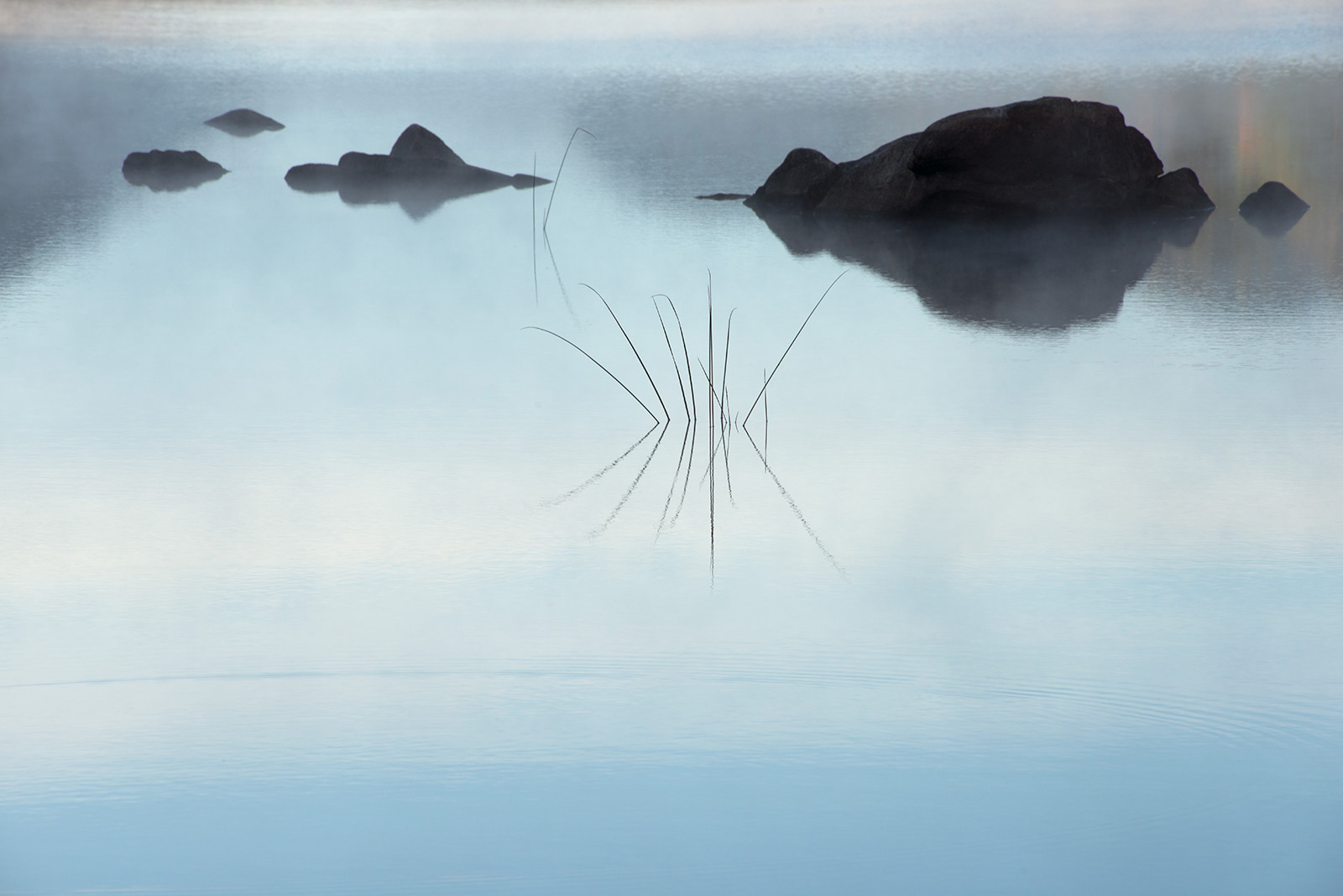
An early morning scene from Eagle Lake before all the mist burned off. The pastels in the image were what initially attracted me as they imparted a serene mood to the lake. I would have liked to get a little closer, but I was already zoomed out to 200mm so this is what I got. I thought about a crop, but decided to post it as is and see what everyone thought.

As always thanks for taking a look and leaving a comment or suggestion.

Ed

Comments

16 comments
Comment posted by Michael Lowe on November 20, 2017 at 11:50 PM
devilLove everything about this. The comp, the mist, the reeds, and the little splash of color in the UR. Initially, I was thinking crop, but decided I like the added visual interest of the ripples in the FG.
Registered on February 11, 2004, 777 Posts, 5252 Comments
Comment posted by Ed Williams on November 21, 2017 at 12:49 AM
This is a really nice, simple, clean and very moody scene Ed. Love it.
Registered on December 28, 2010, 636 Posts, 3499 Comments
Comment posted by SandyRichardsBrown on November 21, 2017 at 2:05 AM
Quite an interesting abstract - the ripples, reeds, mist, and colours really work well together.
Not so fond of the heavy black frame - to me, a light dark line around it would be enough frame, and not detract from the delicate image itself.
Really nice work!
Sandy
Registered on November 24, 2003, 3937 Posts, 12909 Comments
Comment posted by Lon Overacker on November 21, 2017 at 11:47 AM
Ed,

I guess if you're done with the Tarn images, I suppose I'll just have to enjoy something.... just as special!  Wow, Love this.  So simple, but with so much impact.  This comp is slightly unconventional with the heavy weighting up top and all that empty space below, but somehow it just works.  I think the slight ripple and the gradient of light and color coming up from the bottom really help with that space.  I really like the contrast between the delicate nature of the stalks against the heaviness of the rocks.

If I had one suggestion it would be to desaturate the little bit of color in the URC.  While I think the reflected color is neat, it just seems out of place for the overall presentation and impact of this scene.

Oh, I suppose you could have brought out your 8 ft ladder and elevated some to gain some separation.... but lacking that choice, I think this turned out just beautifully.

Lon
Registered on November 24, 2006, 521 Posts, 19147 Comments
Comment posted by Harley Goldman on November 21, 2017 at 3:59 PM
Simple, elegant and beautiful! Love it!
Registered on November 19, 2003, 586 Posts, 11271 Comments
Comment posted by Preston Birdwell on November 21, 2017 at 7:02 PM
This is wonderful, Ed. It has a quiet, mystical quality that I truly love. My only suggestion would be to clone the pair of stalks next to the rock. The color and contrast are excellent. Nicely done!
--P
Registered on November 1, 2003, 471 Posts, 5188 Comments
Comment posted by Bill Fach on November 21, 2017 at 11:28 PM
Ed: This is really well seen and presented. Exceptionally good photography IMO. >=))>
Registered on November 1, 2003, 1805 Posts, 26981 Comments
Comment posted by Kah Kit Yoong on November 22, 2017 at 2:34 AM
Beautifully tranquil and gentle. It's not too much of a distraction but I think cloning the top 2 reeds and their reflections would help accentuate the minimalist nature of this.
Registered on September 27, 2006, 636 Posts, 10682 Comments
Comment posted by Craig Moreau on November 22, 2017 at 9:27 AM
Ed, this is a nice, peaceful scene. I like the minimalist look of this. In an ideal world, more separation between grass and rock would be good, but that wasn't possible, and this works beautifully as is. If anything, I could see a small crop off the left to even up the "margins" to the outermost rocks.
Registered on April 21, 2015, 64 Posts, 584 Comments
Comment posted by Mark Seaver on November 22, 2017 at 10:50 AM
This is a lovely, mysterious (very dreamy) abstract, Ed.  The clean lines, open space and emphasis on the reeds in the center look great.
Registered on January 23, 2011, 1103 Posts, 17270 Comments
Comment posted by Dave Dillemuth on November 22, 2017 at 1:23 PM
What a peaceful scene, Ed. Has a very zen feel and beautifully composed simplicity. Beautifully presented. Only suggestion would be to slightly burn down the bright strip along the very top of the frame.
Registered on December 10, 2015, 104 Posts, 1112 Comments
Comment posted by Igor Doncov on November 22, 2017 at 1:56 PM
A very peaceful scene indeed. Love all that negative space. I feel that the blue band of color at the bottom is a bit too strong. If I crop it off the message is more consistent. I would either desaturate it some to match the upper region or crop it. 
Registered on November 22, 2014, 189 Posts, 2733 Comments
Comment posted by Harry Lichtman on November 22, 2017 at 3:27 PM
I like your take on this.  Does feel a little bottom heavy - maybe not getting closer but a little higher to keep the smooth area of the lake.  Not sure if tilting the camera up would have ruined the smooth part of the image.  Very meditative.
Registered on September 17, 2010, 304 Posts, 3507 Comments
Comment posted by Eva McDermott on December 1, 2017 at 6:23 PM
Very ethereal Ed.  Lovely color and excellent placement of all the elements in the frame.
Registered on January 4, 2009, 1015 Posts, 13229 Comments
Comment posted by Michael Lowe on December 3, 2017 at 10:22 AM
Congrats on the WP. Good thing you didn't sleep in like I did.
Registered on February 11, 2004, 777 Posts, 5252 Comments
Comment posted by SandyRichardsBrown on December 3, 2017 at 4:26 PM
Congrats on a fine WP!
Love everything about this.
Sandy
Registered on November 24, 2003, 3937 Posts, 12909 Comments