Gallery: LandscapePosted November 18, 2017190 views4 comments
Sony A77II
Sony 70-400G @ 330mm
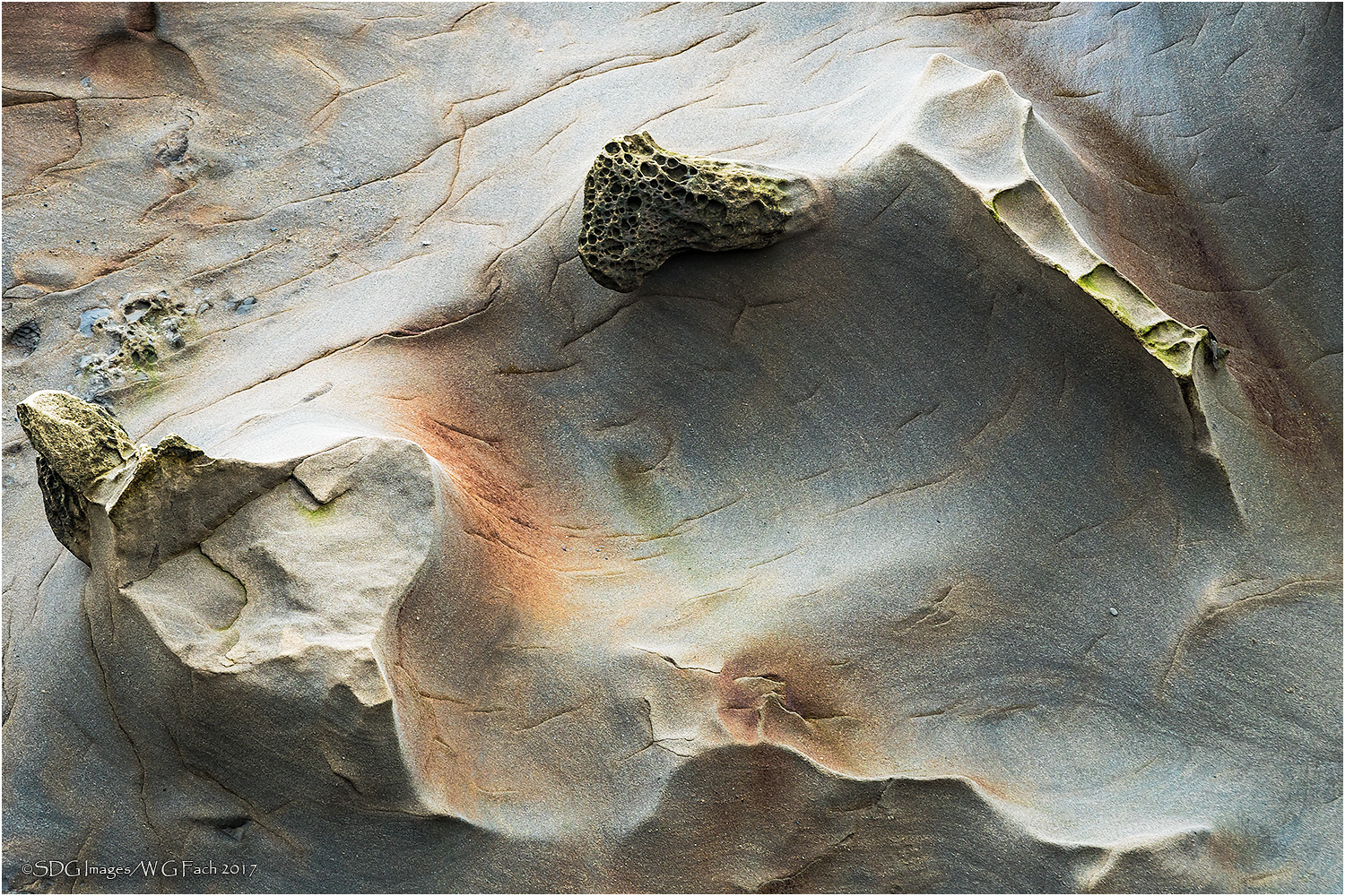
ISO 200, 1/60 @ f8 Shore Acres SP, Oregon
Another of my favorites from Shore Acres. All comments welcome.>=))>
Comments
4 comments
Comment posted by Harley Goldman on November 18, 2017 at 12:09 PM
Another cool rock abstract. Great shapes, lines and colors.
Registered on November 19, 2003, 586 Posts, 11271 Comments
Comment posted by Lon Overacker on November 18, 2017 at 1:50 PM
Bill,
While not quite as impactful as your previous post, this one has it's own beauty and uniqueness. Actually, this is quite fascinating - almost mysterious in trying to figure out what this is, it's orientation, scale, etc. etc. I like the pale colors here.
Only wishes would be a little more room left and bottom - although I'm sure there's some constraint outside this view. For me, I would also consider some burning of the highlighted areas. No too much though.
Fascinating piece and another fine tribute!
Lon
Registered on November 24, 2006, 521 Posts, 19147 Comments
Comment posted by Igor Doncov on November 18, 2017 at 4:27 PM
Personally I like this one a lot more than your previous one where I had trouble with the purple. The gentle waves with the sharp ridges and that morel looking structure work well. It's almost like an abstract of some of those utah landscapes that we see. The muted warm and cool colors are appropriate for the sense of it all. I might burn in every so slightly the upper 'slope' a bit as it extends to the left. The 'morel' on the left is too close to the frame so if there is any space in the original on the left I would consider adding it back in. A very beautiful image that looks even better in the large version.
Registered on November 22, 2014, 189 Posts, 2733 Comments
Comment posted by Preston Birdwell on November 19, 2017 at 6:16 PM
The shapes and textures here a re wonderful. I do agree with Lon about brining down those bright highlights. I also agree that a tad more room on the left would be nice., but I realize you may have been constrained. I love the warm color and the shapes.
--P
Registered on November 1, 2003, 471 Posts, 5188 Comments

Comments
4 commentsWhile not quite as impactful as your previous post, this one has it's own beauty and uniqueness. Actually, this is quite fascinating - almost mysterious in trying to figure out what this is, it's orientation, scale, etc. etc. I like the pale colors here.
Only wishes would be a little more room left and bottom - although I'm sure there's some constraint outside this view. For me, I would also consider some burning of the highlighted areas. No too much though.
Fascinating piece and another fine tribute!
Lon
--P