Nature Photographers Network
This is the preserved archive of the original Nature Photographers Network. The community continues at naturephotographers.network.
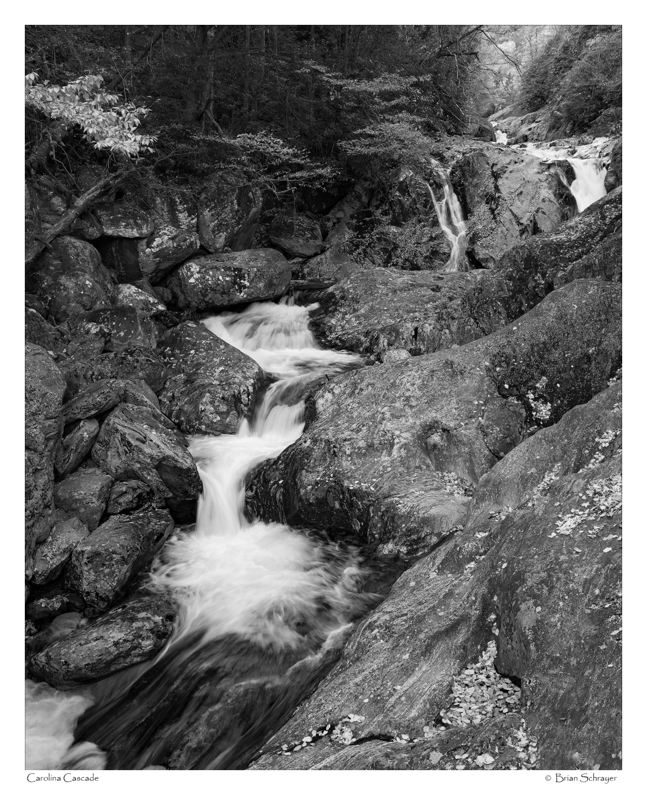
Carolina Cascades
‹ PreviousLandscape GalleryNext ›

Carolina Cascades

by Brian Schrayer

Gallery: LandscapePosted November 2, 20174,241 views9 comments
Here is an image of a nice cascade just off of the Blue Ridge Parkway.  The autumn color was past peak in this spot, but I like the flow of the cascade and thought a black and white conversion would bring out all of the texture in the surrounding rocks. 

As always, all honest comments and critiques are welcome.  crying

Capture Info:
25 mm
f/16 @ 1/6 sec
ISO 100

Processing info:
RAW Processing in Lightroom
Levels adjustment to set black and white point
TK's luminosity masks to adjust contrast

Comments

9 comments
Comment posted by Ian Wolfenden on November 3, 2017 at 10:48 AM
The conversion does work well for capturing the textures, Brian.  A nicely composed image with its diagonal emphasis and glimpse into the distance at the top R.
Registered on May 18, 2007, 1108 Posts, 7647 Comments
Comment posted by Mark Seaver on November 3, 2017 at 12:00 PM
This looks very good, Brian.  I like how there are special "bits" throughout the image.  The central cascade looks great, the overhanging limb in the upper left speaks of fall, and the water and touch of brightness in the upper right add a great sense of depth.  I think a view focused on the central cascade would work well on it's own, but that's a completely different image from what you're presenting here.
Registered on January 23, 2011, 1103 Posts, 17270 Comments
Comment posted by Igor Doncov on November 3, 2017 at 1:41 PM
I like this image a lot. It's beautifully composed and also has a lot of character. The character comes from the marked rocks on the right and the gnarly trees up on top. My initial impression was that this should be a bit darker but I've changed my mind. I would, however, burn in the leaves on upper left corner as they don't fit the overall mood. 
Registered on November 22, 2014, 189 Posts, 2733 Comments
Comment posted by Nick Bristol on November 3, 2017 at 2:15 PM
Brian, This is a great looking image. The composition is excellent and I just love the flow the stream has through the rocks. I felt the same as Igor with thinking it could be a bit darker at first, but then after looking for a bit I like it the way it is. Very nice!

Nick Bristol
Lone Rock, WI.
Registered on February 1, 2004, 752 Posts, 14140 Comments
Comment posted by Harley Goldman on November 3, 2017 at 3:13 PM
I like this a lot. The B&W treatment works really well and it is a beautiful scene. My first thought falls in with Igor about the leaves upper left. The brightness tends to pull my attention out of the frame a bit. Not a deal breaker at all, nice work. 
Registered on November 19, 2003, 586 Posts, 11271 Comments
Comment posted by Ed Lowe on November 3, 2017 at 7:12 PM
The B&W conversion works beautifully for this scene, Brian. The large version showcases a nice mix of textures and details along with a nice range of tones. I am undecided about the already mentioned brighter section of leaves on the left; it would be nice to see a version with it darkened just a bit for comparison. Either way this is a winner.

Ed
Registered on February 7, 2004, 414 Posts, 7115 Comments
Comment posted by Lon Overacker on November 4, 2017 at 12:53 PM
Brian,

I really like the main cascade of water, the flow, texture; all working for a nice b&w conversion.  The tiers and the surrounding rock make for wonderful image.

I'm not as excited about the top of the frame where there is darkness on one side and then much light in the UR. I would consider burning down that UR area to bring the tonality closer to the rest of the scene.  I could even see cropping top and right side to remove the upper cascade, but cropping scenes like this don't always improve them.

The gathered leaves at the bottom makes me want to see color, but again, this works nicely in b&w

Lon
 
Registered on November 24, 2006, 521 Posts, 19147 Comments
Comment posted by Dan Kearl on November 4, 2017 at 7:57 PM
I think the comp is really good, takes my eye right through the scene.
I might darken/add contrast to the lower right.
Registered on September 2, 2013, 209 Posts, 1514 Comments
Comment posted by Rudy Ruberti on November 4, 2017 at 10:42 PM
This is really nice and works well in B&W.  I might consider a crop off the top but I like how my eye moves through the scene.  Nicely done.
Registered on October 28, 2008, 179 Posts, 1875 Comments