Comment posted by Kathy Barnhart on October 4, 2017 at 2:30 PM
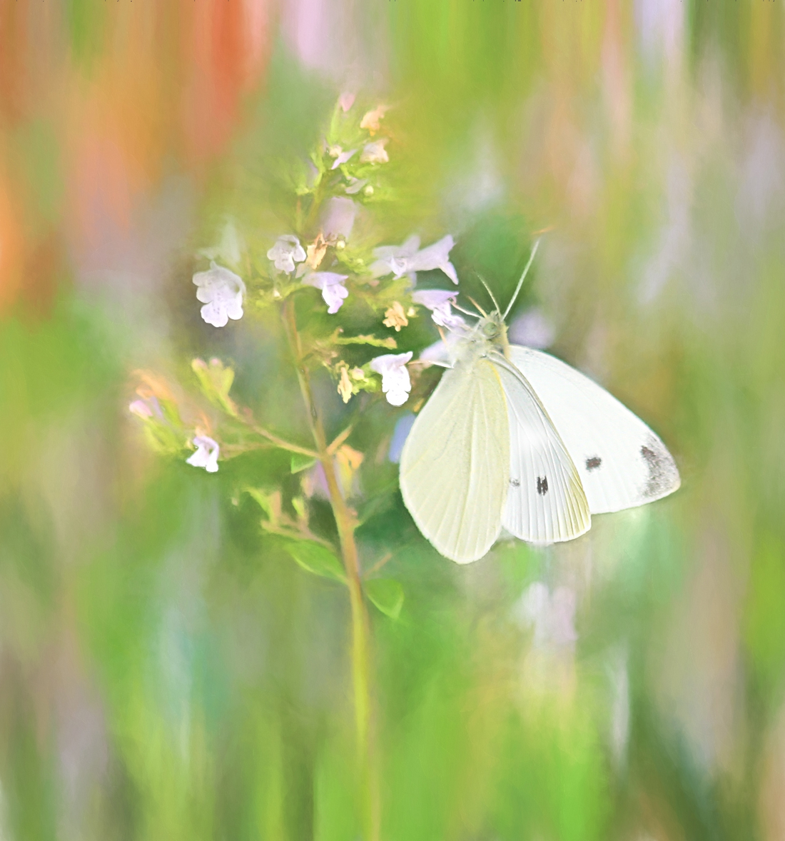
This is a gorgeous impressionist painting. I am wondering about the orange colors in the upper left corner. Since there is no other orange in the photo, it does draw my eye away from the otherwise green and white colors. But even with the orange, it is lovely.
Registered on November 11, 2011, 404 Posts, 1639 Comments
Comment posted by SandyRichardsBrown on October 6, 2017 at 5:08 PM
Lovely!
The combination of in-and OOF areas works very well.
However, the OOF area on the butterfly's body is a little distractting.
I think I'd also tone down the oranges, as Kathy suggested.
Really fine image!
Sandy
Registered on November 24, 2003, 3937 Posts, 12909 Comments
Comment posted by Albert Darmo on October 10, 2017 at 11:01 AM
Hi Barb So beautiful ,. with pleasing pastel colors and soft detail . excellent work
Albert Darmo
Registered on November 25, 2008, 1386 Posts, 11978 Comments

Comments
3 commentsThe combination of in-and OOF areas works very well.
However, the OOF area on the butterfly's body is a little distractting.
I think I'd also tone down the oranges, as Kathy suggested.
Really fine image!
Sandy
Albert Darmo