Nature Photographers Network
This is the preserved archive of the original Nature Photographers Network. The community continues at naturephotographers.network.
Mad Flow 2 + Alt
‹ PreviousLandscape GalleryNext ›

Mad Flow 2 + Alt

by Craig Moreau

Gallery: LandscapePosted September 23, 20173,426 views6 comments
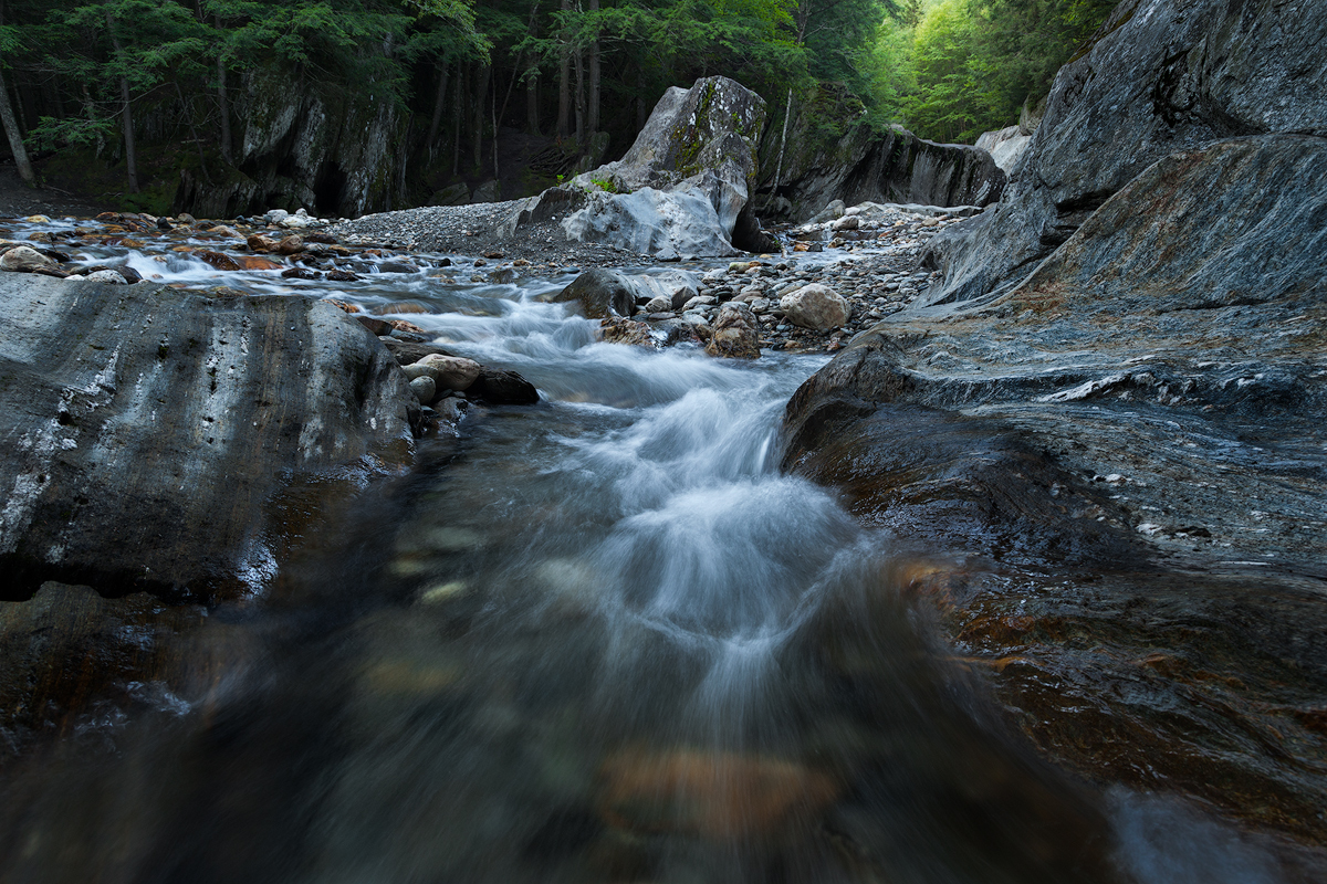
Here's another shot from the Mad River. My last post is immediately to the right of this camera position. Again, a bit more pushing in the processing than normal for me, but I'm liking how this series is looking.

This is just about full frame, but I'm going to post an alternate crop here as well. There are elements I like about both crops, so I'm interested to hear your thoughts, as always.

5d2, 24-105L @ 24mm
0.4s @ f/8, ISO400
TK masks, dodging and burning

Comments

6 comments
Comment posted by Craig Moreau on September 23, 2017 at 9:51 AM
Here's an alternate crop, a bit off the left, more off the right and bottom.
Registered on April 21, 2015, 64 Posts, 584 Comments
Comment posted by Nick Bristol on September 23, 2017 at 11:03 AM
Craig, This is a great looking scene and you captured it beautifully. I really like the water and the 0.4 sec. shutter worked perfectly for my taste. Excellent detail and textures throughout this scene. The rocks are really interesting with the stripes and colors and I like the light in the far background. The first one looks fine but I really like the crop of the second one which looks absolutely perfect to me. Great job on this!

Nick Bristol
Lone Rock, WI.
Registered on February 1, 2004, 752 Posts, 14140 Comments
Comment posted by Igor Doncov on September 23, 2017 at 12:32 PM
A fine job of judicious cropping. The 2nd image is my preference. This is a very nice image. You could darken the green in the urc, or you could leave it as is. I like that light green but it does draw the eye away. 
Registered on November 22, 2014, 189 Posts, 2733 Comments
Comment posted by Lon Overacker on September 23, 2017 at 12:59 PM
Craig,

Of course, both images must be seen larger for the true impact of the scene.  At first glance, I really like the original primarily for the extension and flow of the water at the bottom.  Agree, the ss and texture in the water is wonderful - as are the colors in the water.

The big thing that happened in the cropped version, for me anyway, is that the rock formations really stand out. The striations in the rock on the left really stand out and both the upright rock and the rock on the right really frame the composition nicely.  A yet still, the water and treeline also shine and compliment the scene.

The upright rock looks like an ancient petrified tree stump to me. Not a bad thing, but I like the cropped, closer view just to have a closer look at that particular piece of the image.

No nits, wouldn't change a thing with the 2nd post.  Excellent!

Lon
Registered on November 24, 2006, 521 Posts, 19147 Comments
Comment posted by Preston Birdwell on September 23, 2017 at 1:02 PM
Craig, both images a re very nice. In the original, I like the yellow rock under the water in the foreground, but the dark area left of it needs more detail. In light of this, I prefer  the cropped version. I do think you could bring down the bright area at the top, since it grabs my eye. The color and processing look very nice, and I agree that your choice of shutter speed is perfect for this.
--P
Registered on November 1, 2003, 471 Posts, 5188 Comments
Comment posted by Harley Goldman on September 24, 2017 at 5:47 PM
Put me down for the original post. The red buried rock nicely pulls me into the image and the water leads me through. I see Lon's point about the rock emphasis, but I still like the first. It is my normal bias, but I would pull down or out the cyan/blue in the water. I know it was there and it is very much a personal preference. 
Registered on November 19, 2003, 586 Posts, 11271 Comments