Nature Photographers Network
This is the preserved archive of the original Nature Photographers Network. The community continues at naturephotographers.network.
Eons +2 Alts
‹ PreviousLandscape GalleryNext ›

Eons +2 Alts

by Lon Overacker

Gallery: LandscapePosted September 11, 20179,311 views20 comments
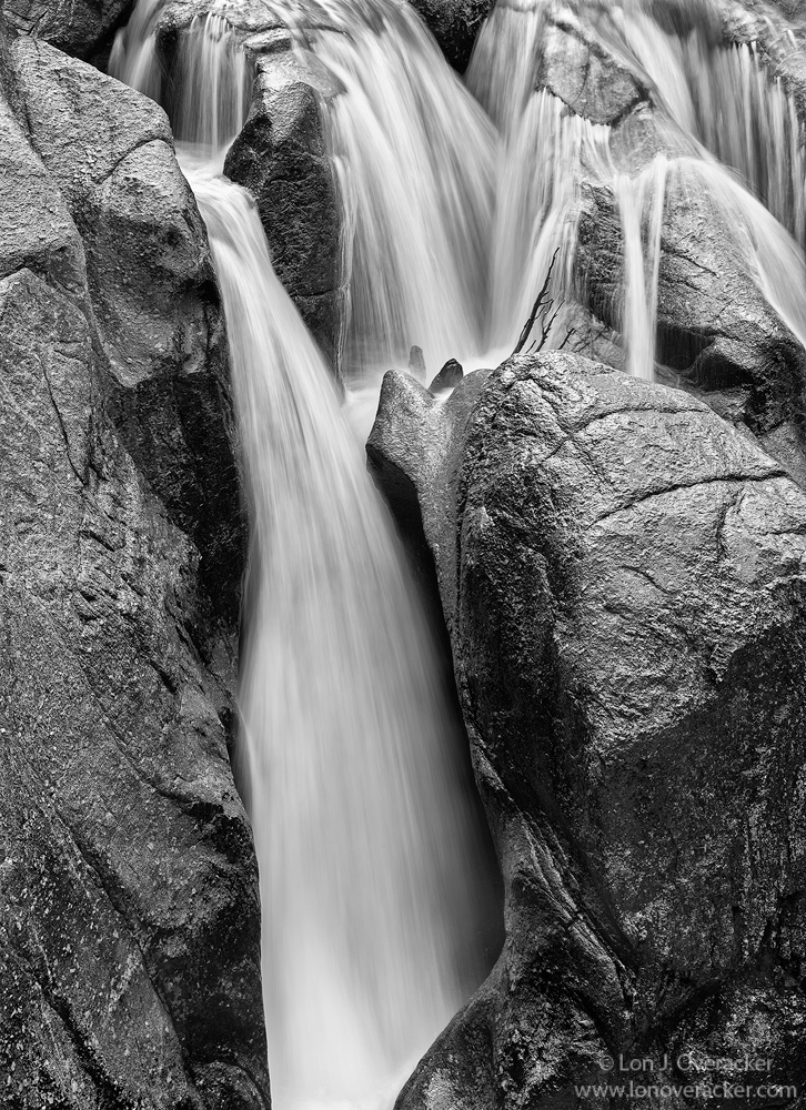
Greetings and thanks for the comments on my previous image.  Gonna mix things up with a b&w processed image of Split Falls on Deadman's Creek, Sonora Pass (That's what we call it anyway.)  This is actually the same falls of Preston's recent post "Water and Stone."  Actually Preston's image is not included in this view; his was a little right of this and included the bottom.  Scale wise, his image is probably smaller than 1/4 of this one.  We were also standing nearly together and again, come away with different views and interpretations.

This one here would like pretty good in color but I decided to go with the more contrast and impact with B&W.  I tend to favor the longer exposures and was testing out my new variable ND filter.  But there's still texture and patterns in the water.

Would love your thoughts, critiques and suggestions. Single frame.

Lon

Comments

20 comments
Comment posted by John Williams on September 11, 2017 at 12:40 PM
Superb water texture, and the composition works very well for me. The tones of the rocks and water are very similar though, and I wonder if making the rocks darker with the water remaining light would add to the drama? (I don't know what the original colors are, but there may be a mask hiding in the channels that would let you separate the rocks and the water easily?)
Registered on September 6, 2007, 221 Posts, 5985 Comments
Comment posted by Harley Goldman on September 11, 2017 at 1:15 PM
Beautiful view of the falls. I love the metallic look to the rock. The B&W interpretation is working really well.
Registered on November 19, 2003, 586 Posts, 11271 Comments
Comment posted by Bill Chambers on September 11, 2017 at 2:59 PM
Well done, Lon.  Lovely composition, perfect shutter speed, and wonderful texture in the rocks.  My only concern, and I really don't know that it's a concern because I'm looking at this on my uncalibrated work monitor, is the shadows might could be opened up just a "wee" bit.  Very little actually.  I'll check this out again when I get home this evening to see if that's actually a valid comment.
Registered on April 10, 2005, 753 Posts, 21216 Comments
Comment posted by Reno DiTullio on September 11, 2017 at 4:04 PM
Lon, I think this would be gorgeous as a metallic print; the water and rocks already have that metallic quality!  Well done.
Registered on November 14, 2003, 130 Posts, 1644 Comments
Comment posted by Igor Doncov on September 11, 2017 at 5:14 PM
Personally I am more attracted to the upper cascade than the falls. But those cascades are chopped off. I would really like to see them fully exposed by having space above them. As things stand they are taking attention from the falls so I would crop just above the top right dark rock in the falls, which would also serve the purpose of not making the cascade look incomplete. 

I like the simplicity of the falls. Their uninterrupted straight borders framed by rocks. The glistening rocks look appealing. I agree with the idea of trying to raise the shadows in the rocks but I'm not sure how that would look. 
Registered on November 22, 2014, 189 Posts, 2733 Comments
Comment posted by Paul Breitkreuz on September 11, 2017 at 5:33 PM
Lon, the processing is just super and I too like the metallic look mentioned already. I really like the added crosscut slices in all of the rocks, especially the upper most ones. They seem to add nicely to the underlying areas behind the water veils. 
I do maybe wish for slightly more room at the top, but will not second guess the thought there as it maybe an area not needed or wanted.
I can't add too much beyond the other thoughts already listed here...a very fine image.......laugh
Registered on February 25, 2006, 525 Posts, 8448 Comments
Comment posted by Eva McDermott on September 11, 2017 at 10:07 PM
I love this view Lon.  The water exposure is spot on for me and I love the textures and details in the rocks.  The metallic look is the ultimate goal in B&W IMHO.
 
Registered on January 4, 2009, 1015 Posts, 13229 Comments
Comment posted by Preston Birdwell on September 12, 2017 at 1:00 PM
This looks great to me, Lon! The tonal range and luminosity are excellent! The detail is superb.

Just a note about this spot: Just above the top of the image there are dry rocks and bushes. Lon's framing works well, in my opinion. We were fortunate to have some cloud cover that softened the light.

No nits or suggestions, here. Well done, sir!
--P
Registered on November 1, 2003, 471 Posts, 5188 Comments
Comment posted by Lon Overacker on September 12, 2017 at 4:24 PM
Thanks for the comments and suggestions.  Here are 2 different views of the falls. One a little wider vertical with a little more up top.  As Preston mentions, the top of the falls is problematic and there isn't really a clean cut anywhere.  The horizontal version shows the complete upper area. I also included color for John's comments regarding trying to separate the rock and water.  Not a lot to pull from in terms of masking. My approach was simply more burning, utilizing the B&W/Luminosity layer as well as TK's original Triple Plays.

The repost of the b&w vertical is actually a blend of 2 images with slightly different shutter speeds.  As will often happen, the longer the shutter speed, the less detail and more likely to blow out some areas.  So I blended 2 images to mitigate issues with detail and blown highlights in the water.

Feedback is so, so valuable in developing images, so thank you so much for the observations and suggestions!

Lon

ps. Wider view showing another channel.  Preston's intimate image here is still not included, it's off frame to the right, for reference
Registered on November 24, 2006, 521 Posts, 19147 Comments
Comment posted by Lon Overacker on September 12, 2017 at 4:25 PM
Color version to show the top of the cascades as well as for showing color variation.

Thanks for looking!
Registered on November 24, 2006, 521 Posts, 19147 Comments
Comment posted by Harley Goldman on September 12, 2017 at 6:24 PM
The second B&W for me!!!!  Most definitely. To my eye, that absolutely nails it. 
Registered on November 19, 2003, 586 Posts, 11271 Comments
Comment posted by Igor Doncov on September 12, 2017 at 8:05 PM
I like them all for different reasons. Any chance of seeing the color version is b&w?
 
Registered on November 22, 2014, 189 Posts, 2733 Comments
Comment posted by Preston Birdwell on September 13, 2017 at 2:46 PM

The second B&W for me!!!!  Most definitely. To my eye, that absolutely nails it. 

Absolutely! While I really like the original image, the second B&W carries the day for me! Excellent, sir!
--P
Registered on November 1, 2003, 471 Posts, 5188 Comments
Comment posted by John Williams on September 13, 2017 at 3:12 PM
May I thread stomp and post a couple of images?
Registered on September 6, 2007, 221 Posts, 5985 Comments
Comment posted by Lon Overacker on September 13, 2017 at 3:16 PM
Thanks for the comments folks!

John, by all means, please feel free to stomp all you want!  The interaction is great and we all can learn some things!

Thanks!
Registered on November 24, 2006, 521 Posts, 19147 Comments
Comment posted by John Williams on September 13, 2017 at 3:34 PM
(Please click on the image to view on a dark background.) Here's a quick and dirty edit to show what I was trying to say with words. (And by quick, I mean about 5 minutes. I'm not ultra-fast at editing, and with more time it could certainly be improved, but hopefully it gets the idea across.) ...more info in the next post.
Registered on September 6, 2007, 221 Posts, 5985 Comments
Comment posted by John Williams on September 13, 2017 at 3:40 PM
...and here's the mask that I was hoping was hiding in one of the channels; it allowed me to apply separate curves to the water and rock. I used the b channel of lab to build it, and that helped make it quick and simple. (I actually timed making this, and it was a little over 2 1/2 of those 5.)  If that doesn't make sense to some, we could get a thread going in the Digital Imaging Forum.

Now, as to whether you would actually want to make a BW like the above post, that's a bigger question. cool

 
Registered on September 6, 2007, 221 Posts, 5985 Comments
Comment posted by Dave Dillemuth on September 13, 2017 at 6:20 PM
Outstanding, intimate water scene, Lon. I for one, prefer the silky water and composition in the first. Exposure is spot on revealing wonderful texture in the water. Processing looks great. No nits.
 
Registered on December 10, 2015, 104 Posts, 1112 Comments
Comment posted by Lon Overacker on September 13, 2017 at 10:33 PM
John,

Thanks so much for taking the time to show what you were trying to describe. Actually I pretty much knew what you were describing, although honestly, not to the degree of your posted example.  Granted, the post in this thread is grossly darker than when you actually click on the image. It's also not a fair start when one is working from a low rez screenshot, so that must be considered.

Thank you for the mask image as well.  I have actually been using a LAB mode layer quite a bit in my workflow, but not for actually creating masks.  thanks for the tip! I'll have to try it out.

Understanding the limitations and how NPN is displaying images in comments, for me, I think the tones of the rock are too dark.  Clearly you've accomplished separating the water from the rock. for me, it's a little too far.

I'm wondering... this may be a good sample image to offer up as a "Processing challenge."  I think we toyed around with this before. Wondering if anyone would be interested.  You have someone post a reasonably sized image and challenge folks to do their best.  Maybe I'll post this in the discussion forum.

Thanks John and everyone for your comments and suggestions!

Lon
Registered on November 24, 2006, 521 Posts, 19147 Comments
Comment posted by John Williams on September 14, 2017 at 10:36 AM
Good deal Lon; points taken. (My monitor was due for recalibration this morning, and unfortunately I agree my edit is much darker; sorry about that. No biggie, it was mostly about the mask anyway.) I think a Processing Challenge image would be fun. By discussion forum, do you mean the Landscape Photo.?
Registered on September 6, 2007, 221 Posts, 5985 Comments