Nature Photographers Network
This is the preserved archive of the original Nature Photographers Network. The community continues at naturephotographers.network.
Hulls Cove + repost
‹ PreviousLandscape GalleryNext ›

Hulls Cove + repost

by Ed Lowe

Gallery: LandscapePosted September 6, 2017149 views7 comments
Nikon D 700
Nikon 80-200 @ 200 mm
f 16 @ 1 sec.
ISO 200
cable release & tripod
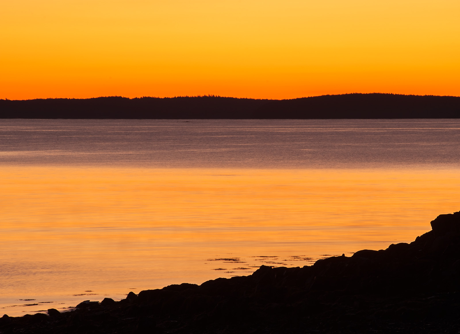
Hulls Cove on Mount Desert Island, ME

I am not sure if this will appeal to a lot of people, but I thought I would put it out there a see what everyone thought. I had gotten up to late to catch the sunrise in the park so I stopped at Hulls Cove to catch some sunrise color. After spending a few minutes looking for a comp I settled on this ass I was attracted to the layers in the scene.

As always thanks for taking a look and leaving a comment or suggestion.

Ed

 

Comments

7 comments
Comment posted by Preston Birdwell on September 6, 2017 at 7:33 PM
I really like the graphic nature of this, Ed. The orange-black color scheme, along with the layers of light and dark are very appealing. The large version has better detail in the water and the sky. Nicely done.
--P
Registered on November 1, 2003, 471 Posts, 5188 Comments
Comment posted by Lon Overacker on September 6, 2017 at 9:25 PM
Ed,

I think you did a great job with the color and processing here.  You've just seemed to capture that moment as if I were standing there.  The large view is a must in order to see the subtle detail in the water.

It's a very simple scene and graphic was also the word that came to mind.  Just the color and simple geometry make the image work.  I'm not sure if you need all the sky.  Personal choice, but I think you could crop top, left and bottom (more off top than left/bottom) and still maintain your proportions but with lesser sky.  Then even the water details and color may come out more.  Just a thought.

Lon

 
Registered on November 24, 2006, 521 Posts, 19147 Comments
Comment posted by Dan Kearl on September 6, 2017 at 10:40 PM
Almost abstract, nice color.
I might take a bit off the top.
Registered on September 2, 2013, 209 Posts, 1514 Comments
Comment posted by Eva McDermott on September 7, 2017 at 2:14 AM
I lke the strong color and contrast Dan.  The dark land mass silhouettes and detail in the water compliment each other.
Registered on January 4, 2009, 1015 Posts, 13229 Comments
Comment posted by Ed Lowe on September 7, 2017 at 1:29 PM
Thanks for your thoughts everyone; always appreciated. Here is a repost with your crop suggestions.

Ed
Registered on February 7, 2004, 414 Posts, 7115 Comments
Comment posted by Harley Goldman on September 7, 2017 at 2:15 PM
Beautiful colors and simple scene. I prefer the original post. I enjoy the color gradient in the sky and the crop cuts into it. Very nicely done. 
Registered on November 19, 2003, 586 Posts, 11271 Comments
Comment posted by gary phillips on September 8, 2017 at 11:50 PM
Ed, I think I'm with Harley, in that I love the gradient of the original.  Orange and black work real well and the dark triangle of the fore ridge and far shore line divide the frame beautifully.  I'd say this has tons of appeal for me.
Registered on October 24, 2013, 185 Posts, 4136 Comments