Nature Photographers Network
This is the preserved archive of the original Nature Photographers Network. The community continues at naturephotographers.network.
N. Panamint Reposts
‹ PreviousLandscape GalleryNext ›

N. Panamint Reposts

by Marylynne Diggs

Gallery: LandscapePosted August 24, 20172,160 views8 comments
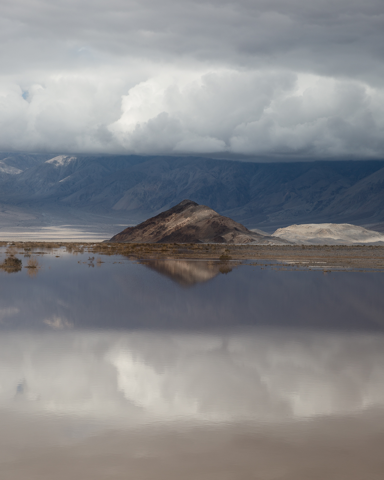
Another image from my stormy February E. Sierra trip.  We headed into Death Valley hoping for some better weather.  The park roads had been cleared of mud, but you could still see where all the flooding had occurred.  One such place was the North Panamint Dry Lake Area, which had signs warning against riding ATVs and dirtbikes across the sand flats.

Here I was drawn to the "islands" in this temporarily full lakebd.  The symmetry of the island and the clouds/reflection pulled me to a stop immediately. 

As always, I'm interested in your suggestions for additional processing, cropping, etc.  I have another version of this that is more of a 4x6 aspect ratio, but I kind of like the placid effect of a shorter, wider composition.  Let me know what you think.

Also, does the open spot in the cloud to the left grab your eye too much?  I keep thinking it looks like a dustbunny.

ML

Comments

8 comments
Comment posted by gary phillips on August 24, 2017 at 7:48 PM
I can't imagine anything much cooler than a stormy, flooded Death Valley.  I am sorry that I missed such an opportunity.  Glad you were able to take this in.  Lovely layers and it's unmistakably Death Valley.  The only thing that could have improved this would be still air.  A crisp reflection would have put this over the top.  Really nice as is.  The hole in clouds doesn't bother me at all.
Registered on October 24, 2013, 185 Posts, 4136 Comments
Comment posted by Igor Doncov on August 24, 2017 at 8:06 PM
I agree with your decision to widen this from the 4:6 aspect ratio. I find that compositions with horizontal layers don't look as well with narrow vertical formats. The wider the image the better it looks. The verticals with layers that overlap with sections that diagonal layers with horizontal work better IMO but straight horizontal layers in a vertical frame looks 'chopped up'. I think you've reached a good compromise here because any further reduction results in too narrow layers at top and bottom. 
Registered on November 22, 2014, 189 Posts, 2733 Comments
Comment posted by Preston Birdwell on August 25, 2017 at 3:05 PM
This is certainly a unique image from Panamint. I really like the clouds. The small open patch is a little distracting, but would be easy to remove. Also, You might consider a crop from the bottom to remove some of the darker part of the cloud reflection. I do agree with Igor's comments. Your processing looks very nice.
--P
Registered on November 1, 2003, 471 Posts, 5188 Comments
Comment posted by Ana on August 25, 2017 at 10:45 PM
I'm enjoying this a lot.  I love the boldness of the composition and how the tone and color are all very "natural" but the strong design makes it something very deliberate.  The first couple of times I viewed this I was wishing it would be wider, but after thinking about it, the crop you have is very effective at highlighting the diamond of that island and a more panoramic frame would have diluted it.  Really sweet image.
Registered on February 10, 2004, 191 Posts, 1446 Comments
Comment posted by Lon Overacker on August 25, 2017 at 11:59 PM
Marylynne,

I like this very much. Good call on the crop.  I agree with Igor in his assessment on the vertical formats with strong horizontal lines.  You did well with this crop.

I don't think this has been mentioned, but given the very nice symmetry of the scene and capture, you might consider a little color tweaking of the lower reflection.  To Preston's comment about cropping the bottom - I wouldn't crop per se, but rather I might adjust the color of that reflected cloud layer to more closely match the clouds above.  Yes, the water makeup contributed to the color of the reflection, but IMHO,  a cooler balance of color in the reflection would increase the symmetry that's captured in this image.  

Up the contrast with a b&w rendition and you've got another option!

Lon
Registered on November 24, 2006, 521 Posts, 19147 Comments
Comment posted by Marylynne Diggs on August 26, 2017 at 4:55 PM
And here is a quickie b/w.  I need to find an earlier point to start at to tweak it more without getting noise.
 
Registered on December 14, 2010, 122 Posts, 1034 Comments
Comment posted by Marylynne Diggs on August 26, 2017 at 5:00 PM
Thanks for the feedback on this one everybody.  I was really torn about whether it was a nice reflective abstract of sorts or just a lot of muddy water with a little island in it. 

I took the suggestion and cooled down the foreground water a bit.  I also did a quickie b/w conversion, which I might work on a bit more.

Thoughts, as always, much appreciated.
ML
Registered on December 14, 2010, 122 Posts, 1034 Comments
Comment posted by John Williams on August 27, 2017 at 10:39 AM
Nice Marylynne. It just enough abstract to be quite compelling. I like both, but think that BW has some real potential. I'd play with brightening that central peak slightly in both versions to give it a little pop. 
Registered on September 6, 2007, 221 Posts, 5985 Comments