Nature Photographers Network
This is the preserved archive of the original Nature Photographers Network. The community continues at naturephotographers.network.
High Drama
‹ PreviousLandscape GalleryNext ›

High Drama

by Brian Schrayer

Gallery: LandscapePosted July 30, 20174,142 views8 comments
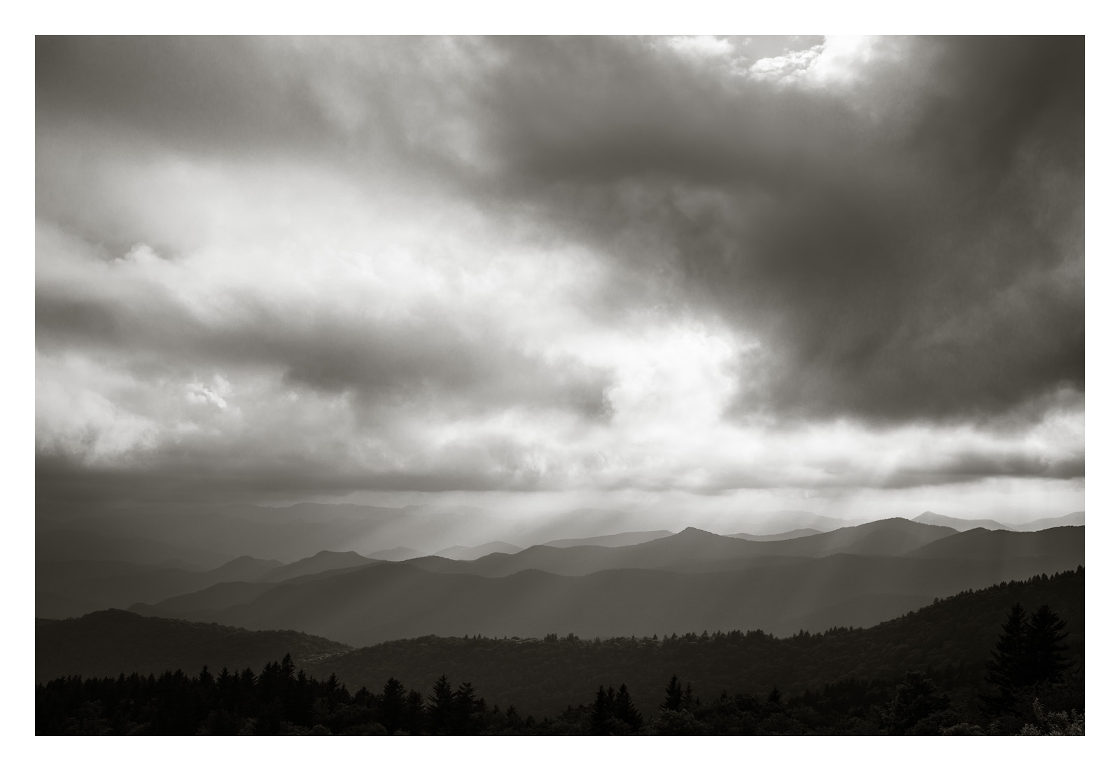
Here is another image that I captured along the Blue Ridge Parkway on my trip last month.  I have to admit that when I captured this image in the field that I wasn't thinking of a black and white comp.  It wasn't until later as I was reviewing the image on the LCD that I thought of black and white.  I exposed this to maintain all of the highlight detail which meant that the shadow detail was really dark on my LCD.  I knew with the dynamic range of my camera that the shadow detail was there, but when I saw the strong contrast with the deep shadows I liked the way that it enhanced the impact of the light beams so I decided to go with a black and white conversion.  

As I was processing the image, I made another creative decision.  When I captured this in the field there was warm light coming down through the clouds.  A pure black and white conversion made the image feel more ominous and lost some of the inviting feel of the warm light.  To bring back some of that feel I added a slight toning to the image.  It's subtle, but I think that it helps capture some of what I felt as I experienced this moment.  I will post the pure B&W below for comparison. 

As always all comments and critiques are welcome.  Please view the large image. 

Capture Info:
35 mm
f/8, 1/1000 sec., ISO 100

Comments

8 comments
Comment posted by Brian Schrayer on July 30, 2017 at 6:26 PM
For comparison, here is the straight B&W conversion.  The toning was accomplished by creating a solid fill layer and choosing a lighter pastel yellow.  I then changed the blending mode to soft light and reduced the opacity to taste which landed at 14%.  The toning is noticeable when you compare it side by side, but my aim was for the effect to be subtle. 
Registered on May 28, 2004, 114 Posts, 2890 Comments
Comment posted by scott lanz on July 31, 2017 at 7:39 AM
Very nice, Bryan. The longer I looked at this, the more I like it. However, I think I like it even more as a pano with the sky cropped. For me, the strongest parts of the image are the rays coming down on the rolling hills, and this is a bit lost in all that sky, especially because of the bright areas of the sky. I think it has more impact with 1/2 the sky cropped. I'll be interested in reading other comments, however. I do like the toning in the origianl more than the repost. 
Registered on November 14, 2003, 840 Posts, 12902 Comments
Comment posted by Nick Bristol on July 31, 2017 at 8:38 AM
Brian, I like this too. The toned b&w looks great to me and I like the feel / mood it has. I agree with Scott cropping about 1/2 of the sky really works here for me. Very nice!

Nick Bristol
Lone Rock, WI.
Registered on February 1, 2004, 752 Posts, 14140 Comments
Comment posted by Igor Doncov on July 31, 2017 at 1:41 PM
Even though there are some beautiful rays descending and the ridges look nice I feel that this image is more about the sky. As such, I wouldn't eliminate any of it. So my vote is to keep the composition as is. The first image is remarkably superior to the 2nd. Great job.
Registered on November 22, 2014, 189 Posts, 2733 Comments
Comment posted by gary phillips on July 31, 2017 at 4:10 PM
My vote is to leave it as is, Brian.  Excellent b/w image and the toning, though subtle, is very effective.  I would burn the bottom right corner so that it is more in keeping with the rest of the silhouetted foreground.  Very minor.  Beautiful work.
Registered on October 24, 2013, 185 Posts, 4136 Comments
Comment posted by Craig Moreau on August 1, 2017 at 11:56 AM
Brian, this works very nicely as a b&w, and the toning, while subtle, really adds a lot. It seems you're getting a lot of suggestions on a crop, and to that I will add that I think cropping that bright bit of sky on the top edge could work nicely.
Registered on April 21, 2015, 64 Posts, 584 Comments
Comment posted by Anil Rao on August 2, 2017 at 2:16 AM
The composition is lovely (quiet and thought provoking ... just how I prefer) and the subtle toning is a nice touch. In comparison to the straight B&W, it provides just a touch of warmth as you mention.

 
Registered on November 15, 2003, 234 Posts, 4923 Comments
Comment posted by John Williams on August 5, 2017 at 12:11 AM
Excellent drama Brian. I love the layered hills and sun rays. My take on the crop would be to remove the small open area where sky shows through; it drags my eye away a bit.
Registered on September 6, 2007, 221 Posts, 5985 Comments