Nature Photographers Network
This is the preserved archive of the original Nature Photographers Network. The community continues at naturephotographers.network.
Sandstone Revisited #3
‹ PreviousLandscape GalleryNext ›

Sandstone Revisited #3

by Tony Kuyper

Gallery: LandscapePosted May 31, 20173,125 views12 comments
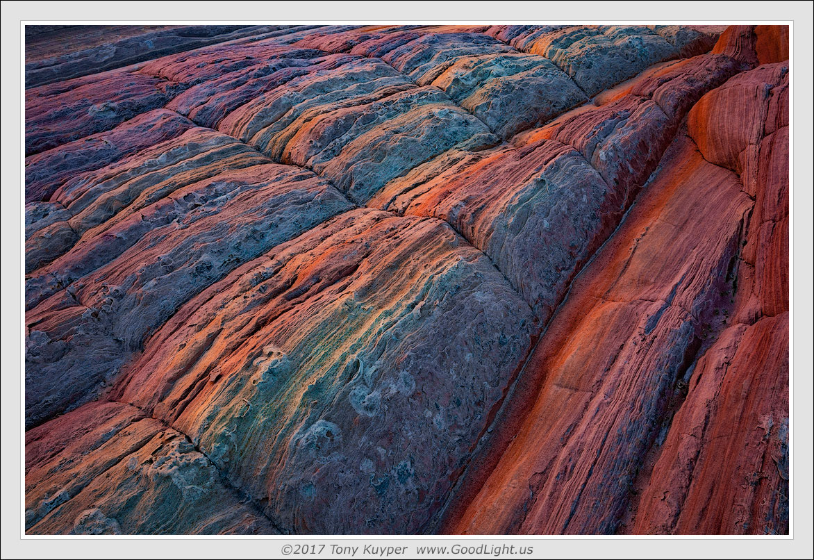
Another sandstone image from the archives.  This one is again taken in the shadows with a clear sky overhead, hence the blue color on the upward facing surfaces.  This image looks down on some ridges whose vertical faces are catching reflected sunlight from a nearby mass of sandstone, hence the warm colors.  Without direct sunlight in the composition, these warm and cool colors have nearly equal brightness as far as the camera is concerned, and the challenge is to introduce additional contrast while maintaining proper color and saturation.  This is where this one ended up.

This is also a focus-blend of 6 images.  At some level I think the sharp focus throughout adds to the abstract quality in a subtle way.

Based on the comments from the last image, I know these images feel a bit extreme to some folks, but these colors really are present in the RAW file.  It's just a matter of separating them out in Photoshop.

Let me know if you have any thoughts.

 

Comments

12 comments
Comment posted by Harley Goldman on May 31, 2017 at 4:10 PM
Real nice lines, textures and composition. To my eye, this rendition has a very saturated yet realistic look to it (pushed quite a bit to the edge). Having been to places like this, I know it would not look quite like that in person, but they work for me in this. I think if you took it any further, it would lose that aspect for me. I know we are making art, not reality, but what can I say? I like what I like and I like this one. 
Registered on November 19, 2003, 586 Posts, 11271 Comments
Comment posted by Igor Doncov on May 31, 2017 at 4:52 PM
Beautiful textures and colors. The rich reds on the right are a joy to look at. The central layer is really the best part though,  with it's swirling blues and striated reds. I think the composition could have been stronger though. All those lines lead you to the urc and there is no visual reward.
Registered on November 22, 2014, 189 Posts, 2733 Comments
Comment posted by Kathy Barnhart on May 31, 2017 at 8:56 PM
Gorgeous colors and the diagonal lines and textures are great. For some reason this one appeals to me most of your recent series. I like the sharp focus and the colors are believable.
Registered on November 11, 2011, 404 Posts, 1639 Comments
Comment posted by Wayne Jones on May 31, 2017 at 8:58 PM
I am really enjoying the intricate textures of these rocks, Tony.  I understand how the two different sources of light would produce different colors, and I think it's fascinating to accentuate that.  To my taste, the relatively equal brightness of the warm and cool sides of the rocks looks a bit "forced" however, like when we were first exposed to HDR processing.  Of course, that's still a matter of individual tastes, but I think I might enjoy this even more (and I do enjoy it now) if the cooler areas were a bit darker; and/or perhaps if the warmer-lit areas were a bit brighter.  I know that's nit-picking, but you did say "Let me know if you have any thoughts."  And when I see interesting images, it's hard to resist wanting to play with them.  
Registered on April 18, 2007, 953 Posts, 6435 Comments
Comment posted by Tony Kuyper on May 31, 2017 at 10:01 PM
"I might enjoy this even more (and I do enjoy it now) if the cooler areas were a bit darker; and/or perhaps if the warmer-lit areas were a bit brighter."

I had the same idea Wayne and tried it, but in the end felt like a step too far with this image.  Can't really say why, but it seemed that the image lost some texture in the process as the blues have quite a bit of detail.  However, I may give it another try with a corresponding contrast increase.  Thanks.
Registered on November 1, 2003, 364 Posts, 22328 Comments
Comment posted by Doug Koepsel on June 1, 2017 at 9:42 AM
Tony, the image has nice detail, lines and color.  To me, it looks just a bit flat and could use a little bit more contrast.
Registered on April 1, 2010, 196 Posts, 1592 Comments
Comment posted by gary phillips on June 2, 2017 at 12:32 AM
Another adventure to magical land of Kuyper's southwest.  Where the sandstone is painted by the great spirits.  I hope to visit this mystical land one of these days.  Seriously, I like this one as well as the last. The diagonal lines pull you through the image nicely.  My only very small suggestion would be to crop or clone the little pink section just in from right on the top edge just where the blue sandstone meets the top.  Minor for sure.
Registered on October 24, 2013, 185 Posts, 4136 Comments
Comment posted by Aaron Feinberg on June 2, 2017 at 7:47 PM
The master of things stone.  Nice work.

aF
Registered on October 26, 2009, 399 Posts, 2789 Comments
Comment posted by Mark Seaver on June 2, 2017 at 9:29 PM
Tony, the colors are lovely and the angles of the ridges through the frame creates a fine sense of motion.  I too like the sharpness throughout and think that it does add to the abstract nature of this view.  In spite of the strong upper right to lower left angles of the ridges, there's a fine lower right to upper left eye movement due to the subtle changes in brightness, tone and saturation.
Registered on January 23, 2011, 1103 Posts, 17270 Comments
Comment posted by Ed Lowe on June 3, 2017 at 4:17 PM
The details, lines and textures really shine in the large version and the diagonal flow does a masterfull job of leading me into the image, Tony. I could see the color dialed back just a touch, but that is just a personal preference. Either way this is a beauty.

Ed
Registered on February 7, 2004, 414 Posts, 7115 Comments
Comment posted by Harry Lichtman on June 5, 2017 at 12:43 PM
The colors are fascinating, but what I really find interesting is the way you decided to present the orientation of the image.  It feels like from viewing that I looking across a stretch of stand stone that gently slopes upward, rather than looking downward.  I think this would work well oriented vertically too, but I like that it's abstract enough to work in several ways.  Such unique takes on these ridges.
Registered on September 17, 2010, 304 Posts, 3507 Comments
Comment posted by Vance Gese on June 9, 2017 at 7:46 PM
Incredible, Tony.  Simply incredible.  The lines, the detail, the color, all are superb.  As always, I am in awe of your vision as an artist, and once again, inspired.
Registered on November 13, 2008, 298 Posts, 6629 Comments