Nature Photographers Network
This is the preserved archive of the original Nature Photographers Network. The community continues at naturephotographers.network.
Ontonagon River
‹ PreviousLandscape GalleryNext ›

Ontonagon River

by Nick Bristol

Gallery: LandscapePosted May 10, 201711,171 views14 comments
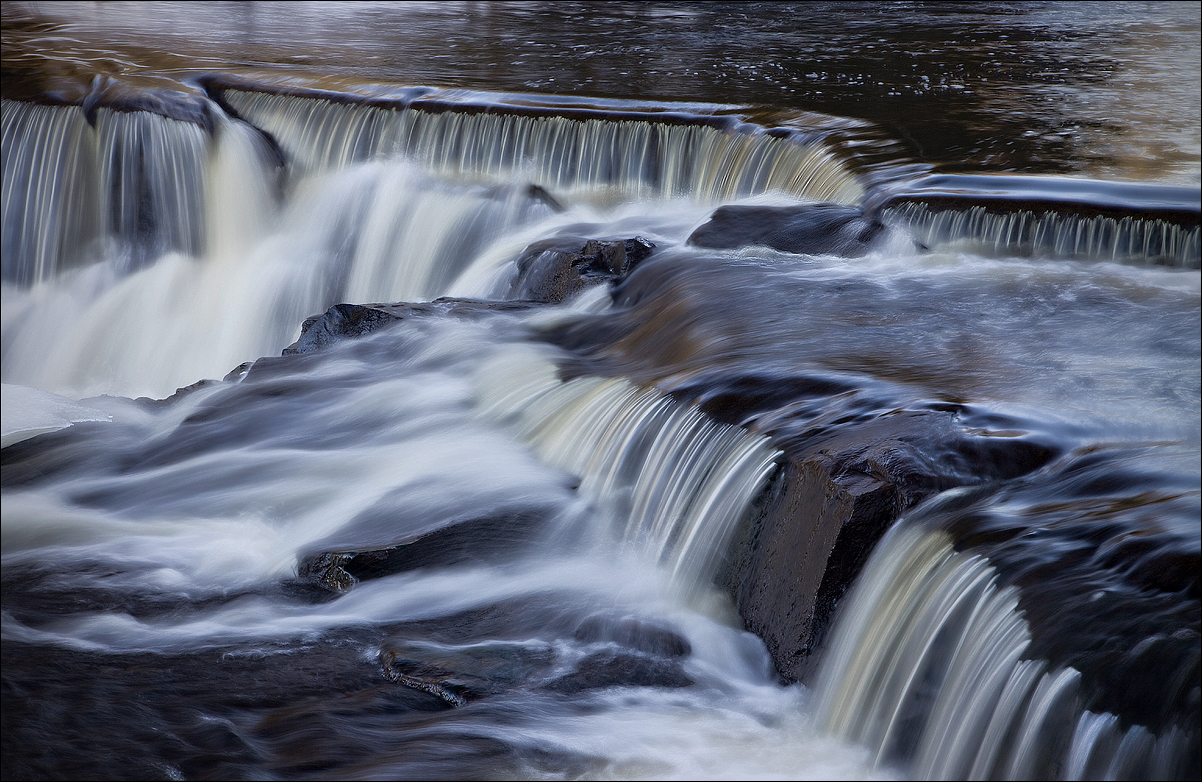
I haven't been on here very much recently but always enjoy coming back to see all the wonderful landscape images that get posted here. This image was made in the late winter / early spring at Bond Falls in Upper Michigan. I try and spend a few hours there a couple of times a year and it is always fun trying to come up with different views of this area on the middle branch of the Ontonagon River. Thanks for looking and any thoughts. 
Canon 5D3, 24-105L @70mm, ISO 160, F/16 and 0.4 sec.

Comments

14 comments
Comment posted by Nick Bristol on May 10, 2017 at 4:27 PM
And a lower contrast version here which was my original plan but I forgot to do it before posting. Any preference?
Click the image for larger view. I do prefer the larger view of this one myself but the small one seems a little flat to me. I let the site resize that one where in the original post I always do both versions myself.
Registered on February 1, 2004, 752 Posts, 14140 Comments
Comment posted by Don Young on May 10, 2017 at 8:35 PM
Nick, great image.  I think I like the lower contrast image a little better.
Registered on April 23, 2015, 56 Posts, 224 Comments
Comment posted by scott lanz on May 10, 2017 at 10:04 PM
Beautiful captured shot of Bond Falls, Nick. Perfect ss. I prefer the higher contrast except for the light band across the top. I would crop the very top.  
Registered on November 14, 2003, 840 Posts, 12902 Comments
Comment posted by Igor Doncov on May 11, 2017 at 12:06 AM
Definitely the less contrasty image for me. It looks slightly more natural to my eye. 

What's interesting about these fall is the regularity of water dropping. They have the uniformity of the teeth of a comb. The combination of several such 'combs' makes a good composition. That's the main source of interest for me, with the white water below of less interest.
Registered on November 22, 2014, 189 Posts, 2733 Comments
Comment posted by Peter Richter on May 11, 2017 at 6:47 AM
Nick, there is an amazing interplay between the flow and the shapes and colors of the rocks for me, a most compelling scene. The higher contrast version fits in best with these elements in my opinion.

One minor suggestion is either to darken or even to crop the brighter area at the top in the left half, that would help me to concentrate on the main area of interest I think.

Peter
Registered on November 10, 2010, 218 Posts, 2723 Comments
Comment posted by Mark Seaver on May 11, 2017 at 9:59 AM
The way the shape of this step falls moves through the frame is great, Nick.  I also like how you captured the sense of flow in the river.  The differences between the two are very subtle.  I like the bit of extra brightness in the high contrast version at the top of the distant step (upper left) while the extra detail showing in the flow at the bottom left and just above the falling water in the lower right corner are better in the low contrast version.  (Using the back and forth arrows for an almost side-by-side comparison works well.)
Registered on January 23, 2011, 1103 Posts, 17270 Comments
Comment posted by Harley Goldman on May 11, 2017 at 12:01 PM
Beautiful little falls. I like the low contrast version best, but the high works well too. Subtle difference. 
Registered on November 19, 2003, 586 Posts, 11271 Comments
Comment posted by Lon Overacker on May 11, 2017 at 11:16 PM
Nick,

This is fantastic!  I'm hard pressed to say which one I like better.  they are both beautiful and honestly to me, the differences are subtle and I certainly wouldn't have made any suggestions on contrast, color, sat or processing with either! So they're both winners to me.

Everything here literally just "flows" together.  All the water components are wonderful; the zig-zag of the lip is making for an excellent composition.  I could see this as a metal print hanging on my wall. 

The only suggestion I have is with Scott.  there's a light patch top edge center, plus more bright as you move left.  Even a slight top crop I don't think would change the impact of the image.  There's also burning and cloning options if you don't want to lose the real estate.

Lon
Registered on November 24, 2006, 521 Posts, 19147 Comments
Comment posted by John Williams on May 14, 2017 at 10:45 AM
Lovely water texture Nick, and the lines of the comp work really well. I agree the difference is only slight, and slightly prefer the low-contrast.
Registered on September 6, 2007, 221 Posts, 5985 Comments
Comment posted by Nick Bristol on May 15, 2017 at 12:03 PM
Thanks much to all of you for your thoughts and suggestion on this. As always, much appreciated! Thank you! Nick
My computer is going to be down for a couple of days for some updating but should be back on line by mid-week.
Registered on February 1, 2004, 752 Posts, 14140 Comments
Comment posted by Albert Darmo on May 16, 2017 at 8:58 PM
Hi  Nickcrying    I  had the same impression  of  the  falls  like Igor.  the  falls  having  a uniformity  of  the teeth of a comb.     each  version  has its  merits.  the first  version  has  an abstract quality   which  i  like  better   ......     very  fine  work


Albert Darmo
Canada
Registered on November 25, 2008, 1386 Posts, 11978 Comments
Comment posted by Nick Bristol on May 19, 2017 at 5:43 PM
Thanks Albert. I appreciate that! Hope you are doing well. Nick
Registered on February 1, 2004, 752 Posts, 14140 Comments
Comment posted by Michael Bjornbak on May 20, 2017 at 10:30 PM
Nick:
Beautiful image, I love anything with water and this is a high impact water image. Just my two cents, I prefer
the first image with higher contrast. I hope you have a high megapixel image because this will make a 
beautiful large print!  The higher contrast image looks like rich dark chocolate. 
Registered on May 13, 2017, 17 Posts, 23 Comments
Comment posted by Nick Bristol on May 21, 2017 at 10:24 AM
Thanks Michael for your thoughts on this. Yes, I have a large hi-res file and thinking about doing a large metal print of this one. As Lon mentioned it just looks like it would work great on metal and I agree. Thanks, Nick
Registered on February 1, 2004, 752 Posts, 14140 Comments