Nature Photographers Network
This is the preserved archive of the original Nature Photographers Network. The community continues at naturephotographers.network.
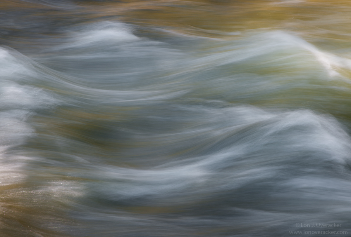
Waving Merced
‹ PreviousLandscape GalleryNext ›

Waving Merced

by Lon Overacker

Gallery: LandscapePosted May 7, 2017302 views16 comments
I was in Yosemite just a couple of weeks ago.  Although it wasn't a photo trip per se (visiting with family), I did manage to squeeze in a few opportunities.  One of those was a quick trip to Happy Isles.  Despite the horrific crowds, Happy Isles was pleasantly vacant and we enjoyed being surrounded in the "silence" of the roaring Merced.

I've always enjoyed the patters, texture, flow and captured moving water.  Sure, nothing original, but I love it. Not 100% sure about this one so I'm posting for feedback.  I attempted to accentuate the flow, texture and especially the internal glow and light of the upper wave.  What I'm very unsure about is the left side.  Cropping to remove the white back splash disrupts the overall flow, but on the other hand it falls in to my own rule of - if you're going to include something, make sure you include it. to me it feels cut off.

Anyway, would love to hear your thoughts, opinions and feedback!  Thanks for looking!

Lon

Comments

16 comments
Comment posted by John Williams on May 7, 2017 at 10:30 PM
Flowing lines make such beauty. In this one, the sharpness at the bottom left adds a lot for me; wonderful contrast to the rest of the image. I wrestle with your choices too. I don't know what the view would have been if zoomed out, but agree that the white on the left feels tight. As is though, I would not crop.
Registered on September 6, 2007, 221 Posts, 5985 Comments
Comment posted by Mattia Oliviero on May 8, 2017 at 5:31 AM
Love this, Lon. The shutter speed chosen for the moving water is perfect to give a flowing feeling. Lines and colors make this image really good. Well done.

Mattia
Registered on August 24, 2016, 43 Posts, 254 Comments
Comment posted by Albert Darmo on May 8, 2017 at 3:45 PM
HI  Loncrying        St Francis  would  have said   "  you  have  captured  the  beauty  of  sister  water   beautifully  and  lovingly"....         i  too  love this image


Albert Darmo
Canada
Registered on November 25, 2008, 1386 Posts, 11978 Comments
Comment posted by Reno DiTullio on May 8, 2017 at 4:10 PM
I like it all, Lon, shutter speed, color, flow...even the comp.  I don't believe cropping the left side would enhance the comp; it would make it too tight for me.  Either including more of the left or leaving as is works for me.  Well done.
Registered on November 14, 2003, 130 Posts, 1644 Comments
Comment posted by Michael Lowe on May 8, 2017 at 4:23 PM
My thoughts echo Reno's. You certainly accomplished your goal with this picture. Simple yet effective. I was lucky to make it to Yosemite around 1980. I thought it was crowded back then. Can't even imagine what it's like now. crying
Registered on February 11, 2004, 777 Posts, 5252 Comments
Comment posted by Sairam Sundaresan on May 8, 2017 at 11:51 PM
I really like these abstracts of flowing water. This is really nice, Lon. I'm on the fence about removing the left side since it grabs my attention and my eye stays there but at the same time it adds interest to the image.
Registered on March 14, 2013, 100 Posts, 643 Comments
Comment posted by Mark Seaver on May 9, 2017 at 2:35 AM
This is a fine looking flow abstract, Lon.  Your shutter speed is perfect for my taste, showing some smoothing as well as the dynamics.  You've also got a good set of subtle colors.  I'm fine with the left side, it completes the waves and I like that.
Registered on January 23, 2011, 1103 Posts, 17270 Comments
Comment posted by Harry Lichtman on May 9, 2017 at 7:42 AM
Without reading your description, I thought a slight crop off the left would improve it.  Maybe 1/2 of the water flow on the far left curl, which wouldn't be much of a crop but does make a difference for me.  The texture of the water and the glow off teh bottom is very soothing.  Also a very slight dark boarder on the top of the water that I might consider cropping down ever so slightly for more uniform tones at the top.  A beauty!
Registered on September 17, 2010, 304 Posts, 3507 Comments
Comment posted by Peter Richter on May 9, 2017 at 12:52 PM
Lon, there is a wonderful elegance to this image for me, I perceive it as an abstract. I personally would not change anything. As the highlights in the uppermost wave at the right are brighter than at the left, my attention is drawn from left to right, what is very pleasing for me. Furthermore, there is an appealing tonal relationship between the left lower corner and the right upper part, what still accentuates this direction.

Peter
Registered on November 10, 2010, 218 Posts, 2723 Comments
Comment posted by Bill Leggett on May 9, 2017 at 1:08 PM
Lon, I'm a big fan of moving water stuff, and this is a nice example.  I have loads like this from my trips to the Smokies and the southwest.  What attracts me about this genre is that results can be limitless, all can be interpreted in different ways with very pleasing results, using different shutter speed options to produce different results.  For me the highlight LHS side doesn't take away when considering the overall frame as you suggest.  Another fun aspect of this type of imagery is that with standing waves I never know what it will ultimately look like until I see the results.
Registered on July 21, 2004, 706 Posts, 3233 Comments
Comment posted by Ed Lowe on May 9, 2017 at 3:08 PM
This may be a tiny bit tight on the left as you noted, but it is not a deal breaker for me, Lon. I think that wave in the ULC helps to balance that out IMO. Your SS choice is perfect for capturing detail in the wave action and I love the color combination along with those splashes of light. Beautifully done.

Ed
Registered on February 7, 2004, 414 Posts, 7115 Comments
Comment posted by Nick Bristol on May 9, 2017 at 5:25 PM
Lon, I like this a lot just as it is. It was such a wonderful flowing motion and I love the lines and way it feels. The left side works just fine as it is and I personally would not want to crop it. This is very pleasing to view and you certainly captured the patterns, texture and flow that you enjoy so much.

Nick Bristol
Lone Rock, WI.
Registered on February 1, 2004, 752 Posts, 14140 Comments
Comment posted by Igor Doncov on May 9, 2017 at 5:53 PM
The repeating and parallel sine waves gives this a sense of movement yet stability. What I like the most about it are the colors and the streaked lines running left to right. It's a bit unusual having all the highlighted areas around the edges of the frame but any cropping seems to break down the composition. I like it the way it is.You might try lowering the highlights in the llc.
Registered on November 22, 2014, 189 Posts, 2733 Comments
Comment posted by Anil Rao on May 10, 2017 at 4:11 AM
I love how the slow shutter speed has turned the speed and energy of the water into a thing of softness and beauty. The range of tones add to that delicate feeling. I wouldn't change a thing -- I think this has turned out really well.

It is always a pleasure to see your work, Lon.

Regards,
Registered on November 15, 2003, 234 Posts, 4923 Comments
Comment posted by Harley Goldman on May 10, 2017 at 10:23 AM
Nice water abstract, Lon. The left side does not bother me in the slightest. The comp works quite well. No suggestions. Fine take on the happiest place in Yosemite. 
Registered on November 19, 2003, 586 Posts, 11271 Comments
Comment posted by Lon Overacker on May 10, 2017 at 11:20 AM
Thank you so much for the comments and observations!

Harry, good call on the slight crop up top. I've incorporated in the master file, but not reposting.

Igor, yeah, that LLC was problematic. In fact it's toned down a lot already, but figured it might stand out simply because that is the one spot where there is actually direct sunlight.  good observation and suggestion as well.
Registered on November 24, 2006, 521 Posts, 19147 Comments