Nature Photographers Network
This is the preserved archive of the original Nature Photographers Network. The community continues at naturephotographers.network.
A Winter's Day....
‹ PreviousLandscape GalleryNext ›

A Winter's Day....

by Lon Overacker

Gallery: LandscapePosted April 10, 2017291 views17 comments
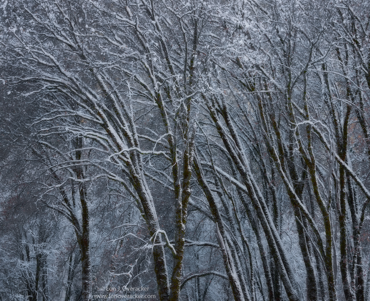
... in a deep and dark December.... (name the group/song) ;-)

Well, not trying to portray this as deep and dark, just a play on words and this song came to mind.  Plus, this was captured in February (16.)  Continuing to go through older images and I hadn't worked this one up from RAW yet.

I'm on my 4th iteration and wanted to post this before I get too far out of whack.  I would love your comments, thoughts and especially feedback and critiques.

Yosemite, El Capitan meadow, of course.

Thanks!

Lon

Comments

17 comments
Comment posted by Kathy Barnhart on April 10, 2017 at 11:07 AM
Yes, know the spot well! Beautiful etching-esque quality to this one. These graceful oaks are just so photogenic, and with fresh snow to contrast with their dark limbs, they make a winning combo. The slightly blue cast says it's cold, and I love all the detail here.
Registered on November 11, 2011, 404 Posts, 1639 Comments
Comment posted by Bill Chambers on April 10, 2017 at 1:26 PM
Simon & Garfunkel/don't know the song though.

This is quite exquisite, and your title is perfect.  This has great mood and flow, and the larger version has great detail. Really nice work!
Registered on April 10, 2005, 753 Posts, 21216 Comments
Comment posted by Prashant Khapane on April 10, 2017 at 2:47 PM
This is a lovely image. With the etching feel it might work better in black and white.
Registered on November 1, 2003, 492 Posts, 4580 Comments
Comment posted by Harley Goldman on April 10, 2017 at 3:18 PM
Really like the image, but it looks a little too blue/cyan for my tastes. On the web version, maybe back off 15 pts in hue/sat on each color?
Registered on November 19, 2003, 586 Posts, 11271 Comments
Comment posted by Dan Schwartz on April 10, 2017 at 7:29 PM
"I am a rock".  (I was a teenager then)
While your image certainly has plenty of mood, it is not depressing like that song.
 
Registered on September 29, 2016, 23 Posts, 97 Comments
Comment posted by Igor Doncov on April 10, 2017 at 9:09 PM
"... and a rock never cries"

I know the area as well. It seems like all the climbers practice in that area. The composition has all the trees leaning from right to left. I'm not sure I like that. The center of interest is on the large tree on the center left but the right side seems to be imposing itself on it. Could just be me.
Registered on November 22, 2014, 189 Posts, 2733 Comments
Comment posted by Tony Kuyper on April 10, 2017 at 9:39 PM
This looks fine, Lon.  Definitely has a strong sense of winter.

It's interesting how your tree image is so similar to your last grass picture.
Registered on November 1, 2003, 364 Posts, 22328 Comments
Comment posted by Mattia Oliviero on April 11, 2017 at 3:58 AM
The composition works great, Lon. I agree with a little bit of warm tones, too much blue as it is. Overall I like this a lot. 
Registered on August 24, 2016, 43 Posts, 254 Comments
Comment posted by gary phillips on April 11, 2017 at 9:57 PM
I can see what Tony's getting at with the comparison of your last grass image.  I hate too say it but your definitely leaning left these days.  I like the image a ton.  The blues are strong but fitting.
Registered on October 24, 2013, 185 Posts, 4136 Comments
Comment posted by Paul Breitkreuz on April 12, 2017 at 10:22 AM
Brrrrr......I hear my bones creaking on this one, Lon. I think the blue gives even more cold feel to it, but I could see a bit less of that for another look. Regardless, all personal tastes in the end. Heck, the composition is truly wonderful.......laugh
Registered on February 25, 2006, 525 Posts, 8448 Comments
Comment posted by Peter Richter on April 12, 2017 at 4:01 PM
A nicely balanced composition with a lot of dynamics and delicate details to my eye, Lon. The cooler shades convey the icy atmosphere well to me.

As a right-handed person I prefer a flow from the left to the right - so maybe flipping the image horizontally might be an option. This is a very personal opinion of course.

Peter
Registered on November 10, 2010, 218 Posts, 2723 Comments
Comment posted by Dave Dillemuth on April 12, 2017 at 10:26 PM
This is an exceptional image, Lon. I find the subtle tonalities sublime. The blue/cyan tones, complimented with the browns/rust colors in the trees make for a great combination. The comp. works well as is but I might experiment with cropping a bit off the left side and top as I see these borders as the least strong. In any event a stellar image.
Registered on December 10, 2015, 104 Posts, 1112 Comments
Comment posted by Harry Lichtman on April 13, 2017 at 8:42 AM
I especially like the wind blown snowy side of the trees which give some nice depth between the trunks and branches. Sure a wintery feel.  The cool blues work for me, WB adjustments will give a different feel which are fun to experiment with.  I'm have the same conversation myself with some winter birch images I recently took.  The processing can go many ways, I like your choices though.
Registered on September 17, 2010, 304 Posts, 3507 Comments
Comment posted by Lon Overacker on April 13, 2017 at 2:51 PM
I wanted to thank everyone for their comments and observations.  Regarding the blue/cyan.  It's always a fine line for me.  Since I usually pay attention to color at the time of capture and I especially try and observe the presence of blue/cyan, I often don't want to eliminate the tones.  However, the challenge becomes in finding that natural balance.  This being the 4th version, and within the psd file are 3 separate layers, each reducing blue and/or cyan.  Then add the concept of working on an image for too long and you can no longer see the forest for the trees.  anyway, I appreciate the observations on the color.

I'm also so glad that a few of you mentioned the left-right thing.  Regarding compositions and how we view an image, I believe that those of us who grew up learning to read and write moving left to right, that that does impact how we view an image.  An image that is open on the left or flows left to right is more appealing to my eye, in general, but of course the image and subject matter a great deal... ;-)  In this particular image, one can look at it either way.  I like the open area on the left, allowing the eye to enter the scene from the left.  But then, I'm kinda blocked as the main tree is kind of a barrier preventing the eye to keep moving right. Flipping the image as someone suggested, there is a much nicer flow left to right with most all the trees leaning that way. So I think it works very nicely reversed horizontally.  Of course it doesn't look correct to me, cause I know it would be backwards... ;-)

Good stuff, thanks for the comments.
Registered on November 24, 2006, 521 Posts, 19147 Comments
Comment posted by Vance Gese on April 16, 2017 at 7:03 PM
Wow, Lon, this is absolutely stunning.  The graceful arc of the trees create such wonderful movement for the eye, accentuated by the lovely contrast of the snow on the dark toned trees.  The larger image is especially nice, allowing one to see the subtle warm tones here and there of the remnant autumn leaves; the overall color is perfect to me.  In my opinion, your fourth iteration is spot on exquisite.  I honestly do not see how this could be any better.  Incredible work as always.
Registered on November 13, 2008, 298 Posts, 6629 Comments
Comment posted by John Williams on April 18, 2017 at 12:20 AM
I commented on your next image first Lon, prior to seeing this one. I love them both, especially the contrasting takes as you noted. This one has a very nice dark mood of winter. Processing looks great to me.
Registered on September 6, 2007, 221 Posts, 5985 Comments
Comment posted by Kah Kit Yoong on April 20, 2017 at 3:51 AM
Can't see anything I would change, I like the dark but not overly cool tones here.
Registered on September 27, 2006, 636 Posts, 10682 Comments