
Nature Photographers Network
This is the preserved archive of the original Nature Photographers Network. The community continues at naturephotographers.network.
White Out (+alt)
‹ PreviousLandscape GalleryNext ›

White Out (+alt)

by scott lanz

Gallery: LandscapePosted March 26, 20179,514 views14 comments
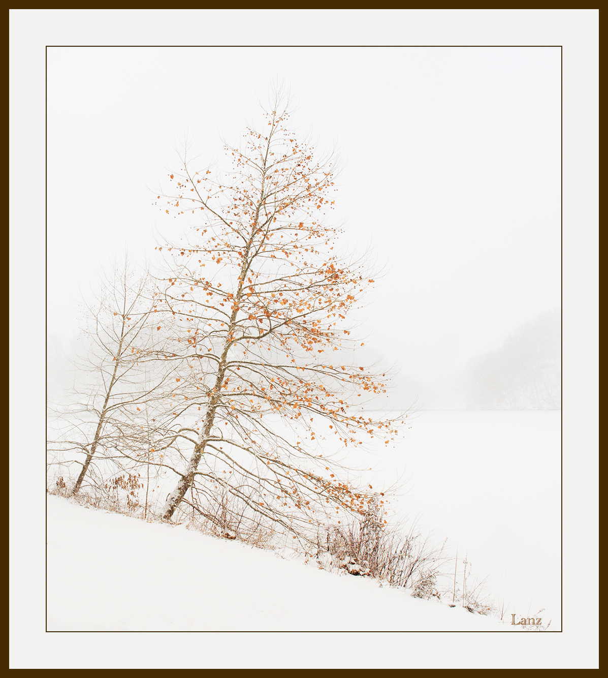
Thought I'd post this winter to contrast with all the beautiful green spring images from California getting posted. We had more snow last week, and it was 14 degrees two days ago. cheeky Anyway, I shot this during a snowstorm in January, and processed it to emphasize the trees in the bleak conditions. Taken in Mill Creek MetroParks, and the frozen lake in the background is Lake Glacier which I drive past daily on my 7 minute commute to work in downtown Youngstown. I will also post a B&W version. 
D600, 24-70 nikkor @29, 1/160, f14, iso 400. Suggestions and other comments welcome. 

Comments

14 comments
Comment posted by scott lanz on March 26, 2017 at 9:05 PM
Registered on November 14, 2003, 840 Posts, 12902 Comments
Comment posted by Harley Goldman on March 27, 2017 at 9:35 AM
Boy, that is tough. I like both, but I prefer the B&W. I might darken the background trees just a bit in the B&W. Nice, simple and beautifully stark. 
Registered on November 19, 2003, 586 Posts, 11271 Comments
Comment posted by Ed Lowe on March 27, 2017 at 11:08 AM
Definitely the color version for me as I really like that bit of warmth with the orange leaves in an otherwise cold looking scene, Scott. The hint of the hills in the BG add an additional wonderful element to this wintery scene. Beautiful work.

Ed
Registered on February 7, 2004, 414 Posts, 7115 Comments
Comment posted by David Schoen on March 27, 2017 at 7:53 PM
Yes, it is still winter in some parts of the country.  I like the high key effect and the tiny bit of color on the leaves.  Nice diagonals and angles in this image.  Very simple and very effective.  And the black-and-white also works however I think I prefer the color version
Registered on November 6, 2006, 1213 Posts, 4587 Comments
Comment posted by Tony Kuyper on March 27, 2017 at 9:57 PM
I like the original.  The soft colors add to the soft light.  Great diagonal with just the right hint in the background this really is level. 
Registered on November 1, 2003, 364 Posts, 22328 Comments
Comment posted by Lon Overacker on March 27, 2017 at 11:51 PM
Wonderful image Scott!  Guess you could call this a transitional image too - fall>winter... and because those are autumn leaves, and autumn COLOR, the b&w isn't moving me nearly as much as the color.  the color version is telling a story, whereas the b&w does not; for all I know it could be a hi-key summer image (well, leaves are sparse... but still...)

The tree and leaves are of course fabulous, but I also like the supporting elements of the smaller tree and ground vegetation too.

Excellent!  And yes, thanks for giving us (me) a break from the green.... sad

Lon
Registered on November 24, 2006, 521 Posts, 19147 Comments
Comment posted by John Williams on March 28, 2017 at 1:34 AM
I'm more torn than typical, but color for me too. The subtlety is a real strength here.

I normally whine about spandrels like that empty lower left corner, but the diagonal is brilliant here; it matches the lean of the tree in a very strong way. The faint background is perfect. Very strong image Scott!devil
Registered on September 6, 2007, 221 Posts, 5985 Comments
Comment posted by Igor Doncov on March 28, 2017 at 1:12 PM
I've given this one time to grow on me and I'm glad I did. I like it more and more. I would try to make the faded hills just a bit more prominent and see how that affects the overall image. I'm not sure how to go about doing that and leaving everything else untouched. I believe that it could be done with TK's masks. 
Registered on November 22, 2014, 189 Posts, 2733 Comments
Comment posted by John Neukirch on March 28, 2017 at 2:10 PM
I also like the color version best. Just the right dash of some brown tones. Looked like a wonderful Winter day to be out enjoying the elements. devil
Registered on July 9, 2012, 207 Posts, 1476 Comments
Comment posted by Preston Birdwell on March 28, 2017 at 5:03 PM
Tough call, as Harley mentioned, but I am in the color version camp. The warm-toned trees and leaves add to the mood. I do like the B&W for its more graphic, and slightly abstract nature. Both images are very nice, Scott.
--P
Registered on November 1, 2003, 471 Posts, 5188 Comments
Comment posted by Rudy Ruberti on March 28, 2017 at 9:39 PM
I prefer the color version here.  Something about fall colors and snow.  Nicely framed, too. 
Registered on October 28, 2008, 179 Posts, 1875 Comments
Comment posted by Dave Dillemuth on March 29, 2017 at 11:48 AM
Beautiful, Scott!  Wonderfully composed image. While both versions work, I prefer the color. The browns are just gorgeous against the monochromatic background.
Registered on December 10, 2015, 104 Posts, 1112 Comments
Comment posted by Kathy Barnhart on March 29, 2017 at 4:49 PM
Love this one, Scott, and I feel your pain about still being so cold and snowy. The delicate leaves, the angle and the background lake to show that the angle is true, all of this works very well. I much prefer the color version. The hills on the far side of the lake at the right are nicely seen in that one. There is something so delicate about the tree, which is standing tall in all that cold.
Registered on November 11, 2011, 404 Posts, 1639 Comments
Comment posted by gary phillips on March 30, 2017 at 10:02 PM
Very artistic, Scott.  Love both versions, but, the color is my choice.  Hard for me to do that cause both images are really good and , well, you know how i feel about b/w.sad.  Beautifully seen and very well done.
Registered on October 24, 2013, 185 Posts, 4136 Comments