Nature Photographers Network
This is the preserved archive of the original Nature Photographers Network. The community continues at naturephotographers.network.
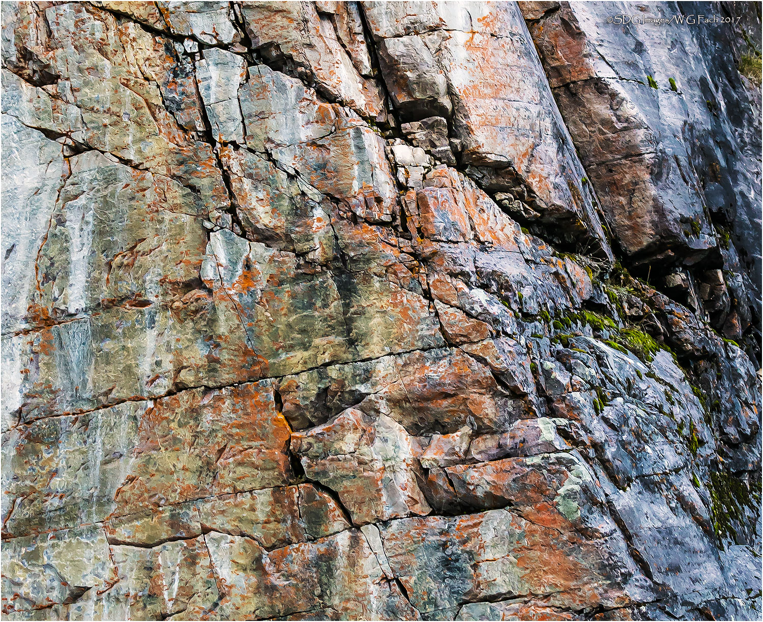
Fissures III
‹ PreviousLandscape GalleryNext ›

Fissures III

by Bill Fach

Gallery: LandscapePosted March 16, 2017235 views7 comments
Sony A77II
Minolta 24-85 @ 28mm, CPL
ISO 400, 1/20 @ f5.6
Lake Louise Trail, Banff NP
Taken from a slightly different angle from Fissures and cropped pretty aggressively for comp and also processed to bring out the colors in the rock. All comments welcome.>=))>

Comments

7 comments
Comment posted by John Williams on March 17, 2017 at 12:02 AM
Love this Bill! There is such rich color there, and the lines provide a lot of interest. I do enjoy the left part more that the grayer right. (You have another one coming that focuses on that, right? enlightened) Nevertheless, it all comes together to make a rich image. You might play with darkening it just slightly, it is a bit bright on my monitor. You got some great stuff from this area!
Registered on September 6, 2007, 221 Posts, 5985 Comments
Comment posted by Lon Overacker on March 17, 2017 at 12:25 PM
Bill,

Fascinating rock study! And I love my rock walls! ;-) Coincidentally, just a few minutes after our recent "Hills of Green" and "Oak tree you're in my way" images, Preston and I photographed a rock wall, not the same geology, but the same light.  I knew the light was too harsh, but photographed it anyway!

That's beating around the bush to say that I think the light is pretty hard here.  The wall and fissures are awesome and I think you did an excellent job bringing out the colors.

For me, I agree with John you could pull down the brightness.  This a perfect candidate for TK's Lights Triple Play, if you have that.  Otherwise, I'd consider cropping the left side as that bright area pull the eye.  I think without that this might present much better.

I gotta say though that this is actually a good example while we shouldn't always follow the rules - and just because this is hot and in full sun, doesn't mean it isn't worth photographing.

Lon
Registered on November 24, 2006, 521 Posts, 19147 Comments
Comment posted by scott lanz on March 18, 2017 at 8:34 AM
I like what you did with this, Bill. I like the colors and textures. Maybe burn a couple of the lighter areas. Otherwise, looks great. 
Registered on November 14, 2003, 840 Posts, 12902 Comments
Comment posted by Preston Birdwell on March 18, 2017 at 12:13 PM
I like the idea here, Bill. I do think the contrast is too high, as is the overall brightness. Also, the very dark area on the right and the bright area on the left could be cropped in order to put emphasis on the red rock mid-frame. I think that with some tweaking, this would be nice rock abstract. The warm/color scheme works.
--P
Registered on November 1, 2003, 471 Posts, 5188 Comments
Comment posted by Daniel & Loana on March 18, 2017 at 1:57 PM
Wonderful shot Bill.
I like texture and colors a lot.
D&L
Registered on October 7, 2008, 166 Posts, 3044 Comments
Comment posted by Harley Goldman on March 18, 2017 at 3:49 PM
Cool display of color and patterns, but the light looks a little on the bright/harsh side. As suggested, perhaps toning it down a bit might be the ticket?
Registered on November 19, 2003, 586 Posts, 11271 Comments
Comment posted by Igor Doncov on March 18, 2017 at 5:31 PM
To me the image looks a bit busy, and that often happens when there is harsh light that breaks down the intended design. I find that the left side of the image holds together better than the right. I think that you could come up with a good composition in the left area despite the less than optimal light by simplifying the composition.
Registered on November 22, 2014, 189 Posts, 2733 Comments