Nature Photographers Network
This is the preserved archive of the original Nature Photographers Network. The community continues at naturephotographers.network.
Brush Fire
‹ PreviousLandscape GalleryNext ›

Brush Fire

by Dave Dillemuth

Gallery: LandscapePosted March 14, 20173,739 views14 comments
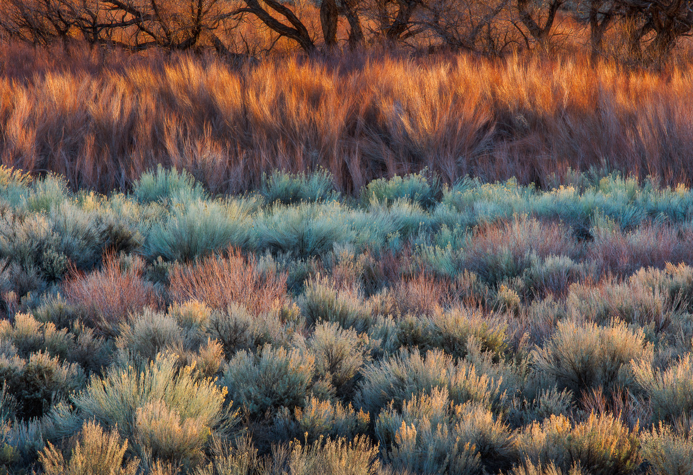
Another from my recent shoot with Harley in the Owens Valley. I've spent collectively maybe 8-9 mornings over the past two winters working this spot trying to refine comps and catch the best seasonal light. While I have a number of comps including the cottonwood trees, I decided to work on isolating the sage and brush.


5DSR, 70-200 f/4 @ 200mm, focus stack of 3 images shot to retain DOF

Comments

14 comments
Comment posted by Ed Lowe on March 14, 2017 at 10:56 PM
You are on a roll with these, Dave. I think this might be the best one yet in your Owen's Valley series. I love everything about this image from the layers of color to the gorgeous light in the scene. Beautiful stuff for sure.

Ed
Registered on February 7, 2004, 414 Posts, 7115 Comments
Comment posted by Mark Seaver on March 15, 2017 at 7:22 AM
Another great set of colors and shapes, Dave.  You caught some fine light on some great colors working this area.  The glow of the branch tips contrasts very well with the solid shapes of the tree trunks standing out so nicely against the glowing shrubs behind.  Another fine example of the value in knowing a location very well.
Registered on January 23, 2011, 1103 Posts, 17270 Comments
Comment posted by scott lanz on March 15, 2017 at 7:30 AM
Wow, this is fantastic, Dave. Love the layers and colors. Predictably for me based on my comments on your other recent posts, I prefer this w/o the trees at the top. To me, the tree trunks are just a distracting element, and I would crop this right where the trees trunks begin. Just me. 
Registered on November 14, 2003, 840 Posts, 12902 Comments
Comment posted by Ian Cameron on March 15, 2017 at 9:44 AM
Nice lines of colour Dave and I love the soft textures but the title is truly excellent.

Ian
Registered on August 6, 2004, 1125 Posts, 3318 Comments
Comment posted by John Williams on March 15, 2017 at 10:19 AM
Well I'd say drop the mike and walk off the stage...

This is supremely gorgeous Dave. From the lighting to the layering, it all comes together here.devil
Registered on September 6, 2007, 221 Posts, 5985 Comments
Comment posted by Igor Doncov on March 15, 2017 at 1:32 PM
I think that compositionally speaking this may be the strongest of the images you've posted on this subject. I would play with the colors a bit more. I would bring down the saturation of the cyan to match the level of the fg foliage. I might also bring down the highlights of the furthest layer just a tad as that layer is dominating the overall composition. It's a stylized image that's subject to interpretation, so mine is just a slightly different interpretation of many ways to go with this subject. The back row is splendid. I think you could have come up with a fine image of just the top half as well.
Registered on November 22, 2014, 189 Posts, 2733 Comments
Comment posted by Nick Bristol on March 15, 2017 at 5:41 PM
Dave, The title is very fitting because it sure does give that impression. Once again the light, colors, textures and layers are just wonderful. For me the tree bases really add something special here and I love the way they look across the top of the frame. Very cool work!!

Nick Bristol
Lone Rock, WI.
Registered on February 1, 2004, 752 Posts, 14140 Comments
Comment posted by Lon Overacker on March 15, 2017 at 5:54 PM
Dave,

I just love this condensed view and how you were able to include so much of the colors, textures and details in to such an intimate view.

The layers here are wonderful and I like the inclusion of the cottonwood(?) trunks up top - although I do wish there was just a bit more. Perhaps you are avoiding other bg elements. But regardless, just enough of them to add to the scene.

I gotta say though, that I'm with Igor on the intensity of the cyan. Not surprisingly though, it's less of an issue in the larger view. But still, the cyan and to some extent, the color/saturation is just bordering on too much. At least for me. Of course your and other's mileage will vary.

Having said that, this is just a gorgeous, intimate and beautifully seen image... that keeps teasing me to get back over there one day!

Lon
Registered on November 24, 2006, 521 Posts, 19147 Comments
Comment posted by Aaron Feinberg on March 15, 2017 at 6:49 PM
Yea, this is freakin rad.  Colors are pushed but it's artisticly done.  Sick stuff.

aF
Registered on October 26, 2009, 399 Posts, 2789 Comments
Comment posted by Dan Kearl on March 15, 2017 at 11:23 PM
You know, this just looks on fire...
I don't know whether to call it a landscape or an abstract even though it is clearly a landscape.
Just superb...
Registered on September 2, 2013, 209 Posts, 1514 Comments
Comment posted by gary phillips on March 15, 2017 at 11:34 PM
I am definitely down with this one, Dave.  Love it.  Yes it is pushed, but in a very artful way for me.  Outstanding.
Registered on October 24, 2013, 185 Posts, 4136 Comments
Comment posted by Harley Goldman on March 16, 2017 at 9:49 AM
Beautiful colors and layering. I would tend to agree with Igor on bringing down the sat on the cyan a touch, but pretty dang minor and a personal interpretation. 

I take you to all the best places! sad
Registered on November 19, 2003, 586 Posts, 11271 Comments
Comment posted by Preston Birdwell on March 16, 2017 at 4:13 PM
Dave, the light here is gorgeous, and I love all the layers. I do agree with reducing the cyan. I also think Scott's suggestion to crop out the trees has merit. To me, the star of the image is the layers of color and texture up to the shadow line. Not only that, but the pano crop accentuates the real nice layers of light and color.

In any event, you did a great job here. this is an exceptional image.
--P
Registered on November 1, 2003, 471 Posts, 5188 Comments
Comment posted by Rudy Ruberti on March 20, 2017 at 10:24 PM
The vegetation in this area has such a distinct look and I like this one a lot.  I also agree with Lon and Igor on the saturation, but very nicely done.
Registered on October 28, 2008, 179 Posts, 1875 Comments