Nature Photographers Network
This is the preserved archive of the original Nature Photographers Network. The community continues at naturephotographers.network.
California Dreamin' +pano
‹ PreviousLandscape GalleryNext ›

California Dreamin' +pano

by Lon Overacker

Gallery: LandscapePosted March 8, 2017268 views16 comments
Ok, so the title really might evoke images of bikini-laden So-Cal beaches... the Beach Boys, ya know, California, dude!

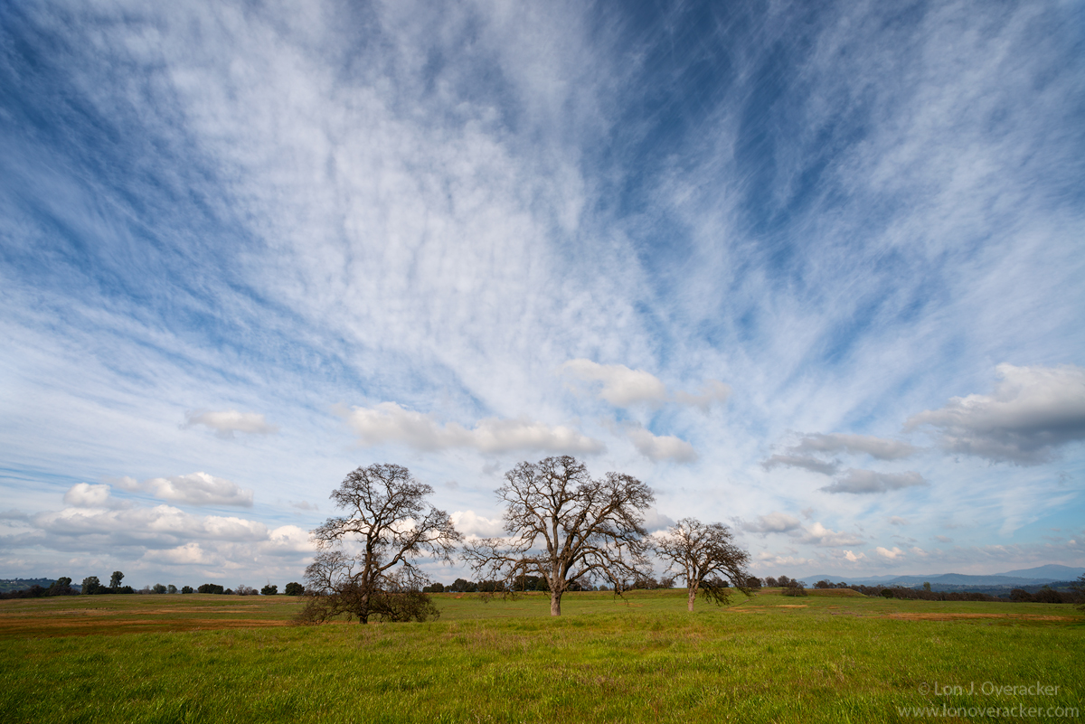
But for me, this really captures my thought of California (minus the population centers...) of oak trees, rolling hills (not displayed here really) and the very important California trait of only having two seasons: Green season and Brown season.  Right now we're all about green, the reservoirs are full, the flowers are starting to bloom, trees beginning to leaf out. It's a glorious time in California.

I left Preston's after lunch in Columbia knowing I wanted to explore the back roads on the way home.  An incoming storm that brought snow to Preston's deck that night, created a dynamic and wonderful sky the entire trip home.  Normally I'm less than a 2 hour drive from Mr. B's, but on this day, it took me over 5 hours.... 5 hours of photographic fun!

Within a half hour after leaving Preston's I was speeding along looking for a scene to go along with the building drama in the sky. I saw these oaks standing alone in the pasture, hit the brakes and set up the camera on the legal side of the barbed-wire fence.

At the time, the clouds told me I was going to process in b&w, but the spring field of greens and blue sky also said color. So I'm posting both.  Which do you prefer?  I like them both.

Would love your thoughts, critiques and comments; especially on the color and processing of both.

Thanks!

Lon

edit: full disclosure, I did clone out a number of white-tipped metal fence stakes; they were small and behind left/right of the trees, but annoyingly noticeable. 

edit2: Preston kindly pointed out to me that "Califonria Dreamin'" was a song from the Mamas and the Papas... ;-)

Comments

16 comments
Comment posted by Lon Overacker on March 8, 2017 at 1:42 AM
b&w rendition
Registered on November 24, 2006, 521 Posts, 19147 Comments
Comment posted by Richard Teller on March 8, 2017 at 6:48 AM
I really like the sky in this image and the trees are a very nice anchor for the whole image. A very peaceful image. It makes me want to be there. I could set and look at the image for a long time. 

I will give my personal bias on the two images. I know that many people say that B&W is the truly artistic photography. I like B&W in certain types of images, but this is not one. The color here is so dynamic. The contrasts with the green grass, blue sky, white clouds really adds to the depth of the image. It just draws me in. It is very three dimensional to me. The B&W is flat and two dimensional. That is just my personal bias. Nature especially is bright, colorful and alive and my bias is toward color in most landscape shots. 

I got in trouble because of this bias. I was at the Ansel Adams studio in Yosemite. I asked a young man working there about Adams color work. He showed me some and I committed a cardinal sin. There was both a B&W and color copy of the famous shot from tunnel view in Yosemite and to me the color grabbed me more and I voiced that. The young man said very curtly, "Every ones a critic" and walked away. We all have our personal biases and they are not necessary good or bad. But some are very passionate about there biases. 
Registered on August 23, 2010, 1162 Posts, 6692 Comments
Comment posted by Harley Goldman on March 8, 2017 at 7:33 AM
Both versions work really well, but I like the drama of the B&W version a wee bit more. Luckily, it is one of those images that can go both ways.  No suggestions here. Very nice!
Registered on November 19, 2003, 586 Posts, 11271 Comments
Comment posted by Mark Seaver on March 8, 2017 at 10:11 AM
Lon, the sense of movement in this view due to the clouds, is great.  I like how that flow is directed to the 3 trees and sets them up as the main subject even as the sky dominates the image.  I much prefer the color version because of the greens and blues and their story of spring (maybe I'm just ready for spring...).
Registered on January 23, 2011, 1103 Posts, 17270 Comments
Comment posted by scott lanz on March 8, 2017 at 10:20 AM
Beautiful, Lon. I like the way you took full advantage of the great sky/clouds. (Although, as purely an alternate image, a pano comp would work nicely as well due to the nice lower scattered clouds). I also prefer the color, but the B&W is a fine alternate for anyone or any situation where B&W is preferred. 
Registered on November 14, 2003, 840 Posts, 12902 Comments
Comment posted by Navin Sarma on March 8, 2017 at 10:58 AM
Nice drama to this one Lon. I prefer the B&W high contrast version as the converted B&W pockets in the sky act a little more effectively as leading lines for me. Great shot!
Registered on July 17, 2011, 233 Posts, 1373 Comments
Comment posted by Dave Dillemuth on March 8, 2017 at 11:05 AM
This is lovely. The clouds are awesome and serve as wonderful leading lines. They make what would be a static image, very dynamic. Both color and B&W versions work well. If I had to pick, I think I'd go with the color version. The warm, lush greens are just too yummy to pass up. Processing looks good but I think the overall image could be brightened up just a touch.
Registered on December 10, 2015, 104 Posts, 1112 Comments
Comment posted by Lon Overacker on March 8, 2017 at 1:05 PM
Thanks for the comments and excellent feedback.  Yeah, for the b&w I was going for that high contrast, Ansel kinda sky, but for sure the color speaks because of the spring greens and blue/white sky.

@Dave, thanks for the comment and good call on raising the brightness a tad, I agree.

@Scott, GREAT idea on the pano!  I hadn't considered that, but it works quite well. In fact here it is.

Thanks everyone!
Registered on November 24, 2006, 521 Posts, 19147 Comments
Comment posted by Harley Goldman on March 8, 2017 at 1:38 PM
For the color version, the pano is working for me. Good modif. 
Registered on November 19, 2003, 586 Posts, 11271 Comments
Comment posted by Ed Lowe on March 8, 2017 at 2:15 PM
This is one of those images where you wish you were there and could pull up a chair to enjoy the wide open spaces before you. The clouds make this image for me Lon as they lend a sense of motion to an otherwise static scene. Hard to pick a favorite as they all work rather nicely for me, but I am leaning towards the original as that showcases the wide open space of the scene.

Ed
Registered on February 7, 2004, 414 Posts, 7115 Comments
Comment posted by Preston Birdwell on March 8, 2017 at 2:40 PM
All three versions look great, Lon. I do prefer the original. Its openness and great clouds carry it for me.

The color in the sky, and the tonality overall looks perfect. The grass and the oaks look a tad on the reddish side to me, at least in MS Edge. But, that is minor. I like this a lot!
--P
Registered on November 1, 2003, 471 Posts, 5188 Comments
Comment posted by Igor Doncov on March 8, 2017 at 4:07 PM
My vote is for the original. The b&w has better lower clouds but the overall the color trumps that advantage. The pano seems to be a more literal capture than the others. It does give a better sense of open space. So, each image has it's strong points and weak points and you just weigh them out.
Registered on November 22, 2014, 189 Posts, 2733 Comments
Comment posted by scott lanz on March 8, 2017 at 7:56 PM
Thanks for posting the pano, Lon. I think it works in its own right, but I do prefer the original which seems more original and dramatic with the big sky. I also prefer the original exposure, as the sky in the repost seems to have lost some contrast, but that may just be my monitor.  
Registered on November 14, 2003, 840 Posts, 12902 Comments
Comment posted by Rudy Ruberti on March 8, 2017 at 11:18 PM
After seeing brown for so long it's great to see some green.  The sky is impressive and I like how the clouds radiate out from the trees, giving a sense of motion.  But the high contrast in the b&w works, too.  I was thinking this would look good in b&w before reading your post and scrolling down.
Registered on October 28, 2008, 179 Posts, 1875 Comments
Comment posted by gary phillips on March 9, 2017 at 1:10 AM
I'm gonna vote for the color original, Lon.  You know my preference for b/w, but in this instance, the trees and wonderful greens are lost in the mono version.  I think the sky is way more dramatic in the b/w. You really have 3 very nice choices here, all of them worthy. 
Registered on October 24, 2013, 185 Posts, 4136 Comments
Comment posted by Craig Moreau on March 9, 2017 at 9:15 AM
Lon, I'm reall enjoying the original. The b&w and pano are really good too, but that grand sky and the blue/green color combo in the original just add a lot to the image. Well seen!
Registered on April 21, 2015, 64 Posts, 584 Comments