Nature Photographers Network
This is the preserved archive of the original Nature Photographers Network. The community continues at naturephotographers.network.
May 2017 GOTM
‹ PreviousGallery of the Month GalleryNext ›

May 2017 GOTM

by Brian Schrayer

Gallery: Gallery of the MonthPosted March 6, 20173,255 views11 comments
Spring Fever (+ Repost)

EDIT:  Please see corrected version below.  I forgot to convert to sRGB before posting.  I also brightened the web version a little.  Larger is better.

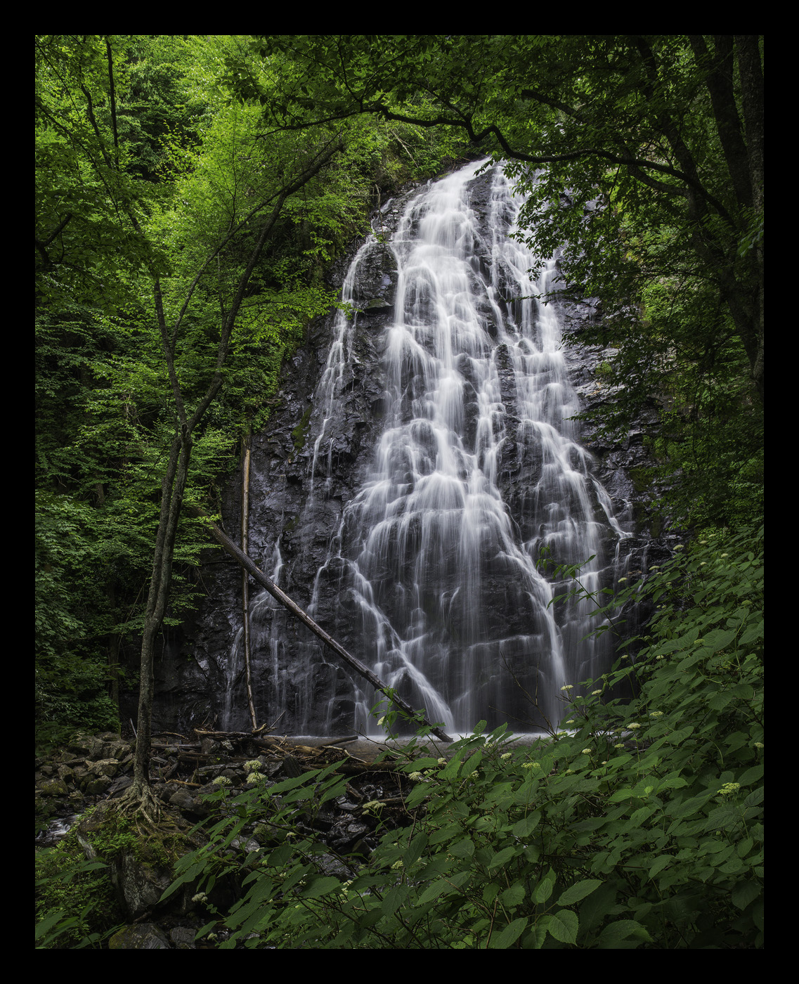
This is a photo of Crabtree Falls which is located along a trail off of the Blue Ridge parkway north of Asheville, NC.  This is a beautiful waterfall, but it was difficult to find a clean composition in this location as there was a lot of debris at the base of the waterfall.  I tried to minimize the impact of the debris in my composition, but there is still some.  In a perfect world, I would prefer that the logs on the left side of the falls were not there, but maybe they add character and a sense of place to the composition.  enlightened

As always, all comments and critiques are welcome.  crying

Capture Info:
25mm (cropped significantly from full frame)
f/16 @ 1/5 sec
ISO 200

Processing info:
TK's luminosity masks to increase contrast in midtones and lights
TK's focused vibrance masks

 

Comments

11 comments
Comment posted by scott lanz on March 6, 2017 at 10:05 PM
Fine image, Brian, and you certainly did well hiding the debris with your comp. The waterfall is framed beautifully. The flowers are a very nice bonus. The water looks great both in terms of exposure and ss. I could see boosting the exposure in the greenery as well as in the flowers in the foreground to make them more prominent. 
Registered on November 14, 2003, 840 Posts, 12902 Comments
Comment posted by Brian Schrayer on March 6, 2017 at 10:14 PM
Here is a corrected version. 
Registered on May 28, 2004, 114 Posts, 2890 Comments
Comment posted by gary phillips on March 6, 2017 at 11:18 PM
Your repost takes care of the color issues, Brian.  I like the framing here and can get a feel of hard it would be to get a clean view.  It is a beautiful falls and I like how you used the foliage to frame the right side.  The logs on the left, as you said, are not ideal, but they are now part of the falls.  I could also see going square here, with the base of the falls as the bottom of the frame. Real nice as is.
Registered on October 24, 2013, 185 Posts, 4136 Comments
Comment posted by Wayne Jones on March 6, 2017 at 11:42 PM

The second one looks perfect to me; and that includes logs, debris and all.  I totally appreciate all that stuff giving "character and a sense of place" to this composition.  That's all a part of what this waterfall is, and leaving it out would be a shame IMO.  I think the trees (dead and alive) framing the falls help give us a sense of where this is -- in the forest.  I would not change a thing.
Registered on April 18, 2007, 953 Posts, 6435 Comments
Comment posted by Harley Goldman on March 7, 2017 at 8:35 AM
Excellent job on the repost. This looks great.  Really nicely saturated (and realistic) colors and a beautiful scene. 
Registered on November 19, 2003, 586 Posts, 11271 Comments
Comment posted by Ed Lowe on March 7, 2017 at 2:40 PM
Brian, as you said in a perfect world the logs would not be there, but I think we have all found that downed trees seem to go along with waterfalls in a lot of cases. I think you did a nice job of minimizing the clutter around this gorgeous waterfall. If you were so inclined I think the logs on the left would be an easy fix with the healing brush. I like the framing of the falls with the flowers and I think it would also work by moving a bit to the left. Great job with the repost!

Ed
Registered on February 7, 2004, 414 Posts, 7115 Comments
Comment posted by Preston Birdwell on March 7, 2017 at 7:10 PM
Brian, the original post has a more austere mood than the re-post. However, the re-post is right on the money. Nicely done.

Just curious, but what is the color profile of the original? This is an excellent example of why it is important to embed sRGB for the best Web presentation.
--P
Registered on November 1, 2003, 471 Posts, 5188 Comments
Comment posted by John Williams on March 7, 2017 at 8:51 PM
Great shot Brian. Comparing the two versions, I do like the bump the greens took, but miss some of the deeper shadows of the original. I wouldn't be afraid to add some selective darkening to the second version to add depth.
Registered on September 6, 2007, 221 Posts, 5985 Comments
Comment posted by Dave Dillemuth on March 7, 2017 at 9:42 PM
Excellent, Brian. I'm loving the lush greens. The repost is a considerable improvement and spot-on IMO.
Registered on December 10, 2015, 104 Posts, 1112 Comments
Comment posted by Lon Overacker on March 7, 2017 at 9:46 PM
Brian,

A beautiful cascade image with just as beautiful supporting greens.  I do like the repost, but perhaps a compromise between the two. For me, the UL greens are a little bright and pull the eye.

I think you did a great job with the comp and using the foreground greens/leaves to obscure the debris was a very good success. Beautifully framed; well seen.

Lon
Registered on November 24, 2006, 521 Posts, 19147 Comments
Comment posted by Brian Schrayer on March 7, 2017 at 10:44 PM
Preston, the original post was in the RGB color space.  I ordinarily convert all of my images to sRGB before posting, but I forgot that step before posting this.  I also brightened the repost a little using the optional curves adjustment layer on TK's web sharpening action. I noticed that the web version looked darker than how it looked in Photoshop.  That could be a monitor calibration issue though.
Registered on May 28, 2004, 114 Posts, 2890 Comments