Gallery: LandscapePosted February 13, 2017249 views8 comments
Sony A77II
Sony 70-400G @ 160mm
ISO 400, 1/60 @ f8
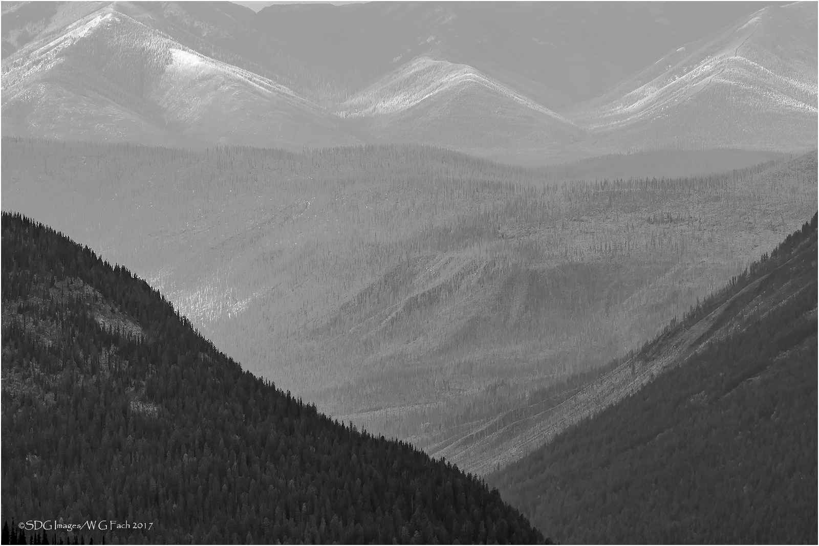
Taken from the Hidden Lake overlook in Glacier NP. Thought I would try a conversion which is not my strong suit so any suggestions would be very much appreciated. >=))>
Comments
8 comments
Comment posted by Lon Overacker on February 14, 2017 at 12:11 AM
Bill,
This is excellent! I think I might enjoy this even more than your previous #1 color version from this location. For me, the graphic element and composition really stand out. And so with the b&w, it's less about the light - like in the previous version, and more about the contrasts, shapes and graphics. From the smaller thumbnail, this looked like an image that portrayed 3 "peaks" yet these are essentially just foothill peaks.
I suppose one could play around with overall and/or selective contrast adjustments, but I thinks this works very well as presented.
My only nit/suggestion would be to clone to remove the very small spit of sky at the top. Cropping won't work cause that messes with the left hand "peak." I think some creative fill to remove the bits of sky could work. But then, that might not be where you're willing to go. It's a minor thought anyway.
I like this a lot.
Lon
Registered on November 24, 2006, 521 Posts, 19147 Comments
Comment posted by Harley Goldman on February 14, 2017 at 8:13 AM
Lon said exactly what I was about to say! I like this a lot, very much my kind of image. I totally agree about the patch of sky. Excellent conversion and presentation, the sort of high key look really works for me. Wonderful depth to the image, too. Sweet!
Registered on November 19, 2003, 586 Posts, 11271 Comments
Comment posted by gary phillips on February 14, 2017 at 11:43 AM
Really nice, Bill. I agree that filling in the breaks on the background ridge line is a good suggestion. I'm not sure how you did the conversion, but it looks very good. I would try to get some tonal separation between the mid and background mountains. The depth is there, it just needs a little coaxing. Perhaps burning it slightly and adding just a smidge of clarity. Also, the foreground ridge line has a slight halo, which is probably due more to web compression than anything else. These are just suggestions to make very slight improvements, the image is fine as presented.
Registered on October 24, 2013, 185 Posts, 4136 Comments
Comment posted by scott lanz on February 14, 2017 at 10:06 PM
Fine image making good use of the shapes and the light, Bill. Lon, Harley, and Gary made some good tweak type suggestions.
Registered on November 14, 2003, 840 Posts, 12902 Comments
Comment posted by Preston Birdwell on February 15, 2017 at 3:41 PM
This works for me, Bill. The soft tones look good to me. I agree with Lon about cloning out that bit of sky. I really like the band of sunlight hitting the slopes. The large version looks best.
--P
Registered on November 1, 2003, 471 Posts, 5188 Comments
Comment posted by D.A. Edwards on February 15, 2017 at 4:35 PM
I agree with the suggestions about the patch of sky up top. It's a bit hidden by your watermark but the very near black trees at the bottom edge might also be a distraction in a print so I would look at eliminating those in some manner.
Registered on October 8, 2014, 226 Posts, 1187 Comments
Comment posted by Bill Chambers on February 15, 2017 at 4:45 PM
This definitely has to be seen large to be fully appreciated. I agree about cloning the sky, plus it will be so easy. In the small size, my eyes are drawn to the FG diagonals but in the large version my eyes play almost exclusively in the distant trees, which are beautifully rendered in B&W. One of your finest, Bill. You need to play with B&W more often.
Registered on April 10, 2005, 753 Posts, 21216 Comments
Comment posted by Doug Koepsel on February 18, 2017 at 11:02 AM
Nice Vs of various tones. If you are open to cloning, maybe rid the lighter thin spot along the top edge, and also the road on the upper right ridgeline.
Registered on April 1, 2010, 196 Posts, 1592 Comments

Comments
8 commentsThis is excellent! I think I might enjoy this even more than your previous #1 color version from this location. For me, the graphic element and composition really stand out. And so with the b&w, it's less about the light - like in the previous version, and more about the contrasts, shapes and graphics. From the smaller thumbnail, this looked like an image that portrayed 3 "peaks" yet these are essentially just foothill peaks.
I suppose one could play around with overall and/or selective contrast adjustments, but I thinks this works very well as presented.
My only nit/suggestion would be to clone to remove the very small spit of sky at the top. Cropping won't work cause that messes with the left hand "peak." I think some creative fill to remove the bits of sky could work. But then, that might not be where you're willing to go. It's a minor thought anyway.
I like this a lot.
Lon
--P